Meteorological winter is over. How’d we do in 2017-18?
I know it may seem a bit ridiculous to say that winter is over when the eastern half of the United States keeps getting repeatedly smacked by nor’easters. But from a meteorological perspective, winter lasts from December 1 – February 28. And it is over. Which can mean only one thing! It is time for the ENSO Blog’s annual post looking back at how NOAA’s Climate Prediction Center’s Winter Outlook did.
So for residents of the Northeast, I ask you to postpone shoveling out your car for 10 minutes, because it’s time to talk forecast verification. (I have an obsession, see here, here, here and here).
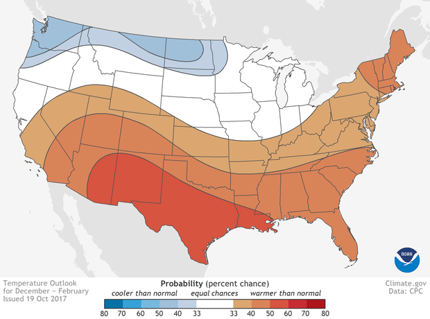
Places where the forecast odds favor a much colder than usual winter (blue colors) or much warmer than usual winter (red), or where the probability of a cold winter, a warm winter, or a near-normal winter are all equal (white). The darker the color, the stronger the chance of that outcome (not the bigger the departure from average). Click image for version that includes Alaska and Hawaii. NOAA Climate.gov map, based on data from NOAA CPC.
Let’s start with the temperatures
The Winter Outlook, which came out in November 2017 predicted a tilt in the odds towards warmer than average conditions across the southern United States (1) and stretching north along the East Coast. In contrast, the Pacific Northwest and the northern Plains were slightly favored to be colder than average. The Outlook was most confident in above normal winter temperatures over the desert Southwest and Texas, with odds of more than 50%. Meanwhile, in Alaska, the Outlook favored a colder than average winter for southern parts of the state and a warmer than average winter for the northern parts.
In reality, the temperature outlook wasn’t that far off. Winter was much warmer than average across northern, central and western Alaska, the southeast and southwestern parts of the country, while the High Plains, parts of the Pacific Northwest, southeastern Alaska, and southern Texas experienced below normal temperatures. Elsewhere, temperatures were around average.
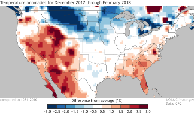
Temperature differences from average across the continental United States for winter 2017-2018 (December, 2017 - February, 2018). The southwestern and southeastern United States observed much warmer-than-average temperatures, while colder-than-average temperatures were recorded across the High Plains. NOAA Climate.gov image from data provided by CPC.
As you can see, reality rarely is as smooth as the Outlook simply due to the limitations in our forecast abilities. But still, even at a quick glance, this wasn’t a bad forecast. Certainly better in many places than a random guess.
But if there is one lesson I hope you take from my many posts on verification, DON’T TRUST YOUR EYES! Ask for the (scientific verification) numbers!
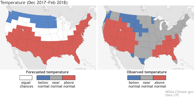
(left) Temperature forecast for December-February 2017-18, made in mid-November. The colors show the forecast category with the highest probability. White areas are where all three outcomes (warm, cool, or average) were equally likely (each had a 33.3% chance of happening). (right) Observed temperature category for December-February 2017-18. Climate.gov image based on CPC data.
The Climate Prediction Center uses a verification metric called the Heidke Skill Score (HSS). In a nutshell (2), the Heidke Skill Score measures how many hits and misses our outlook had and subtracts how often we are likely to have gotten the right answer just by luck. A perfect score would be 100. A score greater than 0 is better than random chance.
Did we beat 0? You bet! This year’s winter outlook scored a Heidke Skill Score of 25 for the continental U.S. if we include all the areas where the forecast said “equal chance,” and a 35 if we only evaluate the places where the outlook got off the fence and favored a specific outcome—above or below-normal (3). And that’s pretty good!
And because we are good, transparent scientists, we’ve put all of CPC’s seasonal forecasts and their verifications online for all to see. Most of our temperature outlooks have performed pretty well (a long-term HSS average of 15 which is greater than 0) going back in time, showing that our forecasters do have skill in this whole seasonal outlook business. We aren’t flawless, but you’re still better off coming to us than asking the groundhog.
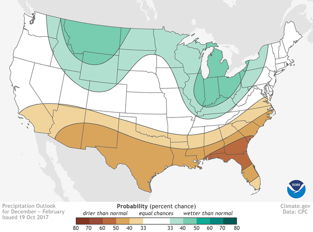
Places where the forecast odds favor a much drier than usual winter (brown colors) or much wetter than usual winter (blue-green), or where the probability of a dry winter, a wet winter, or a near-normal winter are all equal (white). The darker the color, the stronger the chance of that outcome (not the bigger the departure from average). Click image for version that includes Alaska and Hawaii. NOAA Climate.gov map, based on data from NOAA CPC.
What about precipitation?
Precipitation is usually harder to forecast than temperature, as one big storm can have a large impact on the seasonal totals. This leads to a much noisier observed pattern than temperature. This year’s winter outlook forecasted higher chances for a drier-than-normal winter across the southern tier of the United States and higher chances for a wetter-than-normal winter across the northern United States—a generally La Niña-like pattern.
In reality, the western and southeastern regions of the United States observed a drier-than-average winter, while the Missouri and Ohio River Valleys, Great Lakes and western High Plains recorded a wetter than average winter. Not too bad! If we look at the verification number, the outlook scored a HSS of 23 (or a 32 if we only looked at locations with one favored outcome). Remember, a score of 0 would mean we got it right no more often than we’d expect by chance. So, this is a good score for a precipitation outlook when we consider how difficult it can be to predict precipitation.
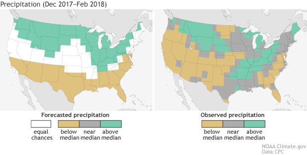
(left) Precipitation forecast for December-February 2017-18, made in mid-November. The colors show the forecast category with the highest probability. White areas are where all three outcomes (wet, dry, average) were equally likely (each had a 33.3% chance of happening). (right) Observed precipitation category for December-February 2017-18. Climate.gov image based on CPC data.
For a full look at how CPC’s precipitation outlooks have done, please go here. You’ll note that precipitation scores in the last five years are lower and not nearly as consistently positive as temperature scores, reflecting just how hard it is to predict seasonal precipitation totals based on our current tools and techniques. However, on average, both temperature and precipitation have HSS numbers above 0.
So were you guys wrong, or were you right?
Both... and neither! This outlook had more hits than misses (yay!), but there were still misses (boo!). It all sort of depended on where you lived. That is the nature of these winter outlooks.
But in figuring out just how good a winter outlook is overall (or whether to trust it), you cannot just look at the one (or two) times a winter outlook was good (or bad). That’d be like proclaiming your favorite baseball team is the greatest ever because they won on opening day (or vice versa).
It’s important to see how ALL of the outlooks have performed to get the true picture. After all, if in the last 10 years, eight of the forecasts were worse than random chance but two were much better, I’m not sure I would rely on that outlook in the future (4).
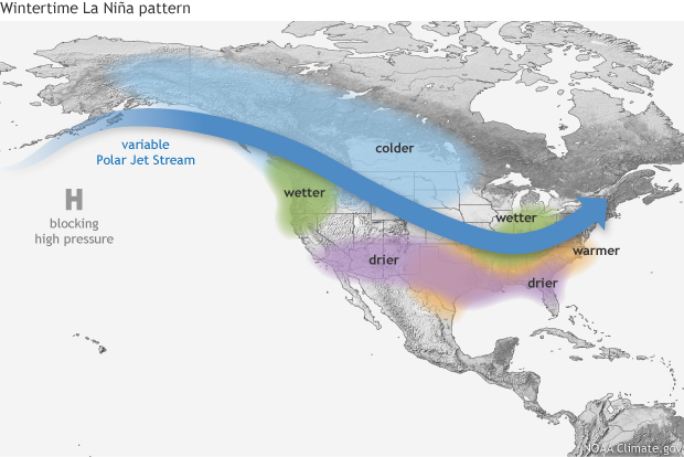
Typical impacts of La Niña on U.S. winter temperature and precipitation. Such impacts have been associated with past episodes, but all impacts aren't seen with every episode. NOAA Climate.gov drawing by Fiona Martin.
What actually happened this winter then? La Nina? Other stuff?
Lots of things. For one (and a reminder that this is the ENSO blog), there has been a La Niña active over the Pacific Ocean. And as we have covered numerous times on the blog, La Niña can influence the winter over the United States by impacting the jet stream and the placement of high and low pressures over the mid-latitudes. But we can’t blame EVERYTHING on La Niña, and no serious scientist does.
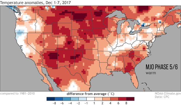
Surface temperature departures from average across the contiguous United States for consecutive periods during the 2017-18 winter while the MJO was active and in different phases. Blue shading indicates below-average temperatures and red shading indicates above-average temperatures (relative to a 1981-2010 base period). Gridded data is from CPC with graphic modified by climate.gov.
Also active during this winter was the Madden Julian Oscillation. Its influence on the United States was already covered extensively by Michelle last month. In short, as the MJO moved around the globe, it led to prolonged periods of colder and warmer than average temperatures across much of the country this winter. Though, while this certainly impacted monthly climate, it likely had less impact on climate patterns averaged over the entire winter.
Anything else, you ask? Well, there was always the randomness of the weather as well as variability in other atmospheric oscillations like the Arctic Oscillation.
As we often say, ENSO is not the only game in town!
Wait, why then do you talk so much about ENSO when making the outlook?
Basically, because it is the one influence that is actually predictable a season ahead of time. We know that other things will impact the winter temperature and precipitation patterns besides ENSO. But we don’t know exactly HOW those other atmospheric features will behave more than a couple weeks in advance.
In contrast, we usually know what phase it will be—El Niño or La Niña—months in advance. The other things mentioned, like the MJO or other patterns of middle to high latitude variability, are much more random, which means they don’t give forecasters nearly as much of a heads up (5).
This leaves forecasters in a tricky spot in searching for climate signals, which is one reason they often turn to “old reliable” ENSO (6), and why reality always looks different and noisier than the seasonal predictions.
Footnotes
(1) When we say “well above” or “well below” average, we mean in the top or bottom third of observed winter average temperatures or precipitation during the climatological reference period, which is currently 1981-2010. This means we can’t get a good grade on our forecast with an observed seasonal outcome that is just barely above or below average.
(2) If you’ve forgotten what the Heidke Skill Score is, read here. No one is harder on forecasters than forecasters themselves. Not only do we account for the fact that our “hits” might have been due to chance (in a three-category forecast, we’ll be right 1/3 of the time just by chance), but we publish exactly what the HSS scores are to the entire world, even the bad ones. And even then, it’s important to note that the HSS is a very simplified verification statistic that does not take into account the probabilistic nature of the outlook. For how to truly do justice to the forecast, check out this post.
(3) Why are there two HSS numbers for the same forecast? Because there are different ways of treating the areas in the outlook where the chances for all three categories are equal (known as Equal Chance or EC). We can calculate the HSS including EC forecast areas, which are essentially the same as random chance, and we can calculate the HSS for only areas where the outlook favors one outcome more than others. These methods reward different ways of forecasting. The HSS that includes areas with EC can be maximized if a forecaster makes non-EC predictions wherever they think there is a signal, regardless of confidence. In contrast, the HSS which does not use EC can be maximized by a forecaster making a prediction only over small regions where their confidence is higher. Both methods have value.
(4) Want an example of what I mean? Say I am a farmer in the South who has a problem with erosion during really wet winters, and I’ve decided to plan a winter cover crop whenever the outlook favors a wet winter for my farm. Yes, there will be a couple years when I plant a crop I don’t end up needing, and yes, there will be a couple years where I don’t plant one when I needed it. But if the forecast score for my area is consistently above zero, then I know that over the span of a decade or more, I will ultimately come out ahead, wasting as little money and effort as I can while preserving my top soil and reducing water quality violations. Seasonal outlooks are most useful when they can be applied consistently to decisions over the long haul.
(5) This does not mean that NOAA and scientists are not actively researching these other forms of climate variability to help improve subseasonal to seasonal climate predictions. Areas of active research include, but are not limited to, the Madden Julian Oscillation, atmospheric rivers, the polar vortex, sudden stratospheric warming events, and other forms of tropical, mid-latitude and arctic variability.
(6) The other “old reliable” in making seasonal temperature forecasts is the trend. Simply put, we are not currently in a stable, non-changing climate. As such, due to human emissions of greenhouse gases and also to natural decadal changes, there are trends in our climate. Forecasters can use the trend in temperature across the United States as another source of predictability when making seasonal forecasts.
Comments
Meteorological Winter Term
What's a blocking high over
RE: What's a blocking high over
Hi Megan,
A blocking high pressure refers to an area of higher than normal atmospheric pressure that acts like a big mountain in the atmosphere. It blocks storms from going through and instead slows down the storms as they try to find their way around.
As for why the northeast keeps getting hit by Nor'Easters, the atmosphere has been stuck in a pretty consistent pattern over the last several weeks which is consistent with a bunch of nor'easters moving up the east coast. Once that pattern breaks, the onslaught of storms will too.
And lastly, Atmospheric Rivers are narrow streams of moisture flowing directly from the humid tropics. The West Coast relies on these events for around half of their precipitation during the winter wet season.
RE: RE: What's a blocking high over
RE: RE: RE: What's a blocking high over
RE: RE: RE: RE: What's a blocking high over
Yes, I believe you're right! I don't think it's a coincidence that the batch of nor'easters occurred after the NAO turned sharply negative in late February. This sort of connection between nor'easter occurrence and the blocking associated with the negative phase of the NAO is consistent with what scientists have noted before.
What's the latest that a
RE: What's the latest that a
I do not know these answers offhand, but the timing of the latest winter storm is going to vary substantially based on the region of interest. Regarding the 2011 tornado season, there probably were numerous factors, but there is a high probability that the La Nina in 2011 was a factor. For more information on the relationship between ENSO and severe thunderstorm activity, please see this post: https://www.climate.gov/news-features/blogs/enso/enso-and-tornadoes
High activity era in Atlantic
RE: High activity era in Atlantic
It certainly indicates high activity in the Atlantic since 1995! I'm curious about the last 5 years - 3 below normal and then 2 above normal. ENSO certaintly played a role in this variability, but I must rely on tropical cyclone specialists to provide more insight.
RE: RE: High activity era in Atlantic
Scientists > Groundhogs ?
RE: Scientists > Groundhogs ?
That was a completely evidence-based put down ;-)
https://www.ncdc.noaa.gov/customer-support/education-resources/groundho…
more than the averages
RE: more than the averages
Thanks for inspiring an idea for a future blog post.... I completely agree w/ you that, for certain sectors and interests, it is more meaningful to look at shorter term forecasts (Week 2, Week 3-4, the the coming month), which fluctuate a lot more than season-to-season changes. As you can see in this recent blog post, we touched on the variability *within* the 2017-18 winter here:
https://www.climate.gov/news-features/blogs/enso/madden-julian-oscillation-has-been-active-so-far-winter-here-why-it-matters
NOAA Climate Prediction Center *also* produces more frequent, near-term forecast products (and their verifications... the links in the blog post can be used to get their verifications as well). See all forecasts on the CPC home page here: http://www.cpc.ncep.noaa.gov
Comments have been disabled on this article