30% of the time, it rains every time
A recent post on the Climate Prediction Center’s (CPC) winter forecast brought out several comments wondering about the quality of these seasonal forecasts. Folks asked: how good are these forecasts? (They have skill. I’ll show you over a couple of posts.) Do we even check? (Of course!) What about the Farmer’s Almanac? (No comment.)
Grading forecasts, or in nerd-speak, verification, is incredibly important. Not to get philosophical, but, like pondering the sound a tree makes in the woods if no one is around, a forecast is not a useful forecast if it is never validated or verified. After all, anyone can guess (educated or… not) at what will happen. I could give you my thoughts on what the stock market will look like in the future but I wouldn’t recommend putting money down based on my musings. I could even tell you what I think tomorrow’s winning lottery numbers will be, but, well, you get the point. It’s not hard to make a prediction; it’s hard to get it right.
How do you know who to trust? The simple answer is by checking how well forecasts have been in the past, making sure to look at all of the forecasts and not focusing on one extremely good or bad prognostication. In the case of seasonal forecasts, how did they do in previous years? Are they routinely on/off the mark, or is there variability in their performance?
How did we do?
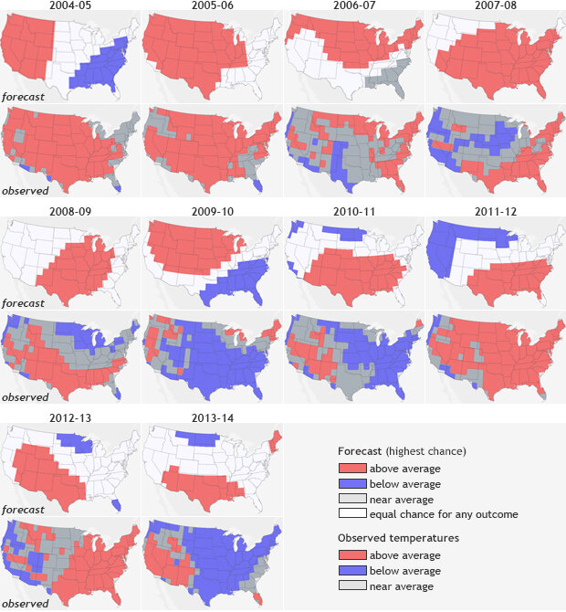
December- February (DJF) temperature forecasts (top rows) and observations (bottom rows) from 2004-2013. Forecasts include probabilities for all three categories (above-, below- or near-normal), but for any given location, only the highest probability category is mapped. Forecast skill varied from year to year, which reflects the changing nature of influences on seasonal forecasts and forecasters’ ability to recognize and use those influences in the outlooks.
Figure 1 shows the December through February (DJF) temperature forecasts from 2004-2013 paired with observations from those seasons. The forecast outcome with the highest probability is colored for each location: red for well above average, blue for well below average, and dark gray for near-normal. White shows “equal chances:” places where the odds for any of the three outcomes were equal.
It is easy to see with your own eyes that the temperature forecasts’ performance varied greatly. Some years (e.g., 2013-2014) were not so good. Other years (e.g., 2005-2006) were much better. Many other years had forecasts that were correct in some areas but missed the larger picture. Precipitation (not shown here) is usually harder to predict as one big wet weather event during the season can skew seasonal totals but even then, some years are very good, while others… not so much.
What can we conclude then by our quick glance at the forecasts? That some years are better than others, but from just visual inspection, it is hard to know, on average, how well we did overall.
While “eyeballing” the difference between a forecast and the observations is easy (and something we all do), it can also be misleading. Your eyes can fail you. We tend to see only the really bad and the really good. Our brains do a poor job of averaging over the entire domain (the United States in this case) and over all of the years’ performance. And if you zero in on just one location—say the town where you live—you would only know how good or bad the forecasts were for one small spot, not the entire country.
Without verification metrics--statistical analyses that boil down everything that your eyes are seeing into numbers that quickly put the forecast performance into context--any “eyeball” verification might lead you astray. Doing such complete summarizing is much easier if you use a computer and use one of many available scoring metrics (I will touch on these in a later post).
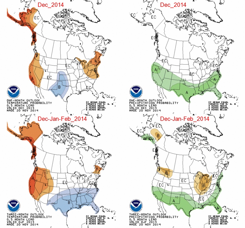
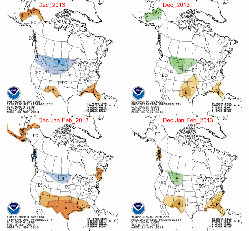
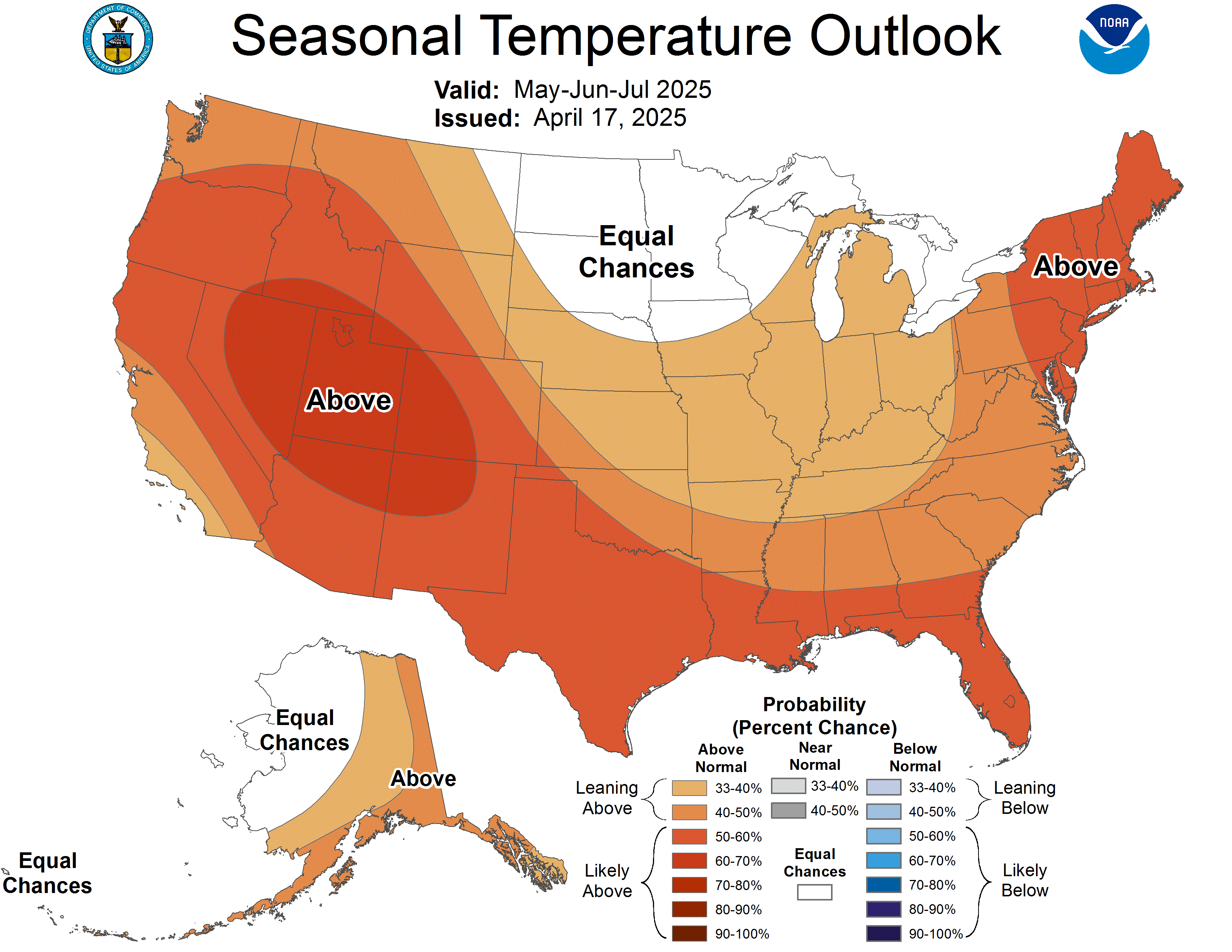
Another issue with this type of verification is that it is zero-sum: a map can only show one probability category for each location. The complete forecast might be 50 percent chance for above normal, 33 percent chance for near-normal, and 17 percent chance for below normal. But for the map, it has to be simplified down to whichever category has the highest probability (see the most recent DJF forecast here and here).
Here’s an example: Figure 2 looks at a different representation of last year’s winter temperature forecast. It shows the probability for above-average temperatures (upper left), for below-average (upper right), and a combination plot (bottom) showing the highest probability for any category. All of a sudden what seemed like a straightforward forecast of above (reds) and below (blues) (last image in figure 1) shows a lot more nuance. Even with a forecast of 40-50% chance of above-average temperatures in Texas last winter (upper left), there was still a 20-25% chance for below-average temperatures (upper right).
This nuance is missed in the eyeball verification in figure 1, which only uses blunt categories. It is important to see seasonal forecasts through this lens. Every point does not have just one forecast, but multiple (above, below, and normal/average).
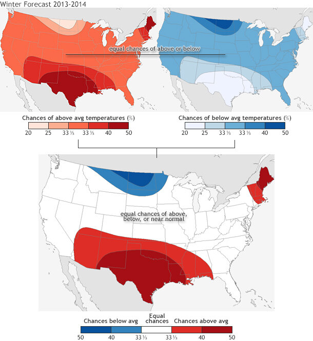
Figure 2. (top row) The 2013-2014 winter (DJF) temperature forecast broken down into two separate maps: probability for above-average temperatures (left) and below-average temperatures (right). (bottom) The two maps are combined during the final forecast map. Even though each seasonal forecast plot shows only the highest probability of above-average, below-average, or normal (see the most recent seasonal temperature forecast for an example), the forecasts can be broken down into chances for above-average and below-average temperature across the entire US. In this case, even when the forecast predicts a 40-50 % chance for above-average temperatures, there still remains about a 20-25% chance for below-average, a small reduction.
So…we forecasted a chance for both above and below average temperature. Does this mean that we can never be wrong? Not exactly. It also means we can’t be right either. Wait… what? The truth is seasonal forecasts cannot be verified using a single year alone. Instead of looking at only one forecast you need to look at many years. That is how forecast probabilities work. Only after investigating their performance over decades can we determine how skillful these forecasts are.
What’s the point then, you might ask. What value do these forecasts have? Let’s use an analogy. If I told you that there was a 40% chance there would be a major traffic jam on the way home today and a 25% chance there would be clear sailing, you probably would not take a different way home (unless maybe it was your turn to meet your kids’ school bus).
However, you likely will at least make plans ahead of time on a different route to take should a traffic jam occur—plans that could be put to use quickly if you get more up-to-date information when you are on the road (like a long line of red break lights ahead of you). Seasonal forecasts are your first chance to plan for upcoming conditions, and those plans could be useful given more accurate monthly or weekly forecasts that come out when the season in question is closer.
Later on, I will apply some verification metrics to the plots in figure 1 so we can see just how well our eyes did at evaluating the forecasts. Because while using your eyes is a good first step, proper verification relies on a large amount of details that our eyes/brains cannot accurately evaluate simultaneously.
Comments
Re: Testing the model
RE: Re: Testing the model
This attempt at verification for the first two forecasts shown (2004-2005 and 2005-2006) is actually somewhat similar to what is done. The way we verify such forecasts will be shown in more detail in a later blog. A difference between what you describe in your comment and how it is actually done, is that the U.S. is divided into over 200 squares that are approximately equal in area. These are the squares implied in the maps in Figure 1 above (note the horizontal/vertical boundaries dividing the regions having differing categories of forecast or observation). At each of these many squares, the forecast versus the observation is noted. If they match, it is called a hit, and if they do not match, it is a miss. Then the number of hits is found. But how many hits indicates a forecast with any accuracy, or "skill"? Well, just by dumb luck, 1/3 of the time a hit will occur by chance alone, since there are 3 categories of outcome, and over the long term each of these has a 33.3% chance of occurring. So, one-third of the total number of squares is expected to be hits just by luck. If this number of hits occurs, the score for the forecast is said to be zero (no skill). If all of the squares are hits (as it would be in a dream world), the score is 100%. In between, the score is caclulated accordingly. So, for example, if the number of hits is exactly halfway between the number expected by luck and 100% hits, the score would be 50%. If the number of hits is less than the number expected by luck, the score would be a negative number. One complicating factor in all of this: How do we score the squares where "equal chances" was the forecast (the white areas on the forecast maps)? One way is to simply not count them in the calculation. Another way is to count them, and give them one-third of a hit. If a forecast map is completely covered with only the "equal chances" forecast, then if it is scored in the first manner, we cannot compute a score. If it is scored the second say, the number of hits would be 1/3 of the total number of squares, and the number of hits expected by chance is also exactly the same number, so that the score would be zero. Note that in the above scoring system, the probabilities given for the designated forecast category are not taken into account. There are some skill scores that do consider the probabilities. Again, there will be a blog on this subject of verification coming in the not too distant future. This reply is just to whet your appetite for that blog!
Population based verification
RE: Population based verification
Great idea! We don't know of any metric like this, but we'll keep it in mind.
Accuracy of Forecast
Comments have been disabled on this article