No ENSO? NOAA still issues Winter Outlook!
While I’ve usually written this post in October, this year we decided to wait until a month before winter (December–February) starts. In past years, we’ve asked if El Niño (or La Niña) will play a role in the winter’s outcome. This year is different, however, as ENSO-neutral is present and expected to persist through the winter and into the spring. So what does NOAA’s Climate Prediction Center (CPC) base their winter outlook on when ENSO-neutral is in the cards? Read on to find out.
Other clues for seasonal prediction
Aside from ENSO, the recent trend in temperature and precipitation turns out to be the most skillful predictor on seasonal time scales. As Tom said in his post on the topic, “simply put, the trend is how temperatures and precipitation have changed over some length of time.” Trends are actually more skillful overall than ENSO for informing temperature forecasts, largely because of the patterns from global warming due to human-emitted greenhouse gases. However, ENSO trumps trends for precipitation. When El Niño or La Niña is a no-show, though, trends often become the primary consideration for both temperature and precipitation.
When CPC makes seasonal outlooks, predictions are always relative to the recent three decades (or “base period”). Right now, that base period is from 1981 to 2010, so, for example, the outlook is the chance that winter will be warmer or cooler than the average during 1981–2010. CPC utilizes trends by comparing the most recent 15 winters to the base period because studies have shown that this maximizes the skill in the forecasts. So for this upcoming winter of 2019–20, we compare the winter averages from 2004 through 2019 to the base period. Tom’s article has a lot more detail about how this 15-year idea, called the “Optimum Climate Normal,” was developed.

The climate trends, defined as the Optimum Climate Normals, for winter (December–February) temperatures across the United States. The trend is determined by taking the average winter temperatures over the last 15 years and subtracting the average winter temperatures from 1981-2010. NOAA Climate.gov image using data from the Climate Prediction Center.
The temperature trend map (1) shows that warmer-than-average winters have become more prevalent across the South and up the East Coast, with the largest trends in California, the Southeast and Florida. Interestingly, trends in much of the central and northern Plains and the Pacific Northwest are quite flat, with even a few regions in Nebraska, South Dakota, and Washington State trending colder during recent winters. This does not mean that global warming is making these regions colder—rather, recent winters have shown a large range of temperature changes, what we call “interannual (year-to-year) variability,” that are likely obscuring the influence of increasing greenhouse gases in these regions.
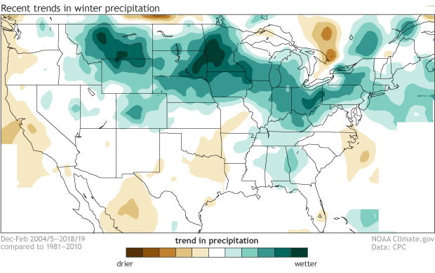
The climate trends, defined as the Optimum Climate Normals, for winter (December–February) precipitation amounts across the United States. The trend is determined by taking the average winter precipitation over the last 15 years and subtracting the average winter precipitation from 1981-2010. NOAA Climate.gov image using data from the Climate Prediction Center.
In a general sense, trends in rain, snow, and other forms of water falling from the sky (precipitation!) favor above-average across much of the northern part of the country, with trends toward drier-than-average conditions along the West Coast, the southern Plains and along the Atlantic South Coast. Both the temperature and precipitation trends share some resemblance to the patterns we would expect during La Niña (northward shift in the jet stream), although temperature trends are warmer compared to historical La Niña patterns, and precipitation trends are somewhat wetter (2).
CPC also uses computer model predictions for the forecasts, leaning on them more during ENSO-neutral times. In this case, the model forecasts (temperature, precipitation) are somewhat consistent with the trends, although most of the model forecasts are even warmer than what would be expected from the recent 15-year trend. The precipitation forecasts have a wide range of possible outcomes, although the average of all model forecasts generally favors wetter-than-average across the northern part of the country with drier-than-average conditions across parts of the South, so again—mostly consistent with trends.
To the outlook!
The temperature outlook favors above-average temperatures across the western, southern, and eastern parts of the nation, and Alaska and Hawaii (not shown here).
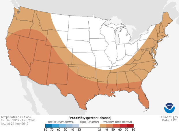
Places where the forecast odds favor a much colder than usual winter (blue colors) or much warmer than usual winter (red), or where the probability of a cold winter, a warm winter, or a near-normal winter are all equal (white). The darker the color, the stronger the chance of that outcome (not the bigger the departure from average). NOAA Climate.gov map, based on data from NOAA CPC.
Other than over Hawaii and western Alaska, probabilities are all between 33-50%, indicating the confidence of this outlook is less than for other winter outlooks. This lower confidence is partly due to the absence of ENSO’s influence.
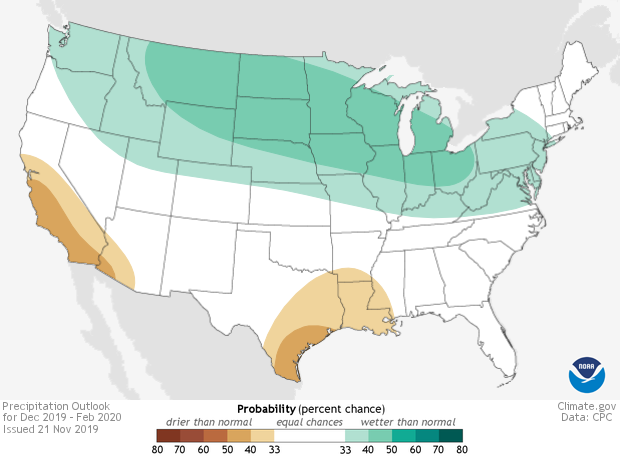
Places where the forecast odds favor a much drier than usual winter (brown colors) or much wetter than usual winter (blue-green), or where the probability of a dry winter, a wet winter, or a near-normal winter are all equal (white). The darker the color, the stronger the chance of that outcome (not the bigger the departure from average). NOAA Climate.gov map, based on data from NOAA CPC.
The precipitation outlook shows that wetter-than-average conditions are favored over much of the northern part of the country, as well as Hawaii and Alaska (not shown). Below-average precipitation is only favored over central and southern California and southern Arizona and in parts of the southern Plains. Again, confidence is quite modest, with probabilities only exceeding 50% over Hawaii and southwestern Alaska.
Both maps include blank regions where neither above-, near- nor below-normal is favored. These areas (shown in white and labeled EC for “equal chances”), have the same chance for above, near, or below-normal (33.33%). This doesn’t mean that near-average temperature or precipitation is favored this winter in those regions, but rather that there’s no tilt in the odds toward any outcome.
And I would be remiss if I didn’t again provide a reminder that these forecasts are probabilities (% chance) for below-, near-, or above-average outcomes with the maps showing only the most likely outcome (3). Because the probabilities shown are less than 100% (of course), there is no guarantee you will see temperature or precipitation departures that match the color on the map. As we’ve explained in earlier blog posts, even when one outcome is more likely than another, there is still always a chance that a less favored outcome will occur (last winter’s forecast for the northern Plains and Pacific Northwest are a good example of the less likely outcome occurring).
CPC issues probabilistic seasonal temperature and precipitation forecasts so users can understand risk and opportunities in order to make informed climate-sensitive decisions. However, the nature of a probabilistic forecast means that other outcomes are always possible, just less likely. In fact, for our probabilities to be “reliable,” the less likely outcomes will and must occur from time-to-time.
Lead editor: Emily Becker, CIMAS
Footnotes
(1) These maps show temperature and precipitation trends in standard deviation, which is a way of showing the change relative to the usual range.
(2) Our own Nat Johnson speculated on why the global temperature and precipitation trends resemble La Niña: sea surface temperature trends over the past decades are La Niña-like, with overall somewhat cooler-than-average trends in the central and eastern tropical Pacific, and so the trends over North America are likely to reflect, in part, decadal to multidecadal La Niña-like sea surface temperature variability. Global warming interacts with this La Niña-ish trend, leading to a warming pattern mostly where La Niña-like and global warming effects add together, and small changes to temperature patterns where they are opposite. The global warming precipitation signal is generally similar to the La Niña pattern, with more precipitation north and less south, so perhaps the La Niña pattern and global warming are working together in this case.
(3) The terciles, technically, are the 33.33 and 66.67 percentile positions in the distribution. In other words, they are the boundaries between the lower and middle thirds of the distribution, and between the middle and upper thirds. These two boundaries define three categories: below-normal, near-normal and above-normal. The CPC forecasts show the probability of the favored category only when there is a favored category; otherwise, they show EC (“equal chances”). In the maps, the probability is shown only for the favored category, but not for the other two categories. Often, the near-normal category remains at 33.33, and the category opposite the favored one is below 33.33 by the same amount that the favored category is above 33.33. When the probability of the favored category becomes very large, such as 70% (which is very rare for a seasonal outlook), this rule for assigning the probabilities for the two non-favored categories becomes different.
Comments
THX
How do you get probabilities
RE: How do you get probabilities
That's a good question. The trends by themselves do not give you probabilities, but they do shift the odds toward one category (above or below normal) and away from the other. You can imagine that we have a probability distribution of seasonal temperature or precipitation at some location. The average of the distribution determines whether the probabilities are tilted toward above or below average. The width of the distribution, which is determined by upredictable weather noise and can be obtained from forecast models or historical data, determines what the probabilities are in each category. If the trend is positive, then the average of the distribution is shifted to the right relative to the base period, and the probabilities for above normal increase while the probabilities for below normal decrease, but the width of the distribution does not change. Therefore, the trends in combination of the shape of the distribution, which is determined by other factors, result in changes in probabilities.
Comments have been disabled on this article