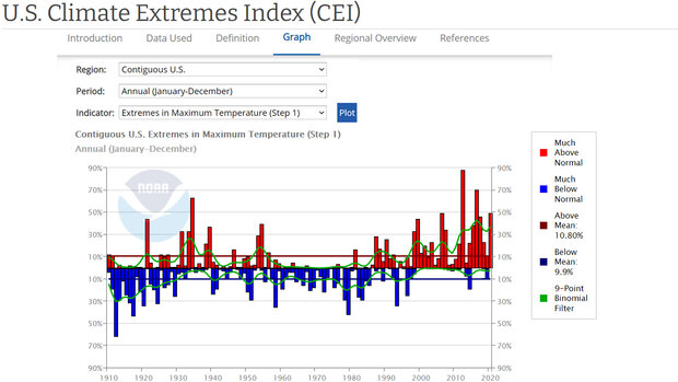
The U.S. Climate Extremes Index documents the area of the contiguous United States (or a region therein) that experienced extreme conditions (as defined by the index) during various time periods. The index is calculated as the arithmetic average of values from a specified set of extreme events, weighted by the percent area that experienced the defined conditions.
A value of 0% for the Climate Extremes Index indicates that no portion of the country experienced extremes considered in the index during the selected period of record. In contrast, a value of 100% would mean that the entire country experienced extreme conditions throughout the period of record for all of the indicators, a virtually impossible scenario. The long-term variation or change of this index represents the tendency for extremes of climate to either decrease, increase, or remain the same.
Where do these data come from?
The Climate Extremes Index is calculated from measures of monthly maximum and minimum temperature, daily precipitation, monthly Palmer Drought Severity Index, and wind velocity of landfalling tropical storms or hurricanes. Specific sources for each type of data are described here.
-
How do I use the site?
Use the drop-down menus to select the area, time span, and parameter you want to display on the graph:
- Use the default of the entire contiguous United States, or choose one of the 9 smaller regions that comprise it.
- Choose the whole year, a particular season, or other period.
- Select a parameter of interest that is available for your selected geography and time period.
Click Plot. Consult the legend to interpret the various features of the graph.
A table of the values appears below the graph. Just above the table heading, you can select any of several download options.
What can I do with these data?
Long-term trends in the index— increasing, decreasing, or remaining about the same over a decade or more—show the tendency of climate extremes in the given region over the selected period. As the graphs display an objective index of extremes, the trend over time is independent of of property values, and population changes.
- Check if the overall index (or components of it) increased, decreased, or stayed about the same over time in your region.
- Compare CEI values among regions to check which experienced above- or below average percent of area covered by extreme weather.
-
Data Format(s)CSV, JSON, PNG, XML
Access Type Link & Description Graphing Check for trends in the area of the contiguous United States that experiences various types or combinations of extreme weather over a season or other period. -
Documentation Type Link & Description General -
Data TypeLand-based station, Severe weatherEssential Climate VariablesAir temperature,
 Click to see more detail
