Another non-ENSO thing that affects seasonal forecasts
You may be thinking “There are even more things that forecasters look at when making seasonal forecasts?” or “Haven’t you already written about those other things, multiple times?” And the answer to both of those questions is yes. But what if I told you that there is another mysterious thing that, at least for seasonal temperature outlooks, gives forecasters a better idea of what will happen than predictions of ENSO or the Madden Julian Oscillation, or the Arctic Oscillation or the North Atlantic Oscillation or the Pacific Decadal Oscillation or…I think you get the point (1). And it’s much simpler than all of those. It’s called the trend.
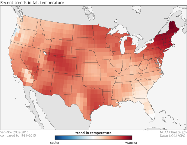
The climate trends, defined as the Optimum Climate Normals, for fall temperatures across the United States. The trend is determined by taking the average fall temperatures over the last 15 years and subtracting the average fall temperatures from 1981-2010. NOAA Climate.gov image using data from the Climate Prediction Center.
Cool, another vaguely science sounding term. Whoopee.
I sense some sarcasm. But ok, you’re right. So what is this trend? Simply put, the trend is how temperatures and precipitation have changed over some length of time. In a stable, non-changing climate, any trend would be tiny and random—useless as a predictor for the future. However, we don’t live in a stable climate. Due to human emissions of greenhouse gases and also to natural, decadal changes, there are detectable trends in our climate.
Forecasters use the trend in temperature across the United States to get important insights when making seasonal forecasts. For instance, if a certain part of the country has a large warming trend during the summer, a forecaster might be more inclined to tilt the odds toward a warmer-than-average summer in that location. In fact, using these trends may give forecasters more skill for temperature forecasts than using the prediction of ENSO (Peng et al 2012). This relationship holds less weight for precipitation, though, as the prediction of ENSO is often (but not always) a better determinant of precipitation patterns in a given season than long-term trends.
At this point, dedicated readers of the blog may be thinking “this seems too simple, what’s the catch? You always like to have a catch.” Smart readers! The catch is that there are plenty of different ways of figuring out what the trend is. So which is best?
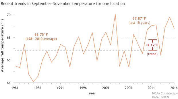
Average fall temperature for a point in the southwestern United States from 1981-2016. The climate trends used by the Climate Prediction Center takes the average fall temperatures over the past 15 years (2002-2016) and subtracts the average fall temperatures from 1981-2010. Forecasters use this information as a predictor for future seasonal temperatures. NOAA Climate.gov image using GHCN data.
How to figure out the trend
In order to determine the trend, we need to figure out what time period would best capture any recent trends in temperature and precipitation that are likely to influence upcoming seasonal average. The traditional period for calculating a climatological average for temperature or precipitation, called a “normal” in scientist-speak, is 30 years, updated every ten years. Currently, scientists at the Climate Prediction Center use the period from 1981-2010 to calculate the normal climate, which is then used to determine monthly and seasonal anomalies (Arguez et al 2011).
But we don’t use the trend—change in temperature and precipitation—during this period as a predictor for our seasonal forecasts. Why? For one, it is 2017 and that period is already 7 years old. We’re closer to the next normal (1991-2020) than we are to the current one. And secondly, because scientists have done studies on the best number of years to include to calculate the trend. Specifically, scientists have run experiments looking at which trend length leads to the best possible skill for a forecaster making a seasonal prediction (Huang et al 1996, Wilks 2013), and it turns out the magic number is 15 years.
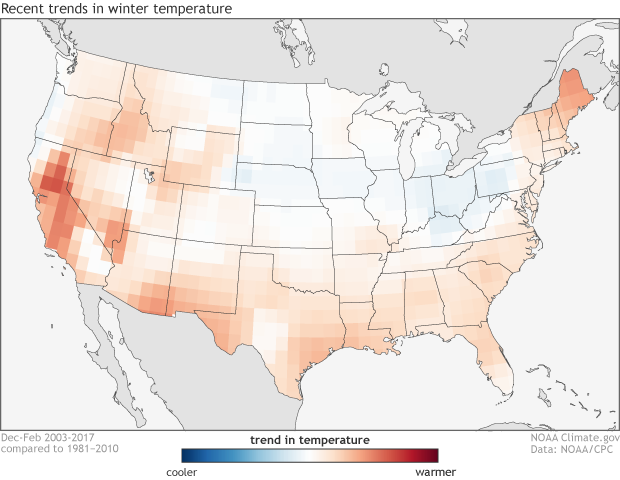
The climate trends, defined as the Optimum Climate Normals, for winter temperatures across the United States. The trend is determined by taking the average winter temperatures over the last 15 years and subtracting the average winter temperatures from 1981-2010. NOAA Climate.gov image using data from the Climate Prediction Center.
So, to calculate the trend in seasonal average temperature or precipitation, the Climate Prediction Center takes the average of the past 15 years’ worth of data and subtracts the 1981-2010 averages to see if the most recent decade and a half is significantly different from the current normal. This difference is called the Optimum Climate Normal. It serves the purpose of figuring out the most recent trend in the data and helping to predict what the near-future trends will be.
Now, these numbers are not set in stone. You could use 10 years, or 20 or 30 to get different trends. But studies have shown that using the past 15 years provides the most skill in predicting the subsequent seasonal anomalies (Wilks 2013), so that is what we use.
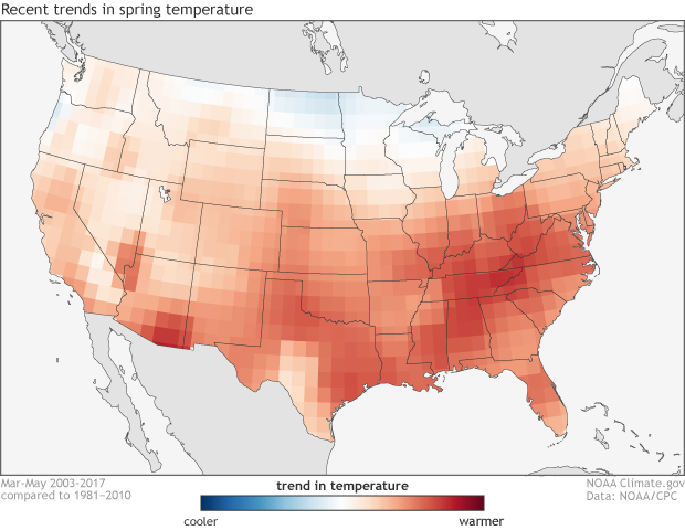
The climate trends, defined as the Optimum Climate Normals, for spring temperatures across the United States. The trend is determined by taking the average spring temperatures over the last 15 years and subtracting the average spring temperatures from 1981-2010. NOAA Climate.gov image using data from the Climate Prediction Center.
So what do those pictures tell me?
Sprinkled throughout this post are the “trends” that forecasters use for different seasonal forecasts made at the Climate Prediction Center (you can go to this link to see another version). Right away, you can see that for temperature, the trends during the summer are much larger, and during spring and fall are more expansive, than the trends during the winter. In fact, much of the country has been near the 1981-2010 average during the winter months of the past 15 years, which brings up an important caveat: human-induced climate change is not the only thing that shows up when you calculate trends.
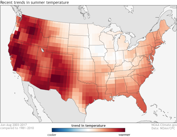
The climate trends, defined as the Optimum Climate Normals, for summer temperatures across the United States. The trend is determined by taking the average summer temperatures over the last 15 years and subtracting the average summer temperatures from 1981-2010. NOAA Climate.gov image using data from the Climate Prediction Center.
We know that over the past century, winter temperatures are rising more rapidly than summer temperatures. But over shorter time periods, there are other influences from the randomness of our climate, including decadal changes in ENSO—more La Niñas or El Niños over the last 10 or so years—or other oscillations in our atmosphere. It’s up to the forecasters to look at these maps and figure out which areas are showing trends which you can count on to continue versus areas which might not be as useful.
References
Arguez, A., I. Durre, S. Applequist, R. S. Vose, M. F. Squires, X. Yin, R. R. Heim Jr., and T. W. Owen, 2012: NOAA’s 1981–2010 U.S. climate normals: An overview. Bull. Amer. Meteor. Soc., 93, 1687–1697, doi:https://doi.org/10.1175/BAMS-D-11-00197.1.
Huang J, van den Dool HM, Barnston AG. 1996. Long-lead seasonal temperature prediction using optimal climate normals. Journal of Climate 9: 809–817.
Peng, P., A. Kumar, M. S. Halpert, and A. G. Barnston, 2012: An analysis of CPC’s operational 0.5-month lead seasonal outlooks. Wea. Forecasting, 27, 898–917, doi:https://doi.org/10.1175/WAF-D-11-00143.1.
Wilks DS. 2013. Projecting “normals” in a nonstationary climate. J. Appl. Meteorol. Climatol. 52: 289–302. doi:https://doi.org/10.1175/JAMC-D-11-0267.1
Notes:
(1) As with most times we compare monthly and seasonal forecasts of temperature and precipitation, precipitation forecasts are much harder to make and thus have lower skill than temperature. The same goes for the ability of trends to inform our predictions. Studies have shown that trends are the most skillful way in predicting seasonal temperatures but ENSO remains the best predictor for seasonal precipitation (Peng et al. 2012).
Comments
Waves
Only for seasonal?
RE: Only for seasonal?
This is a great question - yes, this sort of approach can be applied to forecasts on shorter timescales, including monthly forecasts. The skill from the trend, however, diminishes as we move to shorter timescales because the noise of random weather variability is larger on shorter timescales, drowning out more of the signal from the trend. In other words, more of the noise gets averaged out on seasonal timescales than on monthly timescales. Therefore, we could apply this technique to monthly forecasts, but we wouldn't expect as much skill attributed to the trend.
RE: RE: Only for seasonal?
RE: RE: RE: Only for seasonal?
Hmmm... I am not aware of studies that have examined the sensitivity to averaging length for shorter timescales. My intuition is that the averaging length should not change appreciably for shorter timescales because the relevant signal (trend) should be the same at the shorter timescale, it's just that the noise will be larger. Therefore, my best guess is that the 15-year average also would work for intraseasonal (e.g., monthly) timescales.
And what is the scale being
Comments have been disabled on this article