July in Christmas
For the first time ever my extended family did our Christmas gift exchange outside on my aunt’s patio in the Washington DC area. We did our best imitation of a Florida vacation: We abandoned hot cider in favor of tropical beverages. Some of us wore t-shirts and sandals. We played catch with the dogs. Jimmy Buffet stopped by. Okay, maybe not, but it was still totally awesome.
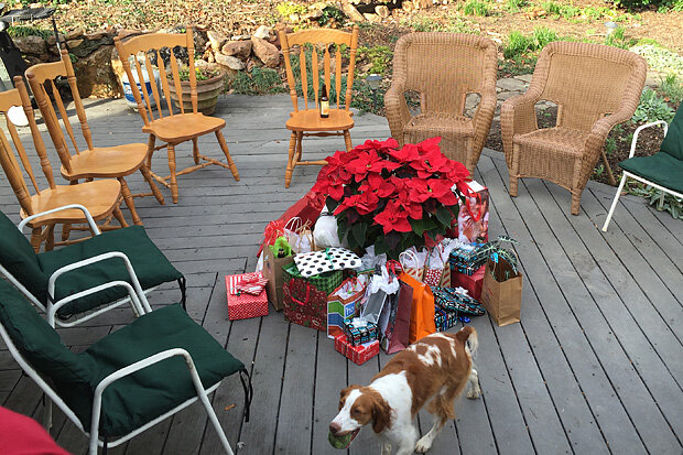
No one wanted to drag the Christmas tree outside, so we all gathered around the poinsettia “tree.” Photo by Paul L'Heureux.
But, what on earth was going on with the weather? Let’s zoom out and look at November and December together because they were fairly similar. As you can see below, temperatures were strongly above-average across much of North America (shown by the yellow/orange/red shading), with the exception of the western U.S. which was either near or slightly below average (shown by the blue shading).
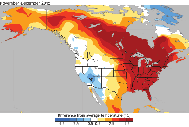
November and December 2015 average temperature anomaly in degrees Celsius (°C). Data from CPC GHCN+CAMS dataset and removing a 1982-2014 monthly mean climatology. NOAA Climate.gov image based on figure provided by Climate Prediction Center.
This blog certainly won’t provide a definitive answer to the question of what’s behind such warmth—we will all have to wait for the more authoritative, peer-reviewed attribution studies that will be forthcoming. But I will try to address some aspects of the last two months using some simple linear statistics—a poor (wo)man’s attribution of sorts (1). More advanced statistical methods and models, which are run on super computers, will eventually provide more credibility, fine-tuning these answers further.
The goal of attribution is to uncover which mechanisms resulted in certain weather and climate events. Said another way, it’s the process of figuring out how much a given influence contributed to a particular outcome. If two cars meet head on and collide on a narrow road at 3 a.m. on a snowy night, an attribution study of the crash would try to figure out how much of the crash was due to the narrowness of the road, how much due to the darkness, how much to the weather, how much to the drivers’ sleepiness, etc.
Of course, given this is the ENSO blog, one question has to be whether the warmth over North America was influenced by the strong El Niño. At least in part! Below is a map showing the typical November and December (which are averaged together) temperature departures related to El Niño. I’m weighting this map by the observed Niño-3.4 value from the last two months of 2015, so the temperatures you see are a statistical estimate of the portion related to El Niño.
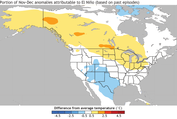
The November and December 2015 reconstruction of the temperature anomalies related to ENSO. The reconstruction is created by taking the linear regression map and multiplying the observed November-December average Niño-3.4 SST index value (+2 standard deviations). NOAA Climate.gov image based on figure provided by Climate Prediction Center.
But El Niño is never the only cause. There was also a strong Arctic Oscillation (AO) or what is more popularly called the polar vortex these days (2), but it wasn’t bringing cold air to the United States, but rather trapping it up near the polar cap. The AO is in a positive state if cold air is trapped near the Arctic and it is in a negative state if cold air is moving away from the pole, toward more central and southern portions of the hemisphere (U.S., Europe, Asia). Tony has previously noted that the AO is less predictable than ENSO. So, what portion of the November–December warmth was associated with the AO?
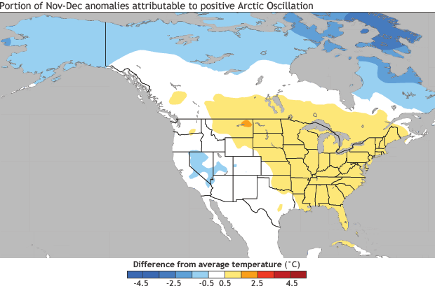
The November and December 2015 reconstruction of the temperature anomalies related to the Arctic Oscillation (AO). The reconstruction is created by taking the linear regression map and multiplying the observed November-December average AO value (+1.5 standard deviations). NOAA Climate.gov image based on figure provided by Climate Prediction Center.
Then we can add up the AO and ENSO maps and obtain a temperature pattern based on the contribution from both climate phenomena. Clearly the appearance of the ENSO+AO map (top right panel below) is pretty similar to what we saw during November-December 2015 (top left panel below).
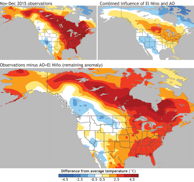
(Upper left) November–December 2015 average temperature anomaly in degrees Celsius (°C). (Upper right) The AO and ENSO reconstruction maps of temperature anomalies summed together. (Bottom) Observed anomalies with the AO+ENSO reconstruction subtracted out (the leftover or residual not linearly explained by AO+ENSO reconstructions). NOAA Climate.gov image based on figure provided by Climate Prediction Center.
However, there is some part that is not well described by the AO+ENSO map. So what does that look like? What is the leftover or residual part that is not explained by our estimate of the El Niño or the positive AO temperature pattern? That map is shown above (bottom panel), and you can see that even after we subtract the combined influence of the AO and El Niño, much of North America is covered mostly by a big splotch of red. Basically, an indecipherable mass of …. warmth. What caused that?
When I first saw this, I thought to myself, well – duh – some part of this is the well-documented trend in temperatures we’ve seen over the past 33 years and what our blogging friends over at NCEI and Beyond the Data have written about. Sure enough, if I compute the linear trend pattern, I obtain the map below.
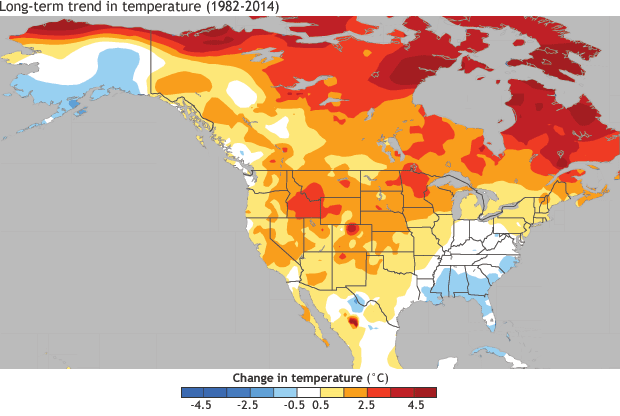
The change in temperature during November-December from 1982-2014 in degrees Celsius (°C). Calculation is based on the linear trend (°C/years) times the number of years. NOAA Climate.gov image based on figure provided by Climate Prediction Center.
Of course it’s not a perfect match; nothing in the climate is ever so simple! But clearly, there is overlap between that leftover part and the predominantly positive trends over North America temperature during November-December.
Now for some caveats: The method here is a statistical method that assumes linearity and that past historical relationships continue to hold. We find in climate science that it is often a decent estimate, but it’s definitely not perfect.
Certainly there was other stuff going on, such as the Madden Julian Oscillation (MJO) toward the end of December, which was in a position that favors above-average temperatures over the eastern United States. While the MJO likely explains a chunk of short-term or week-to-week temperature fluctuations, it is more difficult to blame it for warmth over two months.
There were also the well above-average sea surface temperatures in the Gulf of Mexico and off the East Coast. I don’t have a handy index to quantify this, but it might be worth looking at further, especially for the near coastal regions. There was also a slightly positive Pacific-North America pattern, but it is often associated with El Niño and is not necessarily distinct. As we say in this biz, random stuff happens and we can’t explain everything.
So El Niño, the positive AO, and long-term climate trends are the leading culprits for the temperature pattern over the U.S. during November and December. Now that January is underway, what is next? Keep your eyes on the tropics: we’re now entering the seasons with the strongest El Niño impacts for North America. And, as a special bonus for weather and climate lovers, we have a MJO simultaneously occurring, which is also anticipated to have a ripple effect over the U.S. and regions of the globe (check out CPC’s experimental Week 3-4 outlook). If there were ever an ideal time to be weather ready and climate smart,* it would be now.
Footnotes
(1) Now that we’re down in the safety of the footnotes, it’s time to nerd out. I’m employing a strategy also used in this blog post (click here) called least-squares linear regression. ENSO and the AO are not well correlated, but just in case I calculate the coefficients associated with a 2-predictor equation, which evaluates what happens to ENSO when the AO is held constant (and vice versa). I average all November-December during 1982- 2014. Anomalies are formed by subtracting out the 1982- 2014 monthly averages. The “trend” is also a linear least-squares line over time. For data I’m using the CPC GHCN+CAMS 0.5°x0.5° gridded temperature dataset (Fan and van den Dool, 2008), the ERSSTv4 Niño-3.4 SST index, and the CPC AO index using NCEP/NCEP Reanalysis-1.
(2) To clarify, we’re talking about the tropospheric polar vortex because our AO index measures pressure near the surface (1000mb). There is also a vortex in the stratosphere and not just near the surface. Sometimes, during the winter, the tropospheric and stratospheric vortices are linked together, but this is not always the case. Scientists smile favorably upon you if you specify whether you mean the “near surface” or “tropospheric” polar vortex versus the “stratospheric polar vortex.”
* We should always be weather ready and climate smart!
Comments
Great blog! Could we see a similar precip assessment?
Comments have been disabled on this article