Warming winters across the United States
Daytime highs were in the negative teens in parts of the Upper Midwest and Great Lakes at the end of January, and the chill extended across much of the East. By the first week of February, temperatures in parts of the Mid-Atlantic and Southeast had plowed right past spring and into summer-like warmth. If the weather whiplash has left you wondering how U.S. winters are changing over time, the maps below tell the story. (Apologies Alaska, your statewide historical record doesn’t go far enough back to be included in these analyses).
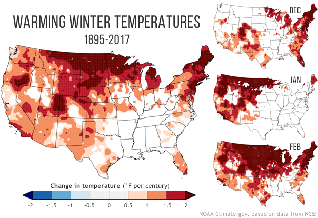
Winter (December-February) temperature trends across the Lower 48 United States from 1895-2017 (left), alongside monthly trends for December, January, and February (right column). Places that have gotten warmer over time are colored in shades of red. NOAA Climate.gov image, based on maps from NCEI.
The large map at left shows average temperature change during winter (December-February) from 1895-2017. The smaller column of maps at right shows individual monthly averages over the same time period. On average, winter is warming across much of the United States, especially in northern locations and higher altitudes.
Of the individual winter months, the most widespread and extreme warming trends are occurring in February. NOAA climate scientist Jake Crouch talked in greater depth about February temperature trends in a Beyond the Data blog post in 2017. Winter warming is part of a broader pattern around the globe: cold things are warming faster than already warm things. NOAA climate expert Deke Arndt blogged about that several years back.
Another way of gauging how winters are changing is to tally up the total area in the country that experienced extremely cold temperatures in any given winter. That’s what you can see in the graph below. The blue bars show the percent of U.S. land area (contiguous U.S.) experiencing extremely cold temperatures each winter since 1910-11. “Extremely cold” means temperatures that were in the bottom 10% of the historical record.
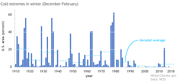
Percent of contiguous U.S. area experiencing wintertime minimum temperatures in the bottom 10% of that location's historical record (1910-2018). Blue bars indicate the percent area, and dashed blue lines indicate 10-year averages. (Final "decade" is 8 years.) In recent decades, very little of the country has experienced extremely cold winters. NOAA Climate.gov image, based on data from NCEI's Climate Extremes Index.
By that indicator, too, it’s clear our winters are changing. Early parts of the historical record show the expected highs and lows associated with natural variability: a mixture of mild winters and severe ones. Winters since the 1990s have been dramatically different. The 2000s decade had so little area with extreme cold, that the decadal average (dotted line) sits barely above the graph’s zero line. In short, winters in which large areas of the U.S. experience extremely cold temperatures have become more rare, but they aren’t impossible.
If you’d like to see the maps of national trends in different months and seasons, you can get those here. If you’d like to plot the history of extreme cold (or heat) at the state or regional scale, you can do that here. If you’d like to view monthly maps of projected U.S. temperatures in coming decades, visit our Data Snapshots map collection.
Thanks to Deke Arndt for advising on graphics and reviewing this post.
Comments
arora
RE: arora
Find the average monthly temperatures and temperature anomalies in our Data Snapshots section
https://www.climate.gov/maps-data/data-snapshots/averagetemp-monthly-cmb-2020-02-00?theme=Temperature
Comments have been disabled on this article