Duct tape and seesaws: Climate trends 101
A few weeks ago, NCEI updated its U.S. climate trends maps with the data from 2018. Most months and places are getting warmer over time, especially over the very long (century scale) term.
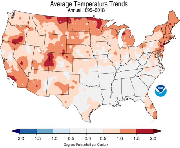
Trends in annual average temperature, measured in degrees Fahrenheit per Century, for the 124 years spanning 1895 through 2017. Similar maps are available here. Data source NOAA/NCEI nClimGrid.
But some regions and seasons are not changing in lock-step with the big picture. For January, considering all 124 years spanning 1895 through 2018, much of the South and Mid-South has cooled slightly. That regional/seasonal exception to the rule is a feature of and testament to the complexity of the climate system.
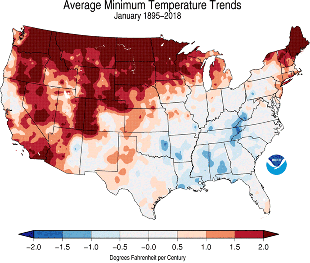
Trends in the average January minimum (morning) temperature, measured in degrees Fahrenheit per Century, for the 124 Januaries spanning 1895–2018. The second frame limits the display to significance at the 95 percent level. Data source: NOAA/NCEI nClimGrid.
We’re going to look at January trends to tease out some nuances with how these trends are computed. Let’s go Beyond the Data.
Linear trends: the duct tape of statistics
The trends depicted in these maps come from “Ordinary Least-Squares” regression. They’re also known as “line of best fit” or “linear trend” or a bunch of other suitable workmanlike names. We’ll call them linear trends here (“linear” as in “a line”). This is the most fundamental (or “simple” if you’re haughty) trend method out there.
Here’s what they do really well: describe the first-order trend over a given time. Period. End of story. Job done.
They often get criticized and dinged by People Who Know Better for not being sophisticated and ostentatious and universal. Whatever. They’re a work horse, not a show horse. Is a shovel bad for not being a scalpel? Would we lampoon a roll of duct tape for not being lace? Should a craftsman apologize for not being an artisan?
You want something more exotic? Look over on the Fancy Aisle at Statistics Mart. You want to understand the basics of change? Then reach for the Workin’ Man’s Friend: linear trends.
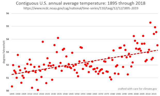
The average annual temperature for the contiguous United States, from 1895-2019. Each circle represents the nation's average temperature for a year. The red dashed line represents an ordinary least-squares regression ("line of best fit") through the data, and implies a warming trend of approximately 1.5 degrees Fahrenheit per century for the period.
In the figure above, computing the linear trend—technically, determining the slope of the red dashed line—lets us know that the CONUS is warming at about 1.5 degrees Fahrenheit per century over the 124 years measured. That’s really useful information. Does it capture all of the detail? Every wiggle? Little sub-trends within the big picture? No, but it lets us put a solid, simple number on the rate of change.
Playground equipment and statistics
One of the many legitimate criticisms of linear trends are their sensitivity to changes in or near the end points. Think of the trend line through a series of data points as a seesaw (or teeter-totter, we’re ecumenical here). How do you get a seesaw to move? You put force on one end or the other, and you’ll maximize the movement by getting out toward either end.
I have two kids: one of them is a six-foot-six teenager and a big dude. The other has spent most of her life below the curve on growth charts. Could not be more opposite. But they can balance on a see-saw like so:
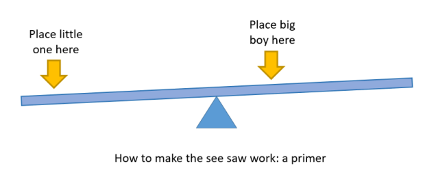
Physics: how to make it work on the playground.
Balanced like this, the slope of the seesaw isn’t very steep. But if you move the big boy to the end, that slope will get a lot steeper. This weird kind of “leverage” (or “torque” or whatever you want to call it) applies conceptually to the behavior of linear trends. The closer it is to either end of a time period, the more “leverage” an observation has to affect the trend.
Let’s see how this works
Here are two maps of January minimum (morning time) temperatures, both based on 30-year trends. One was produced after the 2017 data settled in; the other, just a couple of weeks ago, when 2018 settled in. Notice any differences?
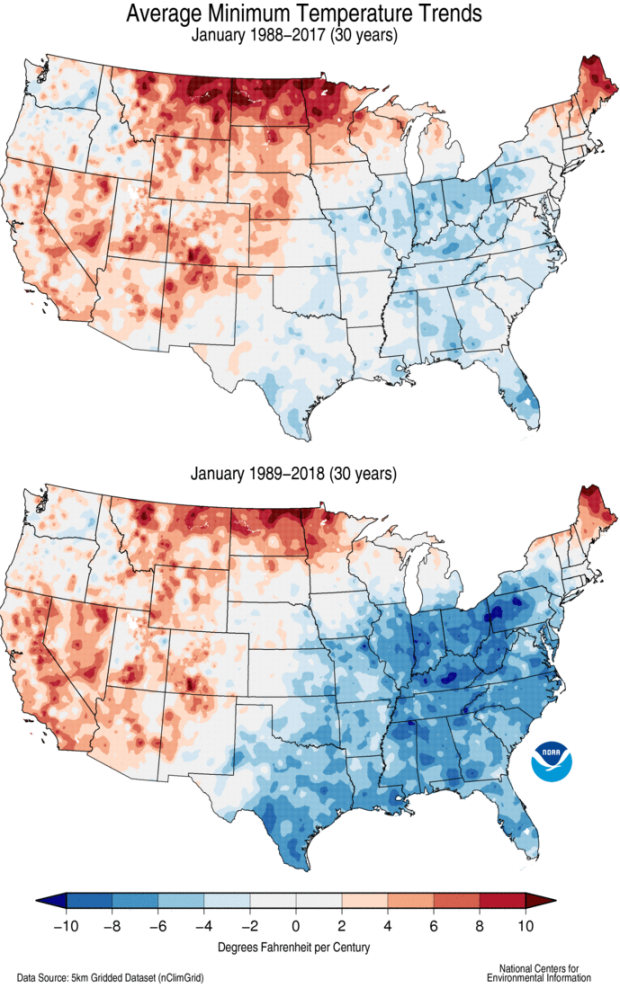
Two maps of 30-year trends in average January minimum temperatures (the average of the month's morningtime temperatures) for two closely overlapping 30-year periods. 1988-2017 (top) and 1989-2018 (bottom).
Wow, what happened?
Okay, first things first. One thing to notice is that these are 30-year trends here. That’s important. When there are only 30 dots on the see saw, each individual dot can exert more influence than when there are 124 dots. In fact, that relatively short period increases the sensitivity to what we’re gonna walk through just below.
As an aside, this issue demonstrates why shorter periods are more prone to "cherry picking." That's where someone consciously selects beginning and ending dates - often with periods even shorter than 30 years - in the pursuit of shaping the answer and in many cases, misrepresenting reality. Thirty data points is usually considered the minimum to provide robust results, but you can see above, and we'll explain below, that even with 30 data points, there's still significant sensitivity to sliding the window by one year.
To figure out what’s going on here, let’s zoom in on January mornings in Tishomingo County in Northeast Mississippi. If you’re playing along at home, you can download those data here: https://www.ncdc.noaa.gov/cag/county/time-series/MS-057/tmin/1/1/1895-2….
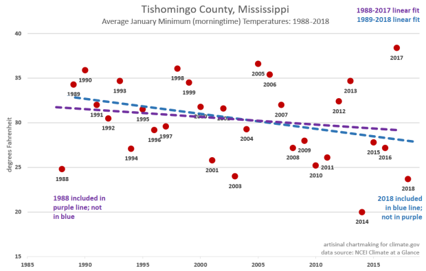
Recent January minimum temperatures, with trend, for Tishomingo County, Mississippi. The purple dashed line represents the least-squares regression ("line of best fit") for Januaries 1988 through 2017. The blue line represents the same, but for Januaries 1988 through 2017.
There’s a lot going on here. The purple line is the linear trend for the 30-year span (of Januaries) from 1988 through 2017. The blue line is the same, but for 1989 through 2018. The slope of the blue line is almost double (in other words, cooling at nearly twice the rate) than that of the purple line.
What happened to make such a dramatic difference as that 30-year window slid just one year to the right? For starters, there is a legitimate underlying trend that both windows picked up. January mornings have trended colder in Tishomingo County over the past three decades.
But the one-year slide also picked up a quadruple-whammy of the endpoint “leverage” we described above:
- The older (1988-2017, purple) trend was anchored, for lack of a better word, by a very cold January of 1988.
- The newer (blue) trend traded January 1988 in for a very cold 2018.
These two points alone—dropping off a cold endpoint at the beginning and adding a cold one at the end—can cause some trend-snap. But the years just inside that played a role, too.
- In the early (purple) trend, the last January is a very warm 2017. It got “demoted” in a leverage sense to the second-latest year. Not a huge change, but not negligible either.
- The transition from purple to blue also “promoted” a very warm 1989 to the new early-anchor spot, and that also helped pull the left side of the graph up.
In other words, it’s that same old end-of-the-see-saw leverage game, but these endpoint-dots jumping off and on the trend line are all six-foot-six big boys and not petite nine-year olds.
Coda: Past performance does not guarantee future results
Another criticism of the use of linear trends is that people can over-rely on their signal and just assume an extrapolation of current trends will play out in the future. That may be generally true for some very big, slow, predictable things, but the climate system, especially regionally, is complex and driven by many actors. That complexity means that especially on the regional level, future trends may be faster, slower—or wholly different—than the past.
Thanks for going Beyond the Data, to a land of see saws and duct tape.
Comments
Thanks for the chuckles
RE: Thanks for the chuckles
That's great to hear. I dream of a world where statistical techniques are the life of the party.
Nice Job
RE: Nice Job
Thanks - much appreciated!
Deke
Best explanation of least
Comments have been disabled on this article