December 2020 La Niña update: walking in a La Niña winter wonderland
La Niña continued to gain strength in November as we approach the normal peak for these events in the Northern Hemisphere winter—usually November–January. Forecasters estimate at least a 95% chance that La Niña will last through the winter, with a potential transition to ENSO-Neutral during spring 2021 (~50% chance).
La Niña sticks out like a sore thumb when taking a gander at a map of sea surface temperature anomalies (the difference from the long-term average) over the Pacific Ocean. The Niño3.4 region of the tropical Pacific (the area we look at for determining ENSO status) was much cooler than the La Niña threshold of -0.5°C, at -1.4°C below average for November according to the ERSSTv5 dataset. In fact, the Niño3.4 region surface temperature anomaly has been lower than -1.0°C for the last two months, and the November anomaly was the seventh lowest of all Novembers going back to 1950.
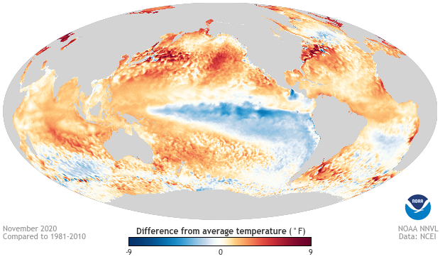
November 2020 sea surface temperature departure from the 1981-2010 average. Cool water at the equator in the Pacific represents La Niña, while waters elsewhere are warmer than average. Image from Data Snapshots on Climate.gov.
In the Tropical Pacific Ocean Lane, the Ocean-Atmosphere is glistening
As always, if we want to see if this La Niña is humming along, we’ll need to take stock of how well our oceans and atmosphere are working together. During La Niña, the expectation is that there will be less rain than average over the central Tropical Pacific Ocean and more rain over the Maritime Continent in Indonesia and the Philippines. This pattern can be seen in looking at changes in the amount of radiation leaving Earth into outer space, which can be detected by satellites.
Clear skies let outgoing longwave radiation (OLR) escape into space. But clouds act like a bouncer, blocking the energy from entering Club Outer Space and telling it to go home. Less OLR reaching the satellite means more clouds and more rain. More OLR means the opposite, sunnier skies and less rain. During November, we saw less rain over the Date Line, but the Maritime Continent rainfall was largely near average (we aren’t sure why, but the expected enhanced rainfall has had trouble sticking around during this event).
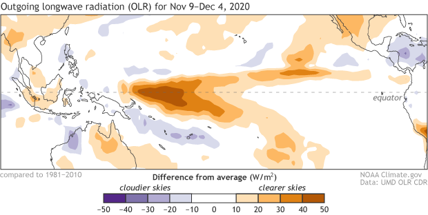
Outgoing long-wave radiation anomaly from November 9 - December 4, 2020. Regions with more clouds and rain than average are shown in green; areas with fewer clouds and less rain are shown in brown. Climate.gov image from CPC data.
Another key signal to how well La Niña is doing lies in the wind. ENSO events disrupt the Walker Circulation, the normal atmospheric wind pattern that blows across the tropics.
La Niñas tend to rev up the existing Walker Circulation. The trade winds, which blow east to west across the Pacific Ocean, blow a little harder, while winds higher up in the atmosphere blow to the east a little bit harder. During November, that is exactly what happened. (For more information on how this is part of a feedback mechanism that gets La Niña going, check out Michelle’s recent post.)
Simply put, this is my long way of saying that this La Niña is looking like a La Niña.
In the Pacific meadow, we can build a forecast
The big question now is how long this La Niña will last. And while we’ve looked a lot at the atmosphere and the ocean surface, to answer that question it’s useful to take a look under the surface of the Tropical Pacific Ocean.
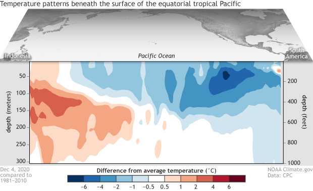
Difference from average (1981-2010) temperatures in the upper 300 meters (980 feet) of the tropical Pacific Ocean for the 5-day period centered on December 4, 2020. The vertical axis is depth below the surface (meters) and the horizontal axis is longitude, from the western to eastern tropical Pacific. This cross-section is right along the equator. Climate.gov figure from CPC data.
There you’ll find plenty of cooler-than-average water across the central and eastern Pacific Ocean. This fount of coolness is (1) a sign of the atmospheric/ocean coupling that I described above and (2) plenty big and strong enough to provide a source for cooler than average water at the surface over the next several months. Although, it is important to note that this fount of cooler than average anomalies in the subsurface ocean has weakened slightly over the last month compared to October.
That small weakening might be a harbinger for the future of this event. Most of the computer models we use as well as the forecasters predict La Niña to last through winter (greater than a 95% chance). But, forecasters do not expect much more strengthening, with the event peaking between -1.0°C to -1.5°C for the seasonal average Niño3.4 surface temperature anomaly (often referred to as “moderate”). After which, the forecast is for La Niña to weaken throughout the spring (~50% chance of ENSO-Neutral during April-June).
As with any forecast six months into the future, there is still plenty of uncertainty as to the eventual path this La Niña takes. But don’t worry, because as those computer model ENSO Bells ring, we’ll be listening. (Is that taking this month’s Winter Wonderland theme too far? No? It’s a beautiful sight? You’re happy tonight? I’ll stop now.)
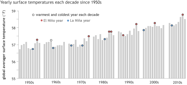
Annual global surface temperature (gray bars), grouped by decade, from 1950 to 2017. The warmest and coldest years of each decade are topped with circles: red for El Niño years and blue for La Niña years. El Niño/La Niña labels are based on the December-February anomaly of the Oceanic Niño Index. In general, the warmest year of any decade will be an El Niño year, the coldest a La Niña one.
Only two decades seem to violate the general rule: the 1960s and the 1990s. By our definition, 1963 did not qualify as El Niño year because the December–February ONI value was neutral. However, El Niño did emerge later in the year, and it persisted for 7 months. The bigger surprise was 1992, which was the coldest year of the 1990s despite being an El Niño year. The 1991 eruption of Mount Pinatubo was likely to blame. Graphic by NOAA Climate.gov, based on data from NCEI.
Gone away are the blue colors (cold anomalies). Here to stay are the red colors (warm anomalies)
La Niña isn’t the only thing happening across our planet, even though it really sticks out on a map of ocean temperature anomalies. Of course, one reason for why it sticks out is that everywhere else is so much warmer than average. Because even as La Niña formed this year, on a whole, 2020 has been sizzling hot.
Usually, years with La Niñas are cooler than years without due to the huge amount of cooler than average ocean water exposed across the equatorial Pacific. On the flip side, years with El Niños tend to fall on the warm side. For instance, the warmest year on record is 2016 when one of the strongest El Niños since 1950 occurred. Meanwhile, the coolest years of most decades coincides with a La Niña.
And that got me thinking. How does this year’s global temperatures compare to global temperatures in similar years when a La Niña developed in the summer/fall after lukewarm conditions during the preceding winter?
Going back to 1950, there have been only seven cases that sort of matched—1954, 1964, 1970, 1988, 1995, 2007, 2010—and of those, four (bolded) were the closest matches. Comparing the closest matches, 2020 is on track to be almost 0.5°F warmer than the next warmest (2010) and 1.6°F than the coolest year. While that doesn’t seem like much, it is the difference between being ranked as the first or second warmest year on record (2020) or the seventh (2010) or #59 (1970). Clearly, the warming trend due to human-caused climate change is helped to bump up global temperatures over time. And 2020 is no exception. But even then, 2020 has certainly been something else.
Emily will be back later this month with the last ENSO Blog post of 2020, but don’t worry—we’ll still be here in 2021, giving you all the latest news on ENSO.
Comments
Easterly Winds Aren't The Driver Of Ocean Upwellings
Projeto Integrador
Rain
general ocean warming trend from 1950 to present.
RE: general ocean warming trend from 1950 to present.
Yes, the picture is a bit complicated. Globally, the earth is projected to get wetter as temperatures rise (~2% per degree C of global average temperature rise), but this increase in precipitation is less than the increase in moisture in the low levels of the atmosphere (~7% per degree C of global warming). The bottom line is that there is a general expectation of more frequent heavy precipitation events (fueled by that big increase in low-level moisture), meaning more flooding, but less frequent precipitation events overall. The precipitation patterns are also expected to change, leaving some areas like the southwestern US drier. When combined with rising temperature and increasing evapotranspiration (more moisuture leaving the earth's surface), that leads to more droughts. So, we see a modest increase in precipitation throughout the global overall, but with a distribution that favors more flooding and more droughts.
Global Temperature During La Nina
RE: Global Temperature During La Nina
La nina forecast
CO2
RE: CO2
We expect any further discussion to remain on the topic of this blog post, but I thought I would quickly mention that the SkepticalScience website has some excellent material that discusses this issue.
La Niña 2020-21
Comments have been disabled on this article