Why are there so many ENSO indexes, instead of just one?
Some people have probably noticed that over the past year, this blog has mentioned several different ways to measure and monitor ENSO—whether we are in an El Niño, La Niña, or neither. At NOAA, the official ENSO indicator is the Oceanic Niño Index (ONI), which is based on sea surface temperature (SST) in the east-central tropical Pacific Ocean. But we have also mentioned other ways of measuring ENSO. Here, we will review some of them and then provide reasons why several different indicators are best for monitoring ENSO.
Historically, an index has been a common way to summarize the ENSO status. An index is a number scale in which all the individual factors needed to describe a complicated phenomenon are boiled down to a single number. That single number then can be tracked over time.
Air pressure indexes
The oldest indicator of the ENSO state is the Southern Oscillation Index (SOI): the difference between the atmospheric pressure at sea level at Tahiti and at Darwin (1); see Fig. 1. A seesaw in pressure at these locations reflects the atmospheric component of ENSO, discovered in the early 1900s by Walker and Bliss (1932) and others. During El Niño, the pressure becomes below average in Tahiti and above average in Darwin, and the Southern Oscillation Index is negative. During La Niña, the pressure behaves oppositely, and the index becomes positive.
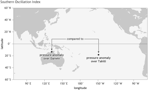
Location of the two stations whose observations of sea level pressure contribute to the Southern Oscillation Index (SOI): one over Tahiti, in French Polynesia, and one over Darwin, Australia. NOAA Climate.gov image by Fiona Martin.
The fact that the SOI is based on the sea level pressure at just two individual stations means it can be affected by shorter-term, day-to-day or week-to-week fluctuations unrelated to ENSO. But averaging the index values over months or seasons helps to isolate more sustained deviations from the average, like those associated with ENSO.
Another limitation of the Southern Oscillation Index is that both Tahiti and Darwin are located somewhat south of the equator (Tahiti at 18˚S, Darwin at 12˚S), while the ENSO phenomenon is focused more closely along the equator. The Equatorial Southern Oscillation Index overcomes this problem, as it uses the average sea level pressure over two large regions centered on the equator (5˚S to 5˚N) over Indonesia and the eastern equatorial Pacific (see Fig. 2).
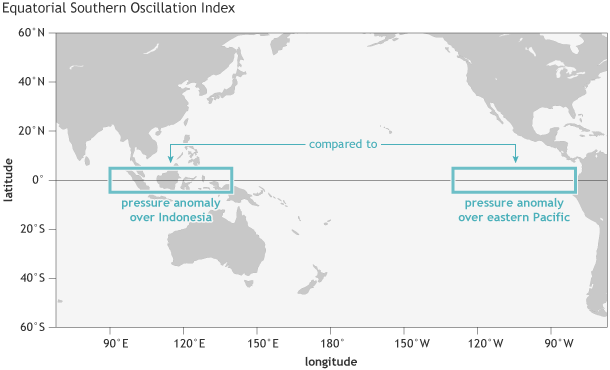
Location of the two parts of the tropical Pacific whose average sea level pressures are used for the Equatorial Southern Oscillation Index: one over the eastern equatorial Pacific, and one over Indonesia. NOAA Climate.gov image by Fiona Martin.
However, data for this index only extend back to 1949 (2). In contrast, the Tahiti-Darwin index goes back to the late 1800s because of longer station records. Due to its longer records, the Tahiti-Darwin index was used to represent the ENSO state in a set of landmark studies relating ENSO to its global climate effects (Ropelewski and Halpert 1986, 1987, among others).
Sea surface temperature indexes
Later on, sea surface temperature data were increasingly used because the ocean was recognized to be a key player in ENSO (Bjerknes 1969, Rasmussen and Carpenter 1982, Wyrtki 1985) (3). Initially, certain regions were defined for measurements—namely Niño1, Niño2 (combined into Niño1+2), Niño3 and Niño4—because of consistently available data coming from ships passing through those areas. Later, an area called Niño3.4 was identified as being the most ENSO-representative (Barnston et al. 1997). Located between (and overlapping with) Niño3 and Niño4, this is the region whose temperature anomaly is reflected in the ONI (see Fig. 3).
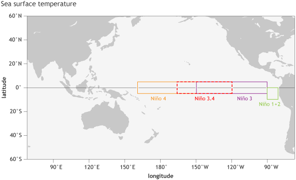
Location of the parts of the tropical Pacific used for monitoring sea surface temperature. The sea surface temperature in the Niño3.4 region, spanning from 120˚W to 170˚W longitude, when averaged over a 3-month period, forms NOAA’s official Oceanic Niño Index (the ONI). NOAA Climate.gov image by Fiona Martin.
Outgoing longwave radiation indexes
With the introduction of continuous satellite-based data in 1979, another highly ENSO-relevant index became available—outgoing longwave radiation, which indicates the extent of convection (thunderstorm activity) across the tropical Pacific (4). By mapping outgoing radiation from cloud tops, we detect which areas in the tropical Pacific are rainier (or drier) than average. Above-average thunderstorm activity often (not always) occurs in areas having above-average sea surface temperature. The outgoing longwave radiation is therefore not only very relevant to the ENSO state, but also serves as a key linkage to the remote climate teleconnections outside the tropical Pacific region (e.g., . Chiodi and Harrison 2013).
Wind indexes
In addition to sea level pressure, sea surface temperature, and outgoing longwave radiation, there are also wind-based indexes across the tropical Pacific, which measure the movement of air flow in the upper and lower branches of the Pacific Walker circulation (5).
Which one’s the best?
So, now you might ask why we continue to use so many different measures of ENSO. Why don’t we settle on just one index? Well, ENSO is multifaceted, involving different aspects of the ocean and the atmosphere over the tropical Pacific. By analogy, consider the process of hiring someone into your organization. You want someone who is proficient and experienced in your specialty. But you also want a good team player, a good writer and speaker, and someone who interacts comfortably with the public. So just a score on a written test would not be sufficient; you and your coworkers would want to interview the person to understand their other qualities (6). Diagnosing the ENSO state works in a similar fashion. Figure 4 shows the locations of the regions used for the two Southern Oscillation indexes shown in Figs. 1 and 2, and for the current official sea surface temperature index (Niño 3.4).
Also, we cannot measure one aspect of the entire tropical Pacific perfectly, so we get a better picture when we consider a few related measures (7). Another reason for multiple indexes is that we want to to compare different ENSO events in history, but not all ocean and atmospheric indexes go far back in time.
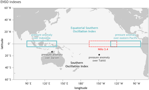
Location of the stations used for the Southern Oscillation Index (Tahiti and Darwin, black dots), the Equatorial Southern Oscillation Index (eastern equatorial Pacific and Indonesia regions, outlined in blue-green), and the Niño3.4 region in the east-central tropical Pacific Ocean for sea surface temperature (red dashed line). NOAA Climate.gov image by Fiona Martin.
To deal with the multiple aspects of ENSO, you might imagine that more than one index could be combined into a composite index, such as one based on both sea surface temperature and pressure anomalies, or other combinations. Such composite indexes have been explored. Although these indexes are interesting and innovative, so far they have not been widely used by any of the global forecast producing centers. Why? Well, similar to when we want to justify hiring a potential employee, we often want to list the various skill sets of the person separately rather than to combine them into a single “candidate quality” score using a complex automated formula. This way we can explain just what went into our hiring decision, and also know where future improvements may be needed.
A final reason for maintaining separate individual indexes is that the location of the user can matter. Different national meteorological and climate agencies may emphasize certain indexes because they reflect the aspects of ENSO that impact their county most strongly. For example, people on a tropical Pacific island might care more about SST, while in a country farther away from the tropical Pacific, they might care more about large-scale changes in sea level air pressure.
So—because ENSO is such a large, complex, and dynamic system, using several different indexes will always be informative and beneficial in measuring the ENSO state. This multifaceted perspective was clearly used in assessing the ENSO status and outlook during 2014.
Footnotes
(1) The sea level pressure (SLP) readings at Tahiti and Darwin are each standardized, so that they fall between -1 and +1 about two-thirds of the time, and rarely go outside of -2.5 to 2.5. Standardization is done to adjust for seasonal differences in both the average and in the year-to-year range of variability at each of the two stations, so that each station always contributes equally to the index.
The difference between these two standardized SLPs is then itself standardized, so that it falls between -1 and +1 about two-thirds of the time. How is standardization done, exactly? Okay, here goes: Standardization re-scales a set of numbers in two steps. In the first step, the average of the numbers is computed, and that average is then subtracted from each number. This causes any number below the average to become a negative number, and ones above average to become positive. The average of all the new numbers then becomes zero.
Then, in the second step, the numbers are further re-scaled so that their range typically ends up only between about -2.5 and 2.5. So, if their original range is much larger than this, then the numbers are compressed; if originally smaller, they are stretched. This second step of re-scaling is done by first computing the standard deviation of the numbers, which is a measure of the extent to which the numbers vary from one another. The formula for the standard deviation is not given here, but can easily be looked up, and basically calculates by how much the numbers are scattered around their average. To give an idea of how large the standard deviation is, the standard deviation of the weight of men in the United States is roughly 30 pounds. If the men’s weights are distributed in a normal and symmetric pattern, this means that about two-thirds of the men are between 30 pounds below the average and 30 pounds above it—that is, about one standard deviation’s worth on either side of the average.
The numbers coming out of the first step above (subtracting the average, which incidentally is about 165 pounds for men’s weight) are divided by this standard deviation, and this is what causes the numbers to end up varying only between about -2.5 and 2.5. Since the Southern Oscillation Index (SOI) is usually standardized, it also varies between about -2.5 and 2.5, and is between -1 and 1 about two-thirds of the time. These are only rough guidelines, of course. In particular, the distribution of numbers may not necessarily be symmetric regarding the cases below and above average. In fact, the SOI shows some lack of symmetry, in that the most extreme negative cases are more negative than the most extreme positive cases are positive. This is because the strongest El Niño events are stronger than the strongest La Niña events, due to the physics of the ocean-atmosphere system.
(2) The Equatorial SOI is dependent on a complete gridded dataset, since much of the area is over ocean, and so the length of the record only extends back to the beginning of the reanalysis record. At NOAA CPC, the NCEP/NCAR Reanalysis goes back to 1949.
(3) Another desirable feature of sea surface temperatures (SSTs) is that they change more slowly than SLP, making it easier to identify ENSO, even when averaging over a period as short as a month or less.
(4) The thunderstorm activity is measurable through detection of the temperature of the cloud tops, which is lower for the higher-up (colder) cloud tops of stronger thunderstorms. So, low outgoing longwave radiation indicates high thunderstorm activity.
(5) Changes in winds can also help us to measure the onset of “westerly wind bursts,” which can influence the movement of warm water across the tropical Pacific, and can sometimes play a role in the initiation of an El Niño event.
(6) For another analogy, consider the diagnosis of clinical depression. It involves more than a person feeling unhappy too much of the time. It also involves a loss of interest in normal hobbies, decrease in physical energy, difficulty in concentrating on tasks, changes in sleep habits and/or appetite, and negative feelings about oneself. All of these indicators must last for at least a few weeks. Here, as is the case with ENSO, several different aspects need to be assessed.
(7) Although we rely on ships, buoys, and satellites to give us ENSO-related SST data, there are different assumptions made (using models and statistical methods) that provide estimates in regions we do not directly measure. So, if you look at SST datasets closely, different methods will give you slightly different estimates (Huang et al. 2013, 2015).
References
Bjerknes, J. (1969). Atmospheric teleconnections from the equatorial Pacific. J. Phys. Oceanog., 97, 163-172.
Barnston, A. G., M. Chelliah, and S. B. Goldenberg, 1997: Documentation of a highly ENSO-related SST region in the equatorial Pacific. Atmos.-Ocean, 35, 367-383.
Chiodi, A. M., and D. E. Harrison, 2013: El Niño impacts on seasonal U.S. atmospheric circulation, temperature, and precipitation anomalies: The OLR-Event perspective. J. Climate, 26, 822–837.
Huang, B., M. L. L’Heureux, J. Lawrimore, C.-L. Liu, H.-M. Zhang, V. Banzon, Z.-Z. Hu, and A. Kumar, 2013: Why did large differences arise in the sea surface temperature datasets across the tropical Pacific during 2012?. J. Atmos. Oceanic Technol., 30, 2944–2953.
Huang, B. W. Wang, C. Liu, V. Banzon , H.-M. Zhang,, and J. Lawrimore, 2015: Bias adjustment of AVHRR SST and its impacts on two SST analyses. J. Atmos. Oceanic Technol.
Rasmussen, E. M. and T. H. Carpenter 1982: Variations in tropical sea surface temperature and surface wind fields associated with the Southern Oscillation/El Niño. Mon. Wea. Rev., 110, 354-384.
Ropelewski, C. F., and M. S. Halpert, 1986: North American precipitation and temperature patterns associated with the El Niño Southern Oscillation (ENSO). Mon. Wea. Rev., 114, 2352-2362.
Ropelewski, C. F., and M. S. Halpert, 1987: Global and regional scale precipitation patterns associated with the El Niño/Southern Oscillation. Mon. Wea. Rev., 115, 1606-1626.
Walker, G.T. and Bliss, E.W., 1932. World Weather V, Memoirs of the Royal Meteorological Society, 4, 53-84.
Wyrtki, K., 1985: Water displacements in the Pacific and the genesis of El Niño cycles. J. Geophys. Res., 90, 7129-7132.
Comments
Outgoing LW Radiation
Why are there so many ENSO indexes, instead of just one?
Outgoing LW Radiation Indexes
RE: Outgoing LW Radiation Indexes
You can obtain data for an OLR index here (scroll to the very bottom):
http://www.cpc.ncep.noaa.gov/data/indices/
It is for the region averaged between 160W-160E on the equator. However, we find that the region 170E-140W tends to be better related to ENSO, but this index is not yet available. We plan to eventually show it on the new CPC webpage, which you can preview here:
http://www.cpcpara.ncep.noaa.gov
Click the ENSO tab. Hopefully the new OLR indices will be rolled out on the new webpage in the next couple of months.
ENSO 'For Dummies' !
Aren't you the answer?????
ONI 3 month average
RE: ONI 3 month average
Very observant! The answer is that the monthly data you are quoting comes from the OISST dataset. We calculate the ONI using ERSST. Indices from both datasets are available on this webpage (link). Tom recently wrote a blog post explaining why there are different SST datasets, which you might find to be helpful:
https://www.climate.gov/news-features/blogs/enso/exactly-same-completely-different-why-we-have-so-many-different-ways
ONI means
RE: ONI means
It is a particilar 3-month average. It could be any of the 12 running 3-month seasons (DJF, JFM, . . . .,NDJ), for any given year.
RE: RE: ONI means
Reply to Anthony's last comment
Yes, in 2015 we had a near-El
Yes, in 2015 we had a near-El Nino during 2014-15, so it was off to a good start even before the current El Nino got going in earnest. And in 1987, there actually was an El Nino in 1986-87, so it has an even better head start. There will be a blog coming out at the end of this week talking about the chances of a La Nina on the heels of El Nino events like this one. It turns out there is an increased chance for it compared with the expectation if we had no El Nino this year, but it is by no means guaranteed. We'll have a better idea of whether or not a La Nina may materialized as we move into the late spring, when the models become more accurate predicting the rest of the year. Remember the spring "predictability barrier".
SOI vs OLR
RE: SOI vs OLR
Hi-- the main point post was to point out we consider many different indexes. There are certainly ways to combine indexes, and those are considered as well, but generally, we like to examine the SOI on its own, the OLR index on its own, etc. I agree that the SOI and OLR indexes are often consistent with each other, so combining them could result in redundancy.
Climate indices classification
RE: Climate indices classification
There is no standard way to map the SOI onto El Nino or La Nina conditions, so different operational centers and research studies will use different thresholds. The Australian Bureau of Meteorology (BOM) uses thresholds of -8/+7, whereas NOAA ENSO forecasters do consider SOI and other atmospheric indicators but do not use any explicit SOI threshold for declaring El Nino/La Nina conditions. The SOI thresholds are likely to vary considerably in the research literature. It's important to consider that not all studies use the same units in their SOI time series. For example, BOM uses an SOI that multiplies the standardized pressure differences by 10. So any studies that use the -1/+1 SOI thresholds are likely not multiplying the index by 10, and so those -1/+1 thresholds really correspond to -10/+10 if we use the formula used by BOM.
Regarding your other question, I am not sure of the source of your confusion, but I can give a brief description of the indexes. The Nino 3.4 index is the SST anomaly averaged in the Nino 3.4 region, as discussed in this post. This is the index that is directly used for monitoring and forecasting ENSO. The AO is the Arctic Oscillation, and it refers to an atmospheric circulation pattern primarily over the Arctic and North Atlantic and that is related to the polar vortex. The AO has important impacts throughout the hemisphere, primarily in boreal winter, and we discussed it in this post. The EAWR refers to the East Atlantic/Western Russia pattern, and this is another atmospheric pattern like the AO but that gets a lot less attention. There is a brief description of it on this CPC website.
If you have additional questions, let us know.
Comments have been disabled on this article