The Incredible Growth of the 2015-16 El Niño followed by the Incredible Shrinking La Niña forecast
I’m back with yet another GIF animation because I think I’ve developed a mild addiction to them [Editor’s note: that’s a classic denial by a serious addict]. Words mean one thing, but movies, well, they can reveal a lot. In this case, we wanted to show you every single North American multi-model ensemble forecast for ENSO over the past year and a half. This does not include every model that forecasters consider when developing their consensus outlook, but it includes a lot of them.
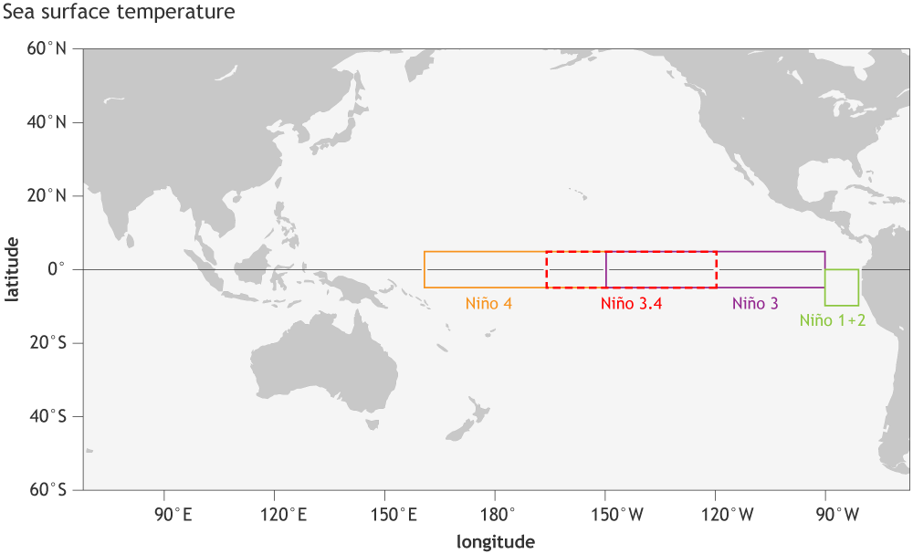
This particular animation displays once-a-month data of sea surface temperature departures averaged in the Niño-3.4 region in the equatorial Pacific Ocean, which is one key location to monitor ENSO variations. Persistent positive numbers in excess of +0.5°C indicate El Niño, and persistent negative numbers less than -0.5°C indicate La Niña.
Black line: these are the Niño-3.4 (ENSO) observations for each month starting in January 2015 and ending in August 2016
Purple lines: each line represents a forecast from a different model (1). There are 9 models shown in this animation, which are run at the beginning of each month (by the 6th-8th of each month) by various researchers and agencies across North America. The year and month in the upper right corner tells you when the model prediction was made. We like to examine different models because it is the forecasting equivalent of crowd sourcing. In climate prediction, no one model is clearly better than the rest, so this allows us to see the potential range of outcomes.
Grey lines: Showing the past model forecasts dating back to January 2015 (2).
Okay, now watch it until the room spins—I mean just a few times—and I’ll point out some of the more interesting features below:
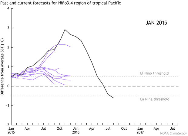
Niño-3.4 Index averages from different climate models (purples lines) within the North American Multi-Model Ensemble (NMME). Persistent positive values at or greater than +0.5°C are indicative of El Niño, while persistent negative values at or less than -0.5°C reflect La Niña. The black line are past observed values of the Niño-3.4 Index based on daily OISST data, which was chosen because it is at a resolution more similar to the SST datasets the NMME models ingest. Grey lines show past model predictions going back to January 2015. The year and month shown in the top right corner is when the models were run or initialized. The x-axis displays the target year and month of the prediction.
-- The strong El Niño growth during 2015 was pretty well predicted by this set of models. There is some quibble (3), but this is an overall accurate forecast and the most skillful since the last historically large El Niño in 1997-98.
-- The peak strength of Niño-3.4 during November 2015 (at least measured by this particular observational dataset) was generally under-predicted by most models. In other words, what actually occurred was warmer than what was predicted!
-- Overall, the demise of the El Niño was also well predicted. A few models hung onto the event a little too long, meaning that the peak in the model prediction occurred after the peak in the observations. Not surprisingly, these mis-timed predictions of peak strength are especially a problem in forecasts made further into the future (~6-12 months ahead). The unofficial term for this is “target period slippage” (Barnston et al., 2012, Tippett et al., 2012).
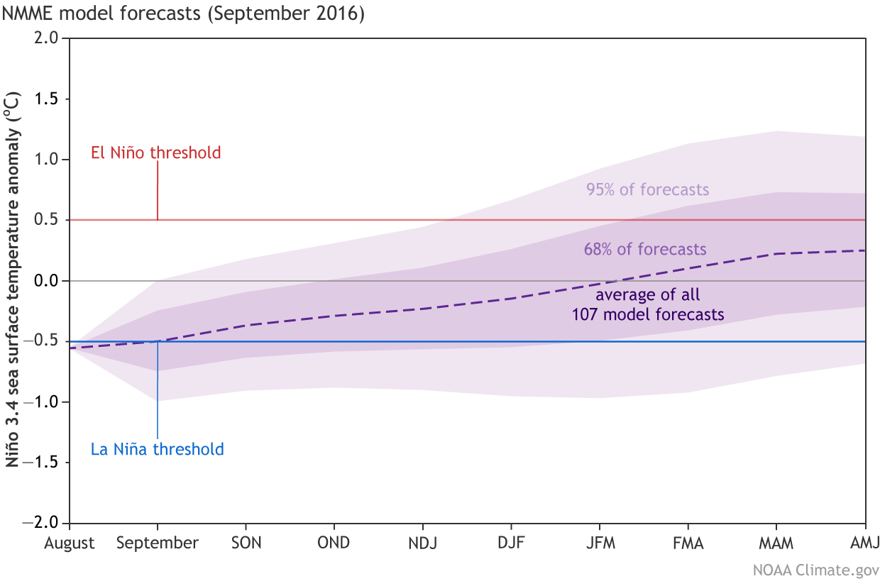
-- The previously predicted La Niña is clearly in trouble. We laid out some possible reasons in our early September blog post, but the number one reason forecasters now slightly prefer ENSO-neutral conditions (55-60% chance) stems primarily from this set of models and how month after month since April 2016, they have gradually predicted less cooling. You can see this in the more positive (upward) shift of the purple lines for all months after April 2016. Could this weakening trend abate? Sure it could. Could we still end up with La Niña? Yes, there is a 40% chance of this, though if it emerges it is likely be very marginal or borderline.
-- The cool Niño-3.4 conditions predicted for the summer months of July-August 2016 were way too cold in most models. In other words, the models were more aggressive forecasting La Niña than what recently occurred. We don’t know why La Niña did not emerge during the summer, despite the fact that theory indicates the odds of La Niña are elevated after strong El Niño events (see here and here). Is it because the below-average subsurface temperatures across the equatorial Pacific Ocean were weaker than anticipated? Was it because we still have yet to see clear interactions between the ocean-atmosphere? (there are some weak hints as of early September). We don’t really know.
What we do know is that ENSO will forever be keeping us on our toes, so stay tuned.
Footnotes
(1) It is showing the average of many different runs (or ensemble mean) from each model. The models included in the North America Multi-Model Ensemble (NMME) are run at NOAA NCEP, NOAA GFDL, NASA GMAO, Univ. of Miami, and Environment Canada (Kirtman et al., 2014). The individual runs are not shown in this figure. They give a better sense for the probability of ENSO, but I wanted to simplify this animation so I’m not displaying them. But you can get an idea of the typical spread from the North American multi-model ensemble from Emily’s most recent blog post.
(2) Ideally, we want the model forecasts (purple and grey lines) to resemble the past observations (black line). Though keep in mind that there is a completely unpredictable or random aspect in the forecast and there are model errors, so we would never expect them to match exactly. In reality, what you expect in a successful forecast is to see the observations (black line) within the spread, or envelop, of the purple or grey lines. The 2015-16 forecast stayed generally in bounds, with a few exceptions.
(3) Clearly most model runs created in July-September 2015 predicted conditions that were too warm during August-September 2015.
(4) Based on models that were run during early April through June 2016.
References
Anthony G. Barnston, Michael K. Tippett, Michelle L. L'Heureux, Shuhua Li, and David G. DeWitt, 2012: Skill of Real-Time Seasonal ENSO Model Predictions during 2002–11: Is Our Capability Increasing?. Bull. Amer. Meteor. Soc., 93, 631–651.
Ben P. Kirtman and co-authors, 2014: The North American Multimodel Ensemble: Phase-1 Seasonal-to-Interannual Prediction; Phase-2 toward Developing Intraseasonal Prediction. Bull. Amer. Meteor. Soc., 95, 585–601.
Michael K. Tippett, Anthony G. Barnston, and Shuhua Li, 2012: Performance of Recent Multimodel ENSO Forecasts. J. Appl. Meteor. Climatol., 51, 637–654.
Comments
Effects of the 2015-2016 El Niño.
RE: Effects of the 2015-2016 El Niño.
Thanks for the compliments! The formal paper which shows more data on comparisons is currently in review at a journal of the American Meteorological Society. While we recognize this route isn't very timely, this approach has the added value of peer review among the larger scientific community, which is why this path was chosen.
RE: RE: Effects of the 2015-2016 El Niño.
La Niña and PDO
Plausible reasons behind La Nina no show?
RE: Plausible reasons behind La Nina no show?
Thanks! To answer your question: the historically strong 1982-83 El Nino was followed by Neutral conditions the following winter (1983-84). It cooled, but not enough to reach the thresholds NOAA CPC maintains for a full episode (5 consecutive 3mo. overlapping seasons < -0.5C). So it is certainly possible to not have a full blown La Nina after a strong El Nino. One limitation here is how short the historical record is... we simply don't have a large sample of strong ENSO events, so there is enough uncertainty that we can't rule out anything. The theories are just that, theories. While the best ones also have model and observational support, no one theory explains it all which is why forecasting will remain challenging. We still have to see what plays out.... the 40% chance of La Nina (current odds) is considerably greater than 0%.
GIF producing program
RE: GIF producing program
Many of the graphics in the ENSO blog are hybrids, with the data processing done in a scientific programming language (or sometimes in ArcGIS) and then polish provided by the Climate.gov graphics team using Adobe creative suite products. Michelle made a rough draft version of this animation to show us what she wanted, and then she handed over eps frames, which our graphics team turned into an animated gif using Adobe Photoshop. Not sure what she originally used to produce her rought draft. Perhaps she will weigh in...
La Nina
Comments have been disabled on this article