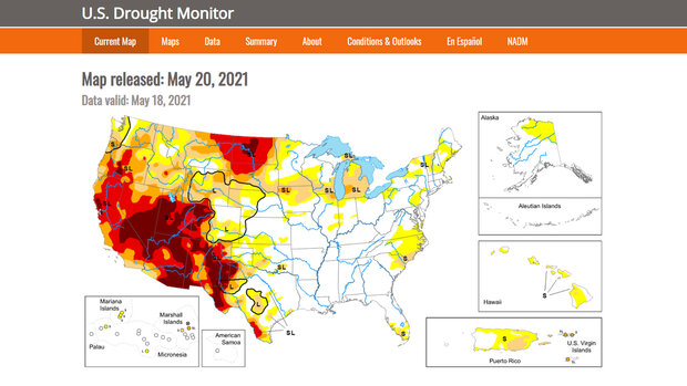
The U.S. Drought Monitor (USDM) is a weekly map—updated each Thursday—that shows the location and intensity of areas currently experiencing abnormal dryness or drought across the United States. The maps use bright colors to highlight experts' current assessments of conditions related to dryness and drought.
| Category Name | Possible Impacts |
|---|---|
| Abnormally Dry | Going into drought: short-term dryness slows growth of crops/pastures. Coming out of drought: some lingering water deficits; crops/pastures not fully recovered. |
| Moderate Drought | Some damage to crops/pastures; streams, reservoirs, or wells are low with some water shortages developing or imminent; voluntary water-use restrictions requested. |
| Severe Drought | Crops/pasture losses are likely; water shortages are common and water restrictions are imposed. |
| Extreme Drought | Major crop/pastures losses; widespread water shortages or restrictions. |
| Exceptional Drought | Exceptional and widespread crop/pasture losses; shortages of water in reservoirs, streams, and wells creating water emergencies. |
Where do these data come from?
Each week, drought experts consider how much water is available in streams, lakes, and soils compared to usual for the the current time of the year. They evaluate how recent precipitation amounts across the country compare to their long-term averages, and monitor variables such as temperature, soil moisture, snow cover, and meltwater runoff. Experts also check whether areas are showing drought impacts such as water shortages or business interruptions. Based on dozens of indicators and using a "convergence of evidence" approach, experts make their best judgments of regional-scale drought conditions. The final step is to check their assessments with local experts who can check actual conditions. Once they gather and consider this input, they publish the weekly drought map.
Statistics presented with the weekly map show what portion of various geographic areas are in each category of dryness or drought, and how many people are affected. Note that areas judged to be "Abnormally Dry" are not included in statistics for areas experiencing drought.
-
How do I use the site?
Generate time series graphs of areas affected by drought. Time Series
Compare two weeks of U.S. Drought Monitor maps side by side. Weekly Comparisons
Display maps from two selected dates with a slider bar to compare how dry and drought areas changed. Comparison Slider
View past maps and graphs for a selected week. Map Archive
View maps showing which areas changed drought status during a selected week. Change Maps
Generate animations of maps for a selected period or download animated GIF files. Animations
Interact with map layers related to drought and precipitation. U.S. Drought Monitor Map
-
Data Format(s)TXT (ASCII), CSV, PNG, shapefile
-
Documentation Type Link & Description General General -
Data TypeLand-based station
 Click to see more detail
