Beyond the Data: Listicle Edition (#4 will amaze you!)
In keeping with the spirit of our blog, we’ll take a look at something obvious from the NCEI monthly climate analysis, then dig a little harder into some even more pertinent climatological truths.
1. March was warm - a lot warmer than you might think.
Our monthly State of the Climate report found that March 2017 was the second-warmest March on record for the globe. Just about any way you slice it, it was second only to 2016 in the history of global-scale temperatures for March. But, as we’ve pointed out in this space before, sometimes it’s human nature - or perhaps American nature - to interpret “second warmest” as “not all that warm.”
But it’s worth a closer look, in two dimensions. First, just looking at the history of the month of March.

Global temperatures, graphed as departures from the 1901-2000 average, for each March from 1880 through 2017. Source: NOAA/NCEI NOAAGlobalTemp; NCEI Climate at a Glance.
The two rightmost bars on the graphic are March 2016 and March 2017. For perspective, March 2016 - the tallest bar - reigns as the warmest month (not just March) on record, globally, in terms of departure from average, since modern records began in 1880. March 2017 stands well above the vast majority of the history here - it was a profoundly warm month globally.
And that’s notable because …
That’s notable because March 2017 wasn’t driven by a large El Nino episode, like March 2016 very famously was. In fact, March 2017 is, by a comfortable margin, the warmest non-El Nino month in our history.
This graphic, an animation favorite old Beyond the Data saw, shows the influence of El Nino and La Nina type conditions on the global temperature. There are only four months in our modern history warmer than March 2017, all of them occurred during the strong El Nino of 2014-16.
Monthly temperatures compared to the long-term average. Months that were influenced by El Niño conditions are colored red, those influenced by La Niña are blue, and neutral months are gray. Animation by Deke Arndt, NCEI.
2. Wait, how do you know to the hundredth of a degree?
One question we often get relates to precision in reporting of global temperatures. It’s usually something like this: “Hi, if the the thermometers typically only measure to the whole degree, how can you come to a temperature to the hundredth of a degree?” Sometimes, maybe not so polite.
But it’s a good question, with a good answer.
In statistics, a larger sample size allows for some inferred precision. If you’re a sports fan, you see this all the time. Even though we measure LeBron James’ free throw shots in whole numbers - ones and zeroes, makes and misses - we can calculate, with some meaning, that he’s a 74% free throw shooter. That’s a bump up of two precision spots, thanks to the 8,700 samples (attempts) taken during games. In other words, we go from individual observations of 1 or 0 to a calculation of 0.74, introducing two significant digits in the process.
It’s a similar concept with global temperatures. Not only do we have thousands of stations in a given month, but each of those monthly values is composed of about 30 daily values, which are themselves drawn upon at least two observations. That monthly global temperature is rich in observations from land and sea.
Of course, all of that averaging contributes to a “margin of error” or “uncertainty” associated with the calculation. That’s published each month along with our estimate of global temperature.
3. Get your globes out to visualize missing sea ice
March is the turning point in the seasonal cycles of sea ice growth or retreat at each pole. In the Arctic, sea ice extent reaches its annual maximum in March, marking the beginning of the retreat season. In the Antarctic, March is typically the smallest value, marking the onset of the growth season. Sometimes, the daily extreme occurs in February, but the monthly value for March has, so far, been the inflection point at each pole.
The Arctic has seen a general decline in ice extent for several decades now, but the Antarctic has shown periods, even extended periods, with increasing sea ice extent. But this year, both poles set records for the smallest March sea ice extent. We often talk about ranks and statistics without really comprehending the magnitude of what we’re measuring. With the help of a map of the globe, or better yet, an actual globe, you can get an idea of how much ice was “missing” this year.

Sea Ice Extent in the Arctic and Antarctic for the month of March, 1979-2017, expressed as departures, in square miles, from the 1981-2010 average. The areas of the nations of Colombia and Mongolia are shown, as they are approximately equal to the area of the "missing" ice in the Arctic and Antarctic, respectively, during March 2017.
So, in order to put it into perspective, the “missing” sea ice, compared to the 1981-2010 average, was roughly 450,000 square miles, or about the size of the nation of Colombia, in the Arctic. For the Antarctic, the “missing” ice, relative to March norms, was about 580,000 square miles, or about the size of the the nation of Mongolia. Combined, the 1.04 million square miles of “missing” ice is about the size of Kazakhstan.
4. The U.S. is on an unprecedented hot streak
March 2017 was warm for the contiguous United States (or CONUS). At 46.15F, a substantial 4.65F above the 20th century average, it was the ninth warmest March on record. In our monthly reports, we focus mainly on the month that just occurred, because that’s the most relevant to the Nation’s commerce. People and businesses that are sensitive to weather and climate (that’s a huge chunk of the economy) compare their own stats and metrics to the recent climate numbers, because those climate numbers often explain some of the up-or-down in their bottom line for the month.
But lurking behind those “most recent month” numbers is a pretty monstrous warm run this decade. For the periods ending in March, the one-year, two-year, three-year, four-year, and five-year running averages are the warmest on record.
| Contiguous U.S. (CONUS) Temperature for five periods ending in March 2017 | ||||
| Length | Period | Average Temperature | Departure from 20th century average | Rank (since 1895) |
| 12-month | Apr 2016 - Mar 2017 | 55.05°F | +3.02°F | Warmest to Date |
| 24-month | Apr 2015 - Mar 2017 | 55.05°F | +3.03°F | Warmest to Date |
| 36-month | Apr 2014 - Mar 2017 | 54.44°F | +2.44°F | Warmest to Date |
| 48-month | Apr 2013 - Mar 2017 | 53.84°F | +1.85°F | Warmest to Date |
| 60-month | Apr 2012 - Mar 2017 | 53.86°F | +1.88°F | Warmest to Date |
The 60-month/5-year streak is especially remarkable, because the 61st month … the one that just rolled off the analysis, was the ridiculously warm March of 2012, the standard-bearer for absurdly warm spring months in the nation’s history.
The fact that we’re knocking down long-term records without the help of months like March 2012 underscores just how consistently warm we’ve been this decade.
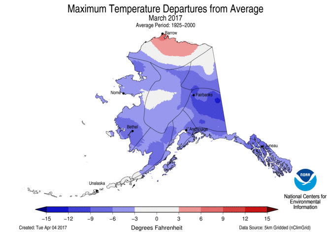
5. Alaska streak comes to an end (get your globes out, again)
In contrast with the CONUS warmth, Alaska was cool in March (most of us lower-48ers would call it cold). This ended a streak of 17 straight warmer-than-normal months for America’s Last Frontier.

This map depicts the March 2017 temperature in Alaska as the departure from the long-term (1925-2000) average. Blue shades show areas that were cooler than normal; red shades show areas that were warmer than normal. The more intense the shade, the stronger the difference from normal. Data Source: nClimGrid, NOAA/NCEI. Adapted from https://www.ncdc.noaa.gov/monitoring-content/sotc/national/grid-temp/tm…
One thing to note is the (relative) warmth of Alaska’s North Slope. This has become a persistent feature, as sea ice tends to be further from the shore, in any given month, than it was during the 1981-2010 period.
However, during this March, the northern shore of Alaska was packed in sea ice, so a lack of sea ice wasn't a driver here. The warmth in March 2017 was more related to the North Slope being on the very edge of a meteorological feature that brought unseasonably warm conditions to much of Far East Russia.

Global temperatures for March 2017, placed into historical context. The darkest reds (blues) indicate grid boxes with their warmest (coolest) March on record. The next shade (Much Above / Much Below) implies that a grid box had a March 2017 in the top / bottom ten percent. The next shade (Above / Below) implies a top / bottom one-third of history. Near Average indicates that the March 2017 temperature was in the middle third of history for the month. Source: NOAAGlobalTemp and the NOAA/NCEI March 2017 State of the Climate report.
On our maps, which use the Robinson projection, the very high latitudes are distorted to look larger than they really are. The truth is that Alaska’s Arctic coast isn’t that far from Far East Russia’s Arctic coast, even though our maps put them at opposite sides of the world. A look at a polar stereographic projection provided by the National Snow & Ice Data Center (Alaska is at the bottom, here) drives home just how close they are.

This map shows the departure from the 1981-2010 average for air temperatures at 925 millibar level of the atmosphere (a couple thousand feet above sea level), as re-analyzed using observations and computer models. This map differs from the previous map in that it shows a polar projection (looking down at the North Pole). Data Source: NOAA/ESRL, via National Snow and Ice Data Center.
Sometimes, going Beyond the Data means tearing up your old map and finding a new one.
Comments
Science
Robinson projection
RE: Robinson projection
Thanks, and I think your comment speaks for itself. I appreciate the advice.
Deke
great info
I’m no sure where you’re getting your info, but great topic. I needs to spend some time learning much more or understanding more.
Thanks for great information I was looking for this information for my mission.
Add new comment