2015 State of the Climate: Highlights
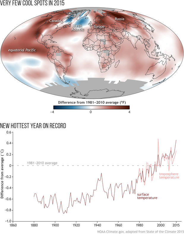
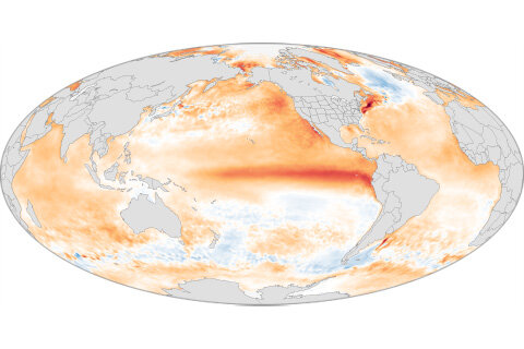
The map shows the average temperature departures for 2015 compared to the 1981-2010 averages. The graph beneath the map shows Earth’s temperature history from 1880 to 2015 compared to the 1981-2010 average (dashed line at zero). Surface temperature is dark red; lower troposphere temperature is light red. (The troposphere is the lowest 10 kilometers [6.2 miles] of the atmosphere.) The 2015 global surface temperature was 0.42oC-0.46oC (0.76°–0.83°F) above the 1980-2010 average, depending on the dataset. Full story.
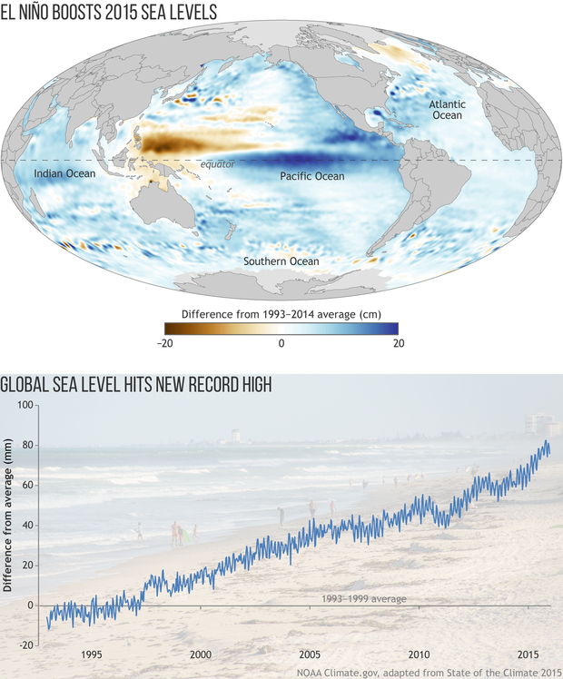
The map shows sea level in 2015 compared to the 1993-2014 average based on satellite altimeter data. Places where sea level was up to 20 centimeters (7.8 inches) higher than average are dark blue, and places where sea level was up to 20 centimeters (7.8 inches) below average are brown. The graph beneath the map shows yearly global sea level since 1993 compared to the 1993–1999 average line (gray line at zero). Full story.
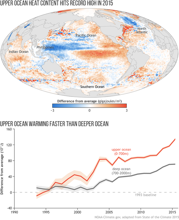
Heat energy in the top 2,300 feet (700 meters, or slightly less than half a mile) of the ocean in 2015 relative to a 1993–2015 average. Areas in blue show ocean where stored heat was below average, while areas in orange and red show where ocean heat content was above average. The graph beneath the map shows heat content in the upper 2,300 feet (700 meters) of the ocean (orange) and the deeper ocean (2,300–6,500 feet, gray) relative to a 1993 baseline. Full story.
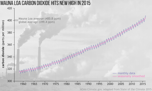
Monthly average carbon dioxide amounts (blue line) measured at Mauna Loa observatory. The bright pink line shows carbon dioxide concentrations with the seasonal cycle smoothed out. Full story.
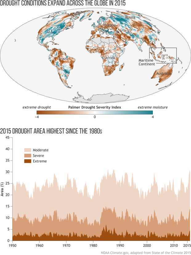
The map shows the areas that experienced drought conditions in 2015. The darker the brown, the more extreme the drought. The graph shows the percentage of global land area (excluding ice sheets and deserts) in a moderate, severe, or extreme drought. By the end of 2015*, 30% of the global land was in drought, with 14% in a severe or extreme drought, the two most dire categories. Full story.
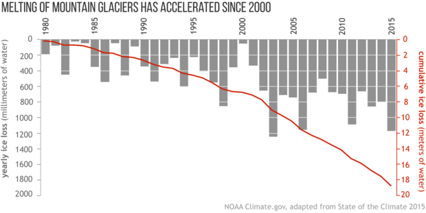
Annual gain or loss in mass for 41 reference glaciers (gray bars) from 1980 to 2015 and the long-term accumulated loss (red line). Full story.
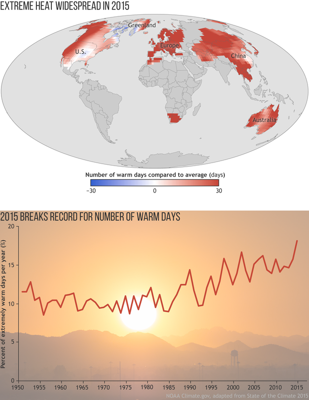
The map shows the frequency of warm days in 2015 compared to the long-term (1961-1990) average. For this analysis, days with temperatures warmer than 90 percent of the 1961-1990 seasonal record are considered “extremely warm days.” The graph shows the percent of days each year that were extremely warm. The year 2015 broke the record for the highest number of extremely warm days in the 66-year record (1.8 times more than the average number according to one dataset). Full story.
About the reportThe State of the Climate report series is the authoritative annual summary of the global climate. Published in the Bulletin of the American Meteorological Society, the report is edited by scientists at NOAA’s National Centers for Environmental Information. The 2015 report is based on contributions from more than 450 scientists from 62 countries, drawing on tens of thousands of measurements of Earth's climate. The report confirmed that 2015 surpassed 2014 as the warmest year since at least the mid-to-late 19th century. The record heat resulted from the combined influence of long-term global warming and one of the strongest El Niño events the globe has experienced since at least 1950. Most indicators of climate change continued to reflect trends consistent with a warming planet. Several markers, such as land and ocean temperatures, sea levels, and greenhouse gases, broke records set just one year prior. Browse the articles below to learn more about our changing planet. |
|
|
Interactive map of extreme events & anomaliesClimate scientists keep careful records of extreme events around the world to understand the type of climate hazards that different parts of the world are vulnerable to and whether those events are becoming more frequent or intense over time. From devastating cyclones to crippling drought, this map highlights the events that scientists from around the world decided should go down in the 2015 record books as the year's most significant. |
|
El Niño came, saw, and conqueredA record-smashing hurricane season in the central North Pacific. Water rationing in Puerto Rico. The biggest one-year jump in atmospheric carbon dioxide concentrations on record. Severe drought in Ethiopia. The hottest global surface temperature—by one of the largest margins—on record. Those are just a few of 2015’s major climate happenings documented in the recently released State of the Climate in 2015 report from NOAA and the American Meteorological Society. While the events were scattered across the globe, they all had one thing in common: they were all connected to one of the three strongest El Ninõs on record. |
|
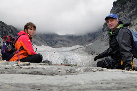
Father and daughter talk about their connection to climate, the wilderness of the North Cascades, and each otherGlacier scientist Mauri Pelto provides an annual update on the status of mountain glaciers each year for the State of the Climate report. This year, his daughter's climate-inspired watercolors appears on the report's covers. Pelto and his daughter, Jill, talk to NCEI's Deke Arndt about about how climate science keeps bringing their family together. |
|
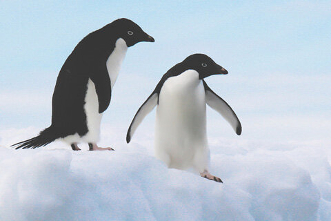
Warm oceans, loss of sea ice behind big changes in marine lifeLoss of sea ice is changing the behavior of Arctic walruses and causing huge declines in some Antarctic penguins species. Warm water fishes are driving polar species out of the Barents Sea. Report editor Jessica Blunden surveys some the dramatic changes in ocean life documented in the State of the Climate in 2015 report. |