Data Snapshots Image Gallery
Drought Monitor
- Dataset Details
- Weekly images from 2010 to present
- Download Directories
- Click on any of the links below to view a directory listing of images and assets related to this dataset.
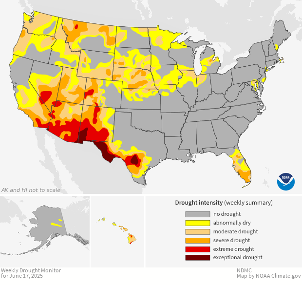
Colors show experts' assessments of conditions related to dryness and drought. These maps focus on broad-scale conditions, so local conditions may vary. Categories reflect how much water is available in streams, lakes, and soils compared to usual for the same time of year. The darker the shade on the map, the more intense the drought conditions.
For maps showing drought status in Alaska, Hawai'i, and other U.S. territories, please access the source data for this snapshot, the U.S. Drought Monitor.
Each week, drought experts consider how recent precipitation totals compare to their long-term averages. They check temperatures, moisture levels in soils, and water levels in streams and lakes. They also watch for indicators of drought such as vegetation stress. Altogether, experts check dozens of indicators to establish consensus for drought categories across the map. Before the weekly map is published, up to 350 people across the country review the draft to check it against reality. Each final map represents experts' best judgments of regional-scale drought conditions, validated by partners in the field.
Colors on the map show where the land is drier than usual for this time of year. Areas shown in yellow are Abnormally Dry. In general, this category indicates land that is going into or coming out of drought. Tan areas are experiencing Moderate Drought: water supplies may be low and damage may occur to crops and pastures. Orange areas are in Severe Drought: water shortages are common and crop and pasture losses are likely. Red areas are experiencing Extreme Drought. Areas in this category may experience widespread water shortages and major losses of crops and pastures; forests in these areas become dry and susceptible to fire. Dark red areas are in Exceptional Drought. Shortages of water in streams, reservoirs, and wells in these areas can lead to water emergencies. Failed crops, barren pastures, and tinder-dry forests may be widespread across these areas.
Most regions of the United States experience drought at least occasionally. Depending on its severity and duration, drought can devastate crops and forests, lead to shortages of food for livestock and wildlife, increase the risk of wildfires, and have a negative effect on local and regional economies. Weekly updates on drought status keep decision makers and natural resource managers informed of current conditions.
Data Snapshots are derivatives of existing data products. To meet the needs of a broad audience, we present the same data as current products in a simplified visual style. This set of snapshots is based on the U.S. Drought Monitor, which is jointly produced by the National Drought Mitigation Center (NDMC) at the University of Nebraska-Lincoln, the United States Department of Agriculture, and the National Oceanic and Atmospheric Administration. To produce these Drought maps, we run a script that accesses map layers from NMDC and assembles them on a prepared base map.
To view the original data in an interactive format, please visit the U.S. Drought Monitor.
References
- Source Data Product
- U.S. Drought Monitor
- Access to Source Data
- GIS Data Archive
- Reviewer
- Michael Brewer, NOAA National Centers for Environmental Information
