
Image caption
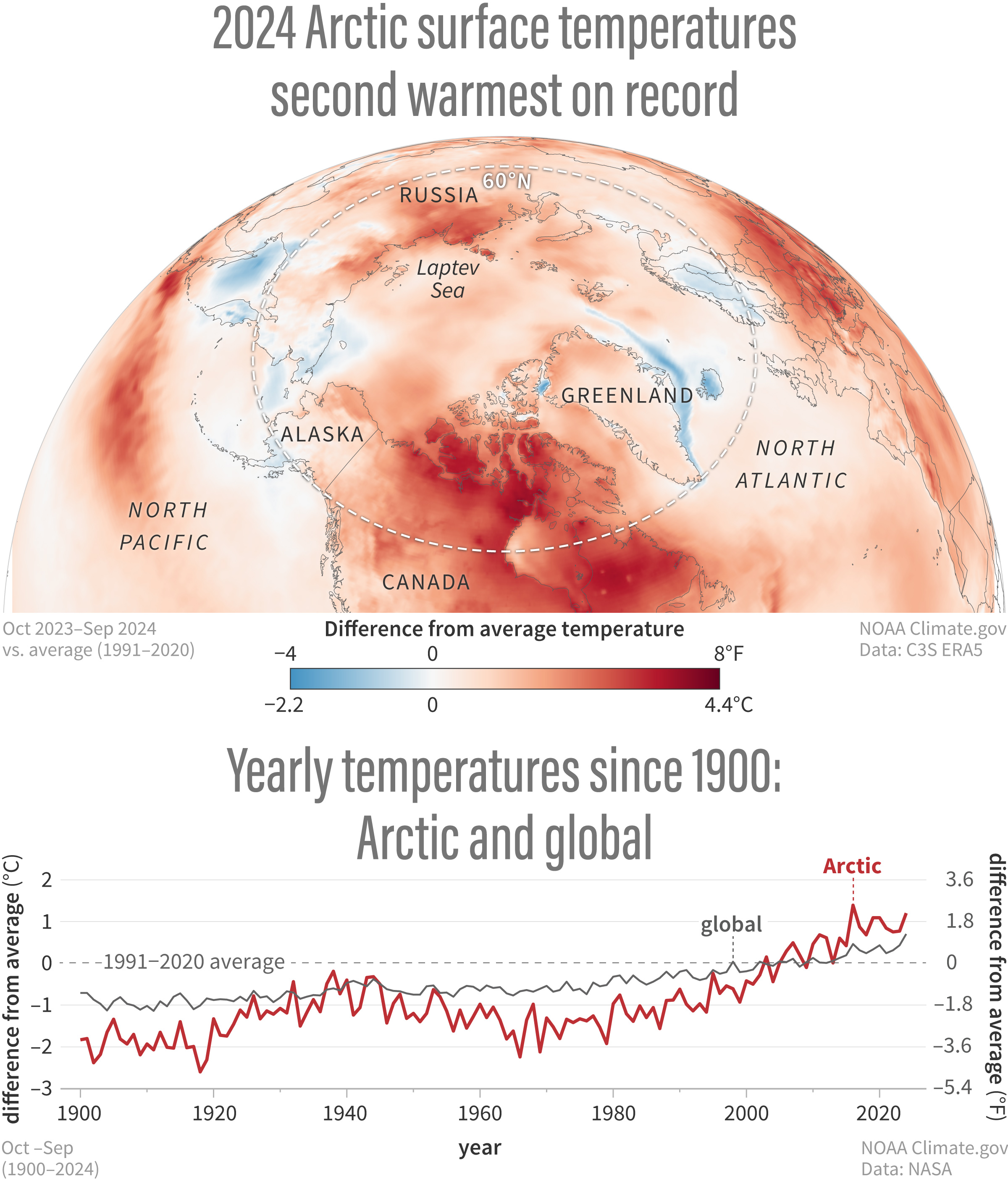
(top) Map of average air temperature across the Arctic for October 2023–September 2024 compared to the 1991–2020 average. Areas with warmer-than-average temperatures are orange and red, and areas with colder-than-average temperatures are blue. The graph shows how yearly Arctic (red line) and global (gray line) temperatures compared to the long-term average (1991-2020) from 1900–2024. NOAA Climate.gov image based on the 2024 Arctic Report Card - Surface Air Temperature. Large image & full story