
Image caption
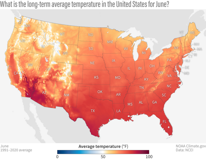
This map shows the long-term average temperature for June measured from 1991 to 2020. The map represents what is usual for June.
This map shows the long-term average temperature for June measured from 1991 to 2020. The map represents what is usual for June.