
Image caption
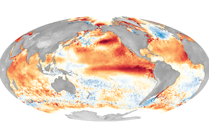
This sea surface temperature anomaly map (high temperatures in red, low temperatures in blue) shows a strong El Niño in 2016. Credit: NOAA
This sea surface temperature anomaly map (high temperatures in red, low temperatures in blue) shows a strong El Niño in 2016. Credit: NOAA