
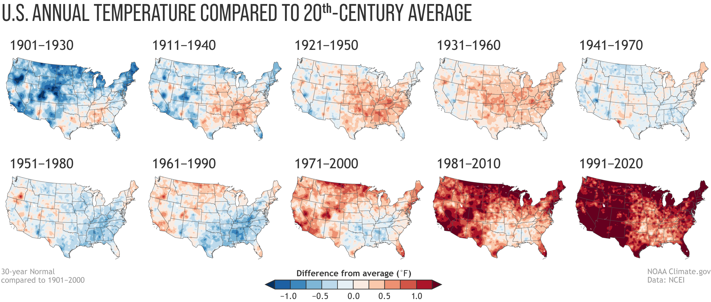
Image caption
Annual U.S. temperature compared to the 20th-century average for each U.S. Climate Normals period from 1901-1930 (upper left) to 1991-2020 (lower right). Places where the normal annual temperature was 1.25 degrees F or more colder than the 20th-century average are darkest blue; places where normal annual temperature was 1.25 degrees F or more warmer than the 20th-century average are darkest red. Maps by NOAA Climate.gov, based on analysis by Jared Rennie, North Carolina Institute for Climate Studies/NCEI. Individual maps available in a zip file.