Data Snapshots Image Gallery
Temperature - US Monthly Average
- Dataset Details
- Monthly images from 2000 to present
- Download Directories
- Click on any of the links below to view a directory listing of images and assets related to this dataset.
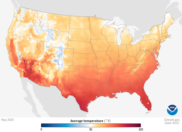
Colors show the average monthly temperature across the contiguous United States. White and very light areas had average temperatures near 50°F. Blue areas on the map were cooler than 50°F; the darker the blue, the cooler the average temperature. Orange to red areas were warmer than 50°F; the darker the shade, the warmer the monthly average temperature.
Daily temperature readings come from weather stations in the Global Historical Climatology Network (GHCN-D). Volunteer observers or automated instruments collect the highest and lowest temperature of the day at each station over the entire month, and submit them to the National Centers for Environmental Information (NCEI). After scientists check the quality of the data to omit any systematic errors, they calculate each station’s monthly average of daily mean temperatures, then plot it on a 5x5 km gridded map. To fill in the grid at locations without stations, a computer program interpolates (or estimates) values, accounting for the distribution of stations and various physical relationships, such as the way temperature changes with elevation. The resulting product is the NOAA Monthly U.S. Climate Gridded Dataset (NClimGrid).
Shades of blue show areas that had monthly average temperatures below 50°F. The darker the shade of blue, the lower the average temperature. Areas shown in shades of orange and red had average temperatures above 50°F. The darker the shade of orange or red, the higher the average temperature. White or very light colors show areas where the average temperature was near 50°F.
The 5x5km NClimGrid data allow scientists to report on recent temperature conditions and track long-term trends at a variety of spatial scales. The gridded cells are used to create statewide, regional and national snapshots of climate conditions. Energy companies use this information to estimate demand for heating and air conditioning. Agricultural businesses also use these data to optimize timing of planting, harvesting, and putting livestock to pasture.
Data Snapshots are derivatives of existing data products; to meet the needs of a broad audience, we present the source data in a simplified visual style. This set of snapshots is based on NClimGrid climate data produced by and available from the National Centers for Environmental Information (NCEI). To produce our images, we invoke a set of scripts that access the source data and represent them according to our selected color ramps on our base maps.
The data used in these snapshots can be downloaded from different places and in different formats. We used these specific data sources:
References
NOAA Monthly U.S. Climate Gridded Dataset (NClimGrid)
NOAA Monthly U.S. Climate Divisional Database (NClimDiv)
Improved Historical Temperature and Precipitation Time Series for U.S. Climate Divisions)
NCEI Monthly National Analysis)
Climate at a Glance - Data Information)
NCEI Climate Monitoring - All Products
- Data Provider
- National Centers for Environmental Information (NCEI)
- Source Data Product
- NOAA Monthly U.S. Climate Gridded Dataset (NClimGrid)
- Access to Source Data
- NCEI direct HTTPS download
- Reviewer
- Chris Fenimore, National Centers for Environmental Information
