Seasonal Verification Part 3: Verify with a Vengeance...This time it's probabilistic.
In my first installment about seasonal verification, I showed how using our eyes to verify seasonal forecasts is easy, but can be misleading—so it is often better to use “metrics” to grade our forecasts and see how well they did. Part 2 looked more closely at one such way to grade our forecasts, called the Heidke Skill Score (HSS). The HSS breaks down the forecast into grid boxes spanning the United States, and then for each grid box showing the forecasted category (above-normal, near-normal, below-normal) with the highest probability, we check how often the forecast was the same as reality.
As a refresher, please check out the first figure in my last post. If movie trilogies have taught me anything, it’s that by the last part in the series, you have to recycle previous plot points or images to keep things interesting. There we saw what the forecasts looked like if each grid box represented the category with the highest forecast probability, as well as what the HSS was for each forecast (click the tabs to toggle between the maps and scores). Any score > 0 means the forecast was better than a random guess.
The Climate Prediction Center (CPC) does not issue seasonal forecasts that look this way. Instead, CPC seasonal forecasts show different probabilities for each forecast category (above-normal, below-normal, near-normal). The HSS ignores probabilities. As defined in the previous blog post, if the forecast shows a 40 percent chance of above normal, 33 percent chance of near normal, and a 27 percent chance for below normal, the HSS evaluates the forecast as if it is instead a forecast for 100 percent chance of above-normal temperatures. Obviously, this is a drawback. It’s like going to see your first place hockey team play (Go Islanders!), a team that wins far more often than they lose, and being shocked if they are defeated. You cannot disregard the opposing, albeit smaller, probabilities.
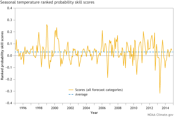
Figure 1. Ranked Probability Skill Score (RPSS) time series averaged over the United States for every CPC seasonal temperature forecast from 1995 to present for the half-month lead time. On average, Ranked Probability Skill Scores are above 0 (to be more exact, about 0.02 for RPSS, as seen from the horizontal dotted lines), representing positive skill over random chance. Graphic by Fiona Martin for NOAA Climate.gov.
Scientists have metrics that DO take probabilities into account. The CPC uses one called the Ranked Probability Skill Score. Similar to the Heidke Skill Score, the Ranked Probability Skill Score boils down the skill of the forecasts into a single number. However, it is different from the Heidke, because it takes into account the forecasted probabilities. The ranked probability approach looks at not only the forecast for the highest probability category, but also the forecasts for, in the case mentioned above, the other two categories as well (1). As such, the Ranked Probability Skill Score will penalize a forecast more if it is off by more than one category.
For example, say the highest forecast probability is for above-normal temperatures, and below-normal temperatures occur. The forecast was two categories off: if near-normal temperatures had occurred, it would have been only one category off. This wrinkle is shrugged off when using the Heidke Skill Score because it interprets the forecast as either right or wrong. It does not consider the level of wrongness (2).
Figure 1 shows the Ranked Probability Skill Score for all CPC seasonal temperature forecasts dating back to 1995. On this graph, a score less than zero would mean the forecast is worse than random chance. The average score over this entire period is slightly above zero, which means the forecasts show value compared to assuming a random 33.3 percent chance of any category (Figure 2). However, significant noisiness in the data reflects times when the scores were significantly higher or lower than zero (3).
If we put these scores onto a map of the United States (Figure 2), the Ranked Probability patterns are similar to the Heidke scores, where the highest values are located over the southwest U.S. and the lowest values are over the Central Plains.
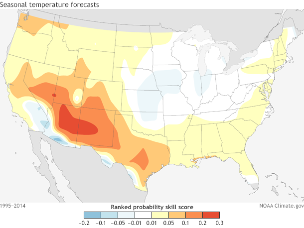
Figure 2. Ranked Probability Skill Score (RPSS) spatial map over the United States for CPC seasonal forecasts made from 1995-2014. On average, Ranked Probability Skill Scores are above 0 over much of the southwest U.S. while near zero or slightly below zero over the Central Plains. You can play around with these verification metrics yourself here and here.
The Ranked Probability Skill Score is by far the simplest way to evaluate probabilistic outlooks, but we still lose out on a ton of information that could be useful for forecasters and users. For instance, the Ranked Probability Skill Score does not actually tell you how accurate forecast probabilities are. If the forecast calls for a 40 percent chance of above-normal temperatures, do above-normal temperatures occur 40 percent of the time? How reliable are those numbers?
To answer that question, we must create the aptly named Reliability Diagram (Figure 4), which we also discussed here. Reliability diagrams compare the forecasted probabilities (x-axis) to what actually happened over the historical record (y-axis). Ideally, a perfectly reliable forecast would fall along a diagonal line where the x-axis and y-axis values are exactly the same: when the forecast says “40 percent chance of above-normal temperatures”, nature would give us above-normal temperatures 40 percent of the time.
Figure 3 shows a Reliability Diagram for CPC seasonal forecasts of above-normal and below-normal temperatures from 1995-2014 (4) (adapted from Peng et. al (2012)). For above-normal temperatures, forecasters tended to forecast lower probabilities than what actually occurred. For instance, when forecast probabilities were 37 percent (or .37), above-normal temperatures occurred almost half the time in reality (50 percent or .5). This was true for most forecasted probabilities, indicating that we “underforecast” the above-normal category.
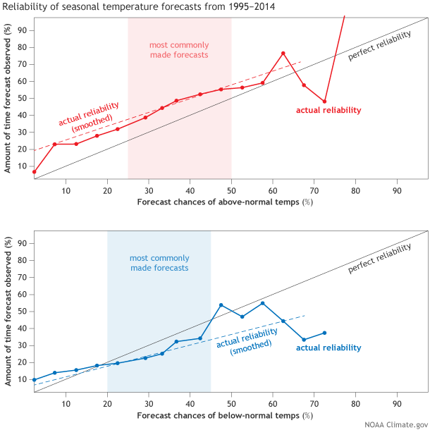
Figure 3. Reliability diagram for above-normal (top) and below normal (bottom) categories for all seasons and grid points of CPC seasonal surface temperatures forecasts from 1995-2014. Shaded areas represent forecast probabilities that were issued the most often. Most forecasts involved probabilities around .333 (33.3%). Very rarely did forecast probabilities exceed 0.5 (50%). This leads to noisier data at both high and low forecast probabilities. The dashed line is a weighted linear regression of the bold line in each diagram. Graphic by Fiona Martin for NOAA Climate.gov.
The exact opposite was true for below-normal temperatures, as overforecasting was prevalent. We tended to predict more below-normal temperatures would occur than actually happened (5). Overall, even though forecasts tended to be underforecast for above-normal temperatures and overforecast for below-normal temperatures, the forecasts were consistent, regardless of the forecasted probabilities (6). While not perfect, the seasonal forecasts are generally reliable, which can be useful for end-users who need to make decisions on particular probability thresholds, like buying more energy if winter seasonal forecasts for below-normal temperatures are greater than 50 percent.
These are just a few ways to evaluate seasonal forecasts, from our eyes to the Heidke Skill Score to the Ranked Probability Skill Score to Reliability Diagrams. And there are even more metrics that could be used. A key point in all of this is that every method of grading forecasts has its pluses and minuses. No one metric should be used exclusively but instead as one piece in the puzzle of figuring out where the forecasts fail and where they could be improved. If you are interested in playing around with some of these metrics, be sure to check out CPC verification summaries and webtools here and here. Let us know what you find out in the comments below!
Footnotes
(1) Check out this explanation of Ranked Probability Skill Score (RPSS) and other metrics from the IRI website for a more in-depth look at how the metric is calculated. In essence, the RPSS is the sum of the squared differences computed with respect to the cumulative probabilities. For example, if the forecast has a 27 percent chance for below-normal temperatures, 33 percent chance for near normal, and 40 percent chance for above normal, and above-average temperatures are observed, the RPSS is calculated as the sum of the squared differences between (0.27-0), (0.6-0) and (1-1). Here, 0.6 is the sum of 0.27 and 0.33.
(2) The RPSS is similar to the HSS in that both metrics compare the forecasts to a baseline climatology forecast, which in this case is a 33.3 percent chance for all three categories. If the forecasts are better than assuming an equal chance between the three categories, then the RPSS is positive. If random chance is better than the forecast, the RPSS is negative.
(3) While the RPSS time series values are low, it is important to note that RPSS is a demanding skill score. High values are only obtained if a forecaster gives probabilities much closer to 0 percent or 100 percent. This simply cannot be done with climate forecasts as the level of uncertainty is too high. Smaller values of RPSS are to be expected for seasonal climate forecasts.
(4) Immediately you will notice that there are not many instances where forecast probabilities were higher than 0.6 (60 percent) or lower than 0.2 (20 percent). This lack of sample size leads to noisy signals for both high and low forecast probabilities on the x-axis. The clearest signal is located where the sample size is the largest, as noted by the shading in figure 3.
(5) When above-normal forecasts are “underforecast” and below-normal forecasts are “overforecast,” it reflects a cold bias amongst the forecasters. We forecasted conditions consistently colder than actually occurred.
(6) By consistent, I mean that regardless of forecast probabilities, the underforecast (overforecast) errors are consistent for above-normal (below-normal) temperatures. This is represented in the nearly similar slope to the black linear line of the two dotted lines that represent the above-normal and below-normal forecasts. These dotted lines were calculated using least squares linear regression that is weighted by forecast probability bin because there is not an equal distribution of forecast probabilities. For example, there are a lot more forecasts for 33.3 percent than there are for 75 percent. In addition, in forecast probabilities with a large number of cases (30-50 percent), there is consistency in that higher forecast probabilities are associated with a higher likelihood that observations match the forecast (i.e. as x-axis values increase, so do y-axis values, or as forecast probabilities increase, so do the probabilities that reality will be the same as the forecast).
References
Peitao Peng, Arun Kumar, Michael S. Halpert, and Anthony G. Barnston, 2012: An Analysis of CPC’s Operational 0.5-Month Lead Seasonal Outlooks. Wea. Forecasting, 27, 898–917.
Comments
wow
RE: wow
Add new comment | NOAA Climate.gov
Wow that was strange. I just wrote an incredibly long comment but after I clicked
submit my comment didn't appear. Grrrr... well I'm not writing all that over again.
Regardless, just wanted to say fantastic blog!
A post on the verification of
A post on the verification of the December 2014 - February 2015 forecast from the Climate Prediction Center will be published later in March.
Comments have been disabled on this article