How much did El Niño influence precipitation over the United States this past winter?
Last November, I wrote about how a strong El Niño might shape precipitation over the U.S. this winter (December – February). So, what happened? With crocuses now starting to bloom and the chirps of spring peepers in full chorus, we’re ready to investigate!
An El Niño-ish big picture
First, let’s acknowledge that a strong El Niño occurred this winter, as NOAA had been forecasting since issuing an El Niño Watch in April 2023. (If we couldn’t check that box, this would be a very short post!) We unofficially consider El Niño to be “strong” when the Oceanic Niño Index (ONI) exceeds 1.5 °C (2.7 °F), and the ONI value for this past December – February was well above that threshold at 1.8 °C.
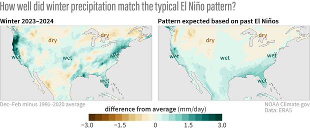
(left to right) The precipitation difference from average for this past winter (Dec-Feb 2023-24) and the geographic pattern of precipitation we'd expect for this past winter based on past El Niño winters from 1952-2022. The precipitation pattern for this past winter is a reasonably good match to the El Niño pattern. NOAA Climate.gov image, based on analysis by Nat Johnson.
What happened with precipitation around the contiguous U.S.? Winter was wetter than normal overall, and as the map above and to the left indicates, wetter conditions were most pronounced across coastal areas, especially the West and Gulf Coasts and from the Mid-Atlantic to the Northeast. Wetter conditions also prevailed over most of the Central and Northern Plains. Drier-than-average conditions were much less expansive, but below-normal precipitation occurred around the Northern Rockies and portions of the south-central U.S. and extending southward into northern Mexico.
How much influence did El Niño have? If we compare the actual precipitation map for this winter with the expected winter El Niño precipitation pattern (1) to its right, we see a lot of similarities! In particular, the shifts in the jet stream induced by El Niño bring wetter conditions to the southern tier of the U.S., especially in California and the Southeast (with some mind-boggling atmospheric river events observed in California in particular).
At least by eye, we can affirm a decent match with the expected El Niño influence, but we’re scientists, so subjectivity alone isn’t going to cut it. To quantify the match between the actual and expected El Niño precipitation pattern, I will use a measure I used last November called the pattern correlation. To recap, values can range from -1 to +1, with values closer to +1 indicating a good match between the observations and typical El Niño pattern, values near 0 indicating no match, and negative values closer to -1 indicating an inverse match (observations look more like La Niña!). For some historical context, the pattern correlations between observations and the expected El Niño winter precipitation are shown below for all moderate-to-strong El Niños since 1950 (ONI values equal to or greater than 1.0 °C).
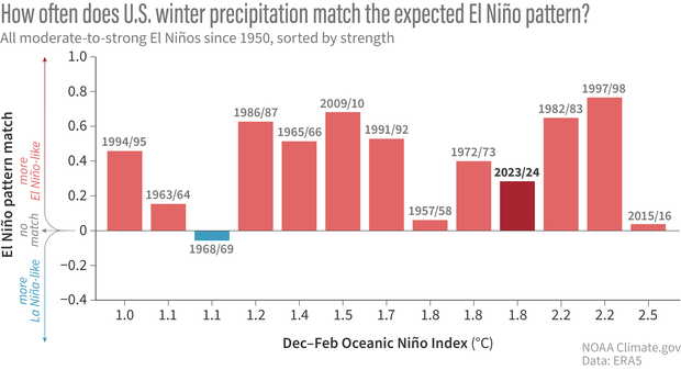
One way to evaluate how well the observed winter precipitation pattern matched the typical El Niño pattern is to calculate an overall correlation "score" that describes how well the two patterns matched. A score of 1 means a perfect match, a score of 0 means no match at all, and a score of -1 means an inverse match, or a mirror image, such as you might expect to see during a La Niña winter. The plot above shows these correlation scores for all moderate-to-strong El Niños since 1950. Almost all moderate-to-strong Niños, including the winter of 2023/24, had a score well above zero, indicating that the actual winter precipitation pattern was a reasonably good match to the typical El Niño pattern. NOAA Climate.gov image, adapted from original by Nat Johnson.
This past winter the pattern correlation was positive and around 0.3, which is a reasonably good match between what we saw and the expected El Niño precipitation pattern. Moreover, most previous moderate-to-strong El Niños matched the expected pattern at least as well as in 2023/24. There are some exceptions, like the winters of 1968/69, 1957/58, and most recently 2015/16, but the figure above supports the general rule that El Niño’s fingerprints are conspicuous whenever El Niño is at least of moderate strength.
What about the differences?
Of course, we shouldn’t just sweep the mismatches under the rug. There were many backyards this winter that did not experience the typical precipitation impacts for an El Niño of this strength. In particular, the Pacific Northwest and Northeast were considerably wetter than the expected El Niño pattern, while portions of the southern tier from southern Texas to the Southeast were notably drier.
So, why did we experience these deviations from the expected El Niño precipitation pattern? And, perhaps more importantly, were there other climate signals that were predictable? The answers to these questions require more thorough analysis than I can provide here, and I’m sure that scientists will try to come up with the answers in the coming months and years ahead (stay tuned for next month’s post!). Nevertheless, we can take a stab at seeking some early clues.
Fluttering butterflies?
We first have to consider the most boring and most frustrating possible culprit for the discrepancy – the chaos of weather or internal variability. Recall that when we consider our computer climate models – like from the North American Multi-Model Ensemble (NMME) – we look at the average of up to hundreds of individual forecast maps. This average, called the ensemble mean, filters out the influence of seasonally unpredictable, random weather and retains the seasonably predictable signal, like from ENSO. The NMME average forecast for this winter (2), shown in the top left below, closely resembles the expected El Niño precipitation pattern and features similarities with this past winter.
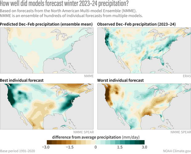
(top, left to right) The precipitation forecast for this coming winter (Dec-Feb 2023-24) based on the average of all the individual models in the North American Multi-Model Ensemble forecast system. The actual precipitation difference from average for this past winter. (bottom, left to right) An individual model forecast that is a very good match to what actually occurred. An individual model forecast that deviates significantly from what occurred. NOAA Climate.gov image, based on analysis by Nat Johnson.
However, if we look at the hundreds of individual forecast maps that went into the ensemble mean, we see the influence of chaotic weather that can either support or oppose the pattern that actually occurred. In fact, if we search the 300+ forecast maps to find the one that best matched the actual pattern this winter (bottom left above), we see that it captured many notable features of this winter, including the very wet conditions in the Pacific Northwest, Mid-Atlantic, and Northeast.
Don’t be fooled, however – there was no way to know, in advance, that that prediction, out of the 300+ maps, would be the “best” one! We know this because we can find the worst-matching pattern (bottom right above), and we see a nearly opposite pattern, with a dry West Coast and Northeast! Both the best and worst forecasts were run in the same model forecasting system with the same El Niño, so most differences are likely attributable to the noise of random weather or internal variability.
Searching for a melody beneath the noise
Just because random, internal variability could be responsible for most of the differences between this past winter and the El Niño pattern, that doesn’t mean we’ve reached the end of our story. It’s still possible that some of the differences could be caused by other predictable factors, such as ENSO flavors, other climate phenomena, or long-term trends. One way to get an inkling of this possibility is to compare the NMME average forecast (ensemble mean) with the expected El Niño precipitation pattern. Because the NMME average has filtered out the effects of random weather, differences should be attributable to factors that are seasonally predictable, at least in climate model world.
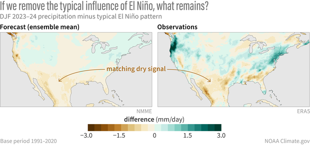
(left) The difference between the North American Multi-Model Ensemble average precipitation forecast for this winter (Dec – Feb 2023-2024) and the pattern of precipitation we'd expect for this past winter based on past El Niño winters from 1952-2022. (right) The difference between the observed precipitation pattern for this past winter and the pattern we’d expect based on past El Niño winters. The matching dry signal over the south-central U.S. and Mexico suggests that these drier conditions may have been predictable more than a season in advance. NOAA Climate.gov image, based on analysis by Nat Johnson.
When we look at the observed deviations from the expected winter El Niño precipitation pattern in both observations (above, right) and the NMME average (above, left), we do, in fact, see some similarities! In particular, the NMME forecast indicated drier conditions over the southern tier of the U.S. and Mexico than we would expect for an El Niño of the strength that occurred. This suggests that the unusually dry conditions in this region may relate to a seasonally predictable signal beyond ENSO. We cannot rule out that some of the other observed deviations also may have been predictable but that our current forecast models were not up to the task – our models are improving but they’re still far from perfect! (3)
As mentioned above, it will take more digging to understand what factors may have resulted in any predictable deviations from the classic El Niño precipitation pattern this past winter. We’re in luck because next month Michelle will share some recent work by Dr. Clara Deser and Dr. Stephen Yeager that sheds some more light on what else might have been predictable alongside El Niño. I’m excited about this, so you definitely will want to check back next month!
Footnotes
- As in my November post, I calculated the “expected winter El Niño precipitation pattern” as the linear regression of December-February precipitation anomalies on the Niño-3.4 index from 1952-2022. This gives a map of precipitation anomalies (in mm/day) per change in the Niño-3.4 index (in °C). The difference between my calculation here and in the November post is that here I then multiplied the regression map by the observed Niño-3.4 index for this past winter (1.8 °C) so that the map is now scaled by strength of the El Niño that actually occurred. Therefore, the expected winter El Niño precipitation pattern represents the precipitation anomalies we would expect for an El Niño of the strength that just occurred, and we can make an apples-to-apples comparison with the observed precipitation pattern.
- As I wrote in November, I averaged all the forecasts produced in September, October, and November of this year from 7 different NMME models. Each model has a set of forecasts (ranging from 10 to 30) with slightly different initial conditions to sample the different possible realizations of chaotic weather variability. The NMME precipitation map was produced by averaging 324 individual forecast maps (108 for each of September, October, and November).
- Note that the NMME also predicted drier conditions along the West Coast that did not actually occur. It is not clear if this model error is a result of random weather variability or a seasonally predictable signal that the models did not correctly capture.
Comments
Comment policy
Welcome! Comments must be on-topic and free of profanity, personal attacks, and links to irrelevant websites. In addition, we do not publish comments that spread false or misleading information about climate.
Will this predicted storm…
Will this predicted storm for central, and Southern California, which looks significant, the factored into the winner of 23 and 24?
winter verification
No, I only considered the December - February 3-month season to be consistent with NOAA's Winter Outlook, so any precipitation falling after February 29th is not factored into the analysis. But you raise a good point - the influence of El Nino on western U.S. precipitation extends beyond February, and I believe the relationship is even stronger in March than in December. So, we should expect that the influence of El Nino is not quite done yet.
Summer 2024
Is there much of a relationship between strong El Nino's in the past winter and the precipitation/temperature conditions in the following spring/summer? We are particularly interested in the U.S. Pacific Northwest up to Vancouver Island, BC.
Brian Brettschneider has…
Brian Brettschneider has done some analysis on this... I'll see if I can get him to comment here. Stay tuned.
Spring Conditions
Looking at the 10 cases of spring conditions following a strong El Nino (since 1940), there is a strong signal for below normal temperatures in the southern half of the Conus and above normal temperatures in the northern Conus. In fact, parts of central Texas were below the (detrended) average in all 10 springs following a strong El Nino. For precipitation, the only place with a strong signal is the desert Southwest. The area south of a line from San Francisco to Las Vegas to Albuquerque to El Paso has very wet springs following a strong El Nino.
Request
This post was both interesting and informative, especially with seeing how the area I live (eastern Oklahoma) might well have been even drier than it was this past winter had it not been for El Nino. And, I look forward to getting a better idea of what else might have been influencing the weather of this area this past winter.
Now, my request is this. Either this blog or the polar vortex one once featured an animation showing average temperatures over the previous week and then month and gradually forwarding it, day by day. It was really interesting, plus seeing longer averages helped to minimize how much day-to-day variability there was. So, would you mind including something like that to show temperatures and precipitation this past winter for the United States? It would make it easier to see the effects of El Nino this past winter.
Thanks for reading this, and I look forward to hearing from you.
It's a fun idea but not…
It's a fun idea but not sure how to implement... I created these animations using python and some download data from other agencies. But it is not set up to run every day and is manual. We'll keep this in mind for future posts though.
Interpretation of the final graphic in the article.
I have questions about the final graphic. The Legend and the Caption do not seem to agree. Perhaps I am confused.
Can you clarify a bit more?
Can you clarify a bit more?
final graphic
Yes, I see there was a problem with the structure of the caption. I have fixed it. Basically, each map shows the result of subtracting the out the typical El Niño influence. Subtracting out the typical El Niño influence from the observations shows us the "competing influences" that shaped the precip pattern. We see that there is a dry signal over the Southwest and Mexico.
The question for forecasters is whether that dry influence was "internal variability" (i.e. chaotic, unpredictable at the start of the season) or if it might reflect some other seasonal influence besides El Niño that might have been predictable in advance. To start to answer that question, we can look at what the forecast would have looked like if we subtract out the typical El Niño influence. That is what the left hand map shows. Here, we also see the same dry signal over the Southwest and Mexico that we see in the observations. This suggests that before the season began, the models picked up on something operating in the climate system that favored dry conditions over that area, something predictable at the start of the season that was working against the wet influence that El Niño typically has in that area.
Well done
Thanks for this outstanding summary.
PDO
We have been in a deep and prolonged state of negative PDO that we cannot seem to shake. It seems this would have had an effect on the lower than expected precipitation levels in the southwest and south central US.
I see what you mean for the…
I see what you mean for the index, but I have to admit I don't think it's a great match with the PDO. A negative PDO would be conducive to below-average SSTs near the West Coast and right now those are above-average. You may be interested in our article on the PDO here.
West CA SST
You're right about our local SST off the coast of Cali being above average, as shown in you're link. It seems our typical NW winds are running late but recently have been trying to get established. Winter seemed to linger a bit longer this year, maybe El Nino did that. The upwelling caused by the NW winds is just starting now. Maybe we'll be closer to normal by the end of May.
I beg to differ Michelle.....
That the oceans around the World are warming that much. The PDO has been negative since the last La Nina event. If you would please, why look at the anomaly SST map ? I look at the current SST map, and it clearly shows cold waters off the West Coast, therefore a negative PDO, which indicates La Nina not El Nino.
Please share which SST map…
Please share which SST map you are referring to. If you are looking at the actual SSTs, it makes sense that waters off the West Coast would be cooler due to the Humboldt current.
Add new comment