Déjà Vu: El Niño Take Two
Here we are—in March 2015—and we’ve got...
- above-average temperatures in the subsurface equatorial Pacific.
- westerly wind anomalies near the surface across the western tropical Pacific Ocean.
- El Niño favored through the Northern Hemisphere Summer with a 50-60% chance (see March 5th ENSO update and blog post).
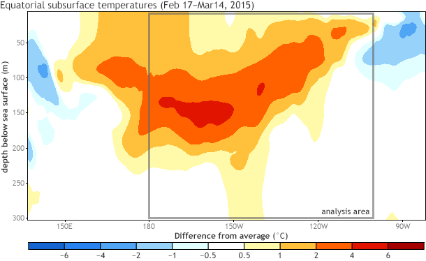
Subsurface (0-300 meters) temperature in the equatorial Pacific from February 17-March 14, 2015, compared to the 1981-2010 average. The gray box outlines the area used for the scatterplot analysis described below. Map based on data from the NCEP Global Ocean Data Assimilation System (GODAS).
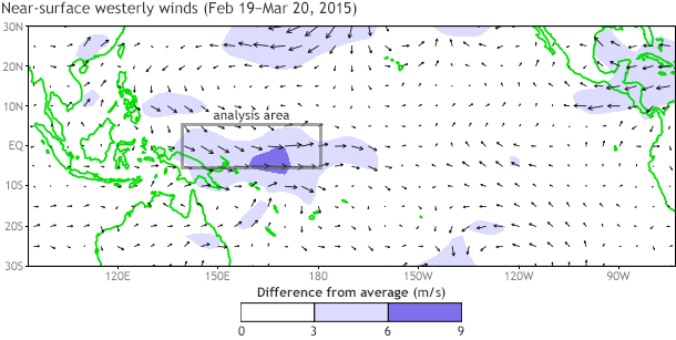
Near-surface winds (850-hPa) from February 19-March 20, 2015, compared to the 1981-2010 average, with a gray box outlining the region used for the scatterplot analysis described below. Map based on NCEP/NCAR Reanalysis-1 data.
Unbelievably, it was exactly last year at this time (March 2014) when we were watching the progress of a strong downwelling Kelvin wave crossing the equatorial Pacific (#1), in part driven by westerly wind anomalies (#2), and some folks were getting excited about a potentially strong El Niño by the end of 2014 (#3). It’s similar enough to have us rubbing our eyes and double-checking the year on the calendar.
But there is one big difference this year: sea surface temperatures are quite warm. Last year, we were coming out of relatively cool state in the tropical Pacific Ocean. And last month, due to the emergence of favorable atmospheric indicators, NOAA CPC/IRI issued an El Niño Advisory, meaning that El Niño conditions are now in place. So, surely, this means we can be more confident that El Niño will continue this winter and maybe even strengthen. Right?
Not so fast. March is a bit early in the year to say anything with confidence about the coming winter. Should you keep one eye open and start hedging your bets? Well, certainly. This is why we routinely provide forecast probabilities in CPC/IRI monthly updates.
Can we predict winter El Niño from March wind and ocean anomalies?
In this post, I’m going to demonstrate that March observations of low-level winds and subsurface ocean temperatures are not generally sufficient to predict ENSO with confidence during the coming winter. This was the case in March 2014 and it’s similarly true in March 2015.
How did I come to that conclusion? Well, let’s start with an analogy. Say you are a student and your teacher asks you “why did you fail the test?” Well, maybe the fact you were hungry explains 30% of why you failed, that you didn’t study enough explains about 50% of your failure, and finally, the fact you were slightly tired explains the final 20% of the failure (sums to 100%).
We do the same type of analysis in climate prediction, asking ourselves what factors have to be in place and how much each one contributes to the final El Niño outcome. Our goal is to get as close as we can to accounting for 100% of the variations in ENSO (as measured by the up and downs of the Niño-3.4 SST index or ONI), or at the very least, finding something that explains a big percentage of the variance.
Instead, what we see is that the western Pacific winds and subsurface temperatures in the eastern half of the tropical Pacific Ocean – for March – explain only about a quarter to a third (~25-33%) of the coming winter ENSO state. That’s not nothing, and it could certainly help to grow El Niño, but it’s far from a foregone conclusion: there are still plenty of innings left to play in the ballgame.
The figures below show where the 25-33% estimate comes from. The y-axis is the wintertime (November-January) ONI value (ENSO) in degrees Celsius. The x-axis is the previous March values of subsurface temperatures and near-surface winds shown as departures from the average state for certain regions (1). Positive numbers represent above-average temperatures or anomalous westerly winds (winds that blow from west-to-east) (2). Negative numbers represent below-average temperatures or anomalous easterly winds. Each dot depicts a specific year between 1980-2014.
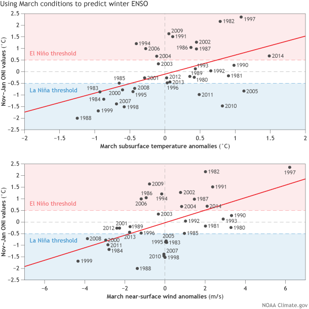
Winter (November-January) Oceanic Niño Index (ONI) values (vertical axis) shown against March subsurface temperature anomalies (horizontal axis in top panel) and March near-surface wind anomalies across the western tropical Pacific (horizontal axis in bottom panel). Each dot represents the value for a particular year (1980-2014) corresponding to March and November-December. The ONI is one ENSO index that is used to determine El Niño and La Niña states, which are shaded in red and blue (note: there are others). The ONI is based on NOAA ERSSTv3b data. See footnote #1 for more details on other datasets used. The solid red line is based on least-squares linear regression (see footnote #3).
I’ve also drawn a straight red line that fits the data as well as I can (3). The red line is a simple model based on history. One very simple prediction would be to use that red line to guess what ENSO is going to do this winter. For example, after March is over, you would use this chart to draw a vertical line from the x-axis value representing March 2015. Where your line hits the red line, you then draw a horizontal line to the y-axis, which gives you your prediction of the winter ENSO state (for just one index, the ONI).
However, it is important to notice that not all dots arrange themselves exactly on that red line and there is substantial scatter around the red line, which means that, in reality, a large range of ENSO states (ONI values) have resulted from a particular wind or subsurface temperature value on the x-axis (4).
So, for a specific March value of winds or subsurface temperatures, we can bet on some range of different ENSO outcomes the following winter. Correlations between wind and temperature are both around r = 0.5, which means one quarter of the total wintertime ENSO fluctuations can be explained using these particular March conditions (0.52 × 100 = 25%).
Some of you might correctly note that the combination of both winds and the subsurface temperatures would improve the correlation. And it does (details in footnote #5) but only to 0.6 (~36% explained). While not shown here, I also played around with various aspects of March sea surface temperatures on the equator and found they were not significantly correlated with winter ENSO either (6).
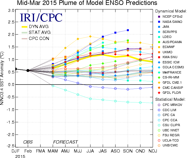
While the example above might be instructive as a first guess, for prediction we rely on more sophisticated state-of-the-art models to convey our level of certainty about ENSO. These models can take into account many aspects of the atmosphere and ocean at different locations simultaneously and then use equations of our physical system to render a set of possibilities. And, not surprisingly, as of now, those prediction models indicate a range of potential outcomes into the coming winter.
So, while it’s tempting to be fixate on a wind burst event or an oceanic Kelvin wave in the tropical Pacific and compare it to a similar big El Niño event in the past, the large scatter in these figures show that El Niño this coming winter is still not inevitable. Still, it’s fun to speculate and bet on what may happen!
Footnotes:
(1) I’m averaging together regions that are known predictors of ENSO and are based on the location of anomalous winds and subsurface temperatures that are currently present in the most recent 30-day average. Near-surface winds (at 925hPa level) are averaged on the equator (5°S-5°N) in the western Pacific (140°E-180°), and subsurface temperatures are averaged on the equator (0°) in the eastern Pacific (180° – 100°W) and from a depth extending from the surface down to 300m. Data is from NCEP/NCAR Reanalysis-1 and NCEP Global Ocean Data Assimilation System (GODAS). The anomalies are formed by subtracting the monthly mean 1981-2010 average.
(2) Note that because there are usually trade winds (winds that blow from east to west), weaker than average trade winds mean anomalous westerly winds (positive values).
(3) This is a method called least-squares linear regression, a simple but powerful method to understand data. It is fundamental to making statistical predictions. Many more sophisticated statistical models of ENSO are based on principles of linear regression (see Tippett et al. 2008). The line is drawn to minimize the squared error, which basically means we’re picking a path for the line that makes the distance between the red line and all of the dots is as small as we can get it.
(4) If all the dots were to hypothetically lie perfectly on the line, then we would be able to perfectly predict the coming winter ENSO using March conditions (r = 1.0 meaning 100% of variability is explained by March wind and ocean anomalies). The “explained variance” is calculated as 100 × r2. Finding high correlations between two variables is certainly ideal for prediction, but the discovery of high correlations should be questioned because it is possible to cherry pick the data in order to scavenge out the best fitting prediction model. This is called over-fitting and over-fit models generally do badly when used to make new predictions. This is why we also want to have some understanding of the physical relationship between those variables.
(5) In the figure below I standardized both indexes of wind and subsurface temperature and then applied multiple linear regression to obtain a “combined” index value. So the combination index (y) is based on y = 0.30×Temp + 0.43×Wind (I know… probably TMI).
![]()
(6) I looked at basin wide average, zonal gradients, and regional averages of SST. This isn’t to rule out that some surface SST configuration could provide predictive value, but I could not find one on the immediate equator. However, there is a lot of work that has focused on off-equatorial precursor patterns (e.g. Vimont et al., 2001, Pegion and Alexander, 2013), which we plan to address in future blog posts.
References:
Pegion and Alexander, 2013: The seasonal footprinting mechanism in CFSv2: simulation and impact on ENSO prediction. Clim. Dynam, 41, 1671-1683.
Tippett, DelSole, Mason, and Barnston, 2008: Regression Based Methods for Finding Coupled Patterns. J. Climate, 21, 4384-4398.
Vimont DJ, Battisti DS, Hirst AC (2001) Footprinting: a seasonal connection between the tropics and mid-latitudes. Geophys Res Lett 28:3923–3926
Comments
1997
probably TMI
Déjà Vu: El Niño Take Two
RE: Déjà Vu: El Niño Take Two
While the dots are not colored, the backdrop shading provides information on whether the ONI threshold was met for the single season (Nov-Jan). Red shading denotes El Nino thresholds. Blue shading denotes La Nina thresholds. That doesn't mean it was considered part of an longer ENSO episode however, but it gives some some sense. Thanks.
Good stuff
variance
More about El Nino Prediction
Under subsurface conditions
Data before 1980?
RE: Data before 1980?
The points are roughly distributed into 1/3 El Nino, 1/3 neutral, and 1/3 La Nina mostly because the threshold (+/-0.5 degree Nino3.4 index) is close to the boundaries delimiting the upper, middle, and lower thirds of the available data. Your interpretation of the data is correct, but you make an important point when you mention the limited data. It's too limited to make a very confident statement, but does give us an idea of the relationship between the winds and the ONI value. We have not repeated the study with pre-1980 data.
RE: Déjà Vu: El Niño Take Two
Lluvias fuertes en Ecuador
Comments have been disabled on this article