Hovmöller Diagram: A climate scientist’s best friend
The seasonal migration of rainfall in Africa is one of the major rhythms of Earth’s climate system. Rains are generally dominated by the location of the Intertropical Convergence Zone (ITCZ), where the trade winds in each hemisphere meet. Millions of people rely on the timely seasonal progression of the rains in order to plant crops and feed their families.
Animation by Hunter Allen, based on data from the Climate Prediction Center.
As seen in the animation above, the seasonal migration of the rains across the continent lead to distinct rainfall seasons in West Africa, Eastern Africa, and Southern Africa. An animation shows this pattern easily.
But imagine you were trying to explain this pattern to someone and you were only allowed to use a small amount of space on a single printed page. That’s a conundrum scientists face all the time when they are explaining their research.
You’d be left with static images to describe an anything but static earth. Because try as we might, we have yet to create artistic technology that mimics the moving pictures found in newspapers and artwork throughout the Harry Potter universe.
But have no fear! It’s a tough problem, but someone’s already solved it. In 1949, a scientist by the name of Ernest Hovmöller created a diagram that excels at showing movement in static pictures (Hovmöller 1949). A cross between a map and a graph, the figure is known today as a Hovmöller Diagram.
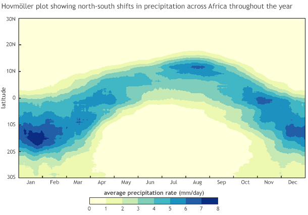
Each individual column in this Hovmoller Diagram is one day of rainfall across Africa (20W-55E), averaged by latitude. The columns are arranged chronologically like the books on a shelf. The horizontal axis shows the time of year, and the vertical axis shows how much it rained at each latitude. Animation by Mary Lindsey and Hunter Allen, based on data provided by the Climate Prediction Center.
Hovmöller Diagrams average all the values in a single column of longitude or row of latitude and puts those values on one axis. The other axis represents time. In the example above, we are using the horizontal dimension (X axis) to represent time and the vertical dimension (Y-axis) to represent latitude. This way, we can show how rain moves north or south over the course of the year.
Let’s walk through how we built this Hovmöller Diagram step by step.
- We set the boundaries of the area to focus on. In this case, it was most of Africa, from 20°W to 55°E longitude and 30°N to 30°S (avoiding locations in South Africa and dry northern Africa where rains are not dominated by the movement of the ITCZ).
- Starting with January 1, we averaged the rainfall amounts in all the grid boxes (pixels) across each latitude strip between 30°N and 30°S. For example, we averaged all the rainfall values along the equator from 20°W to 55°E.
- Then we repeated Step 2 for every day in the year (365 days). Each day’s data is one column in the Hovmöller Diagram. Imagine that each day is like a book tucked vertically into a bookshelf, spine facing out. Each day is a different book on the shelf, a different story of the rainfall patterns from north to south on each day of the year.
Still a bit confused? The animation below shows how we built our Hovmöller Diagram.
Animation by Mary Lindsey, based on data from the Climate Prediction Center.
In the Hovmöller Diagram, you can still see that the heaviest rains push farthest up (north) along the Y-axis in the northern hemisphere summer (June-August). In contrast, during the southern hemisphere summer (December-February), the opposite occurs. Rains are farther down (south) along the Y-axis. The seasonal cycle of African rainfall is simplified in one tidy figure!
While they may pale in comparison to the type of sorcery seen in Harry Potter, Hovmöller Diagrams are excellent at tracking signals that move, like rains in Africa. These diagrams can be used for many more types of atmospheric features. Stay tuned for our next post where we rotate a Hovmöller Diagram by 90° and learn how to use it to learn more about a recent MJO rainfall event that caused widespread flooding across the Maritime Continent.
Works Cited
Hovmöller, E. (1949), The Trough-and-Ridge diagram. Tellus, 1: 62–66.