2014 Global Temperature Recap
47 sec
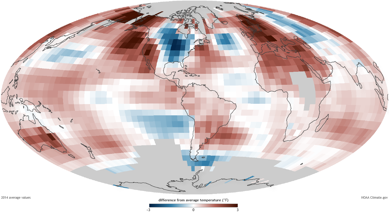
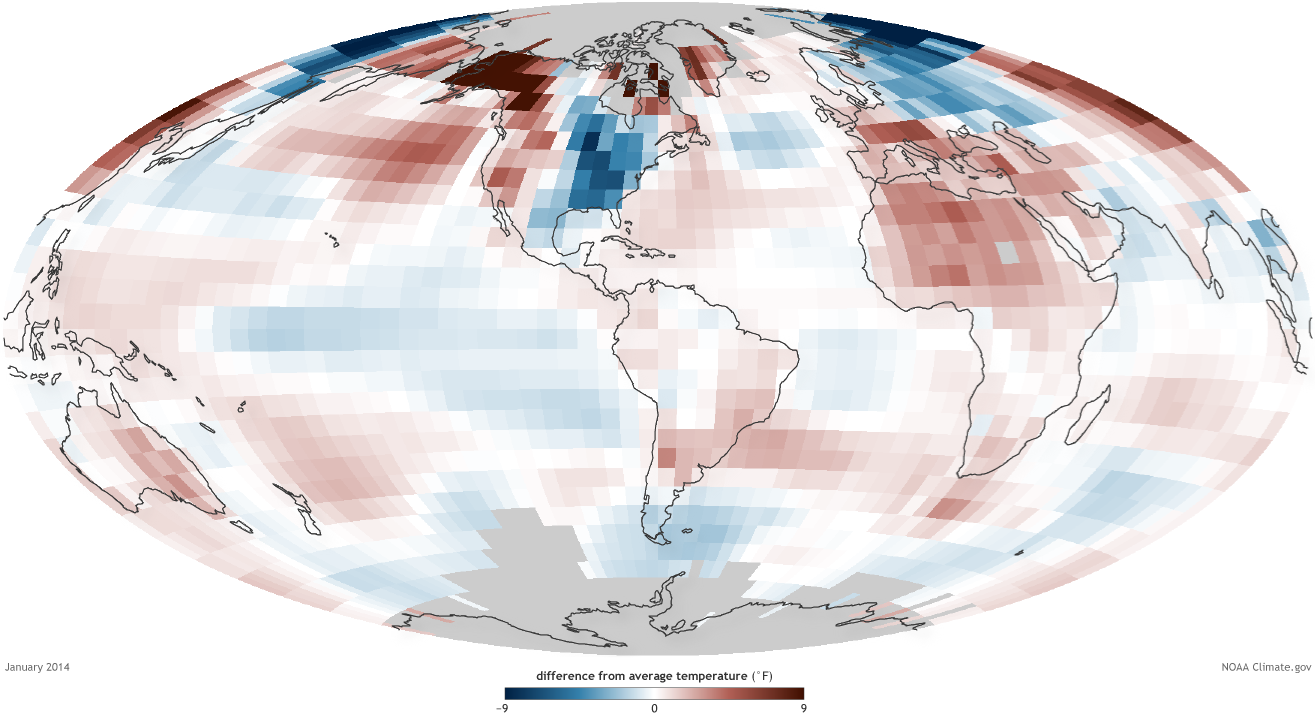
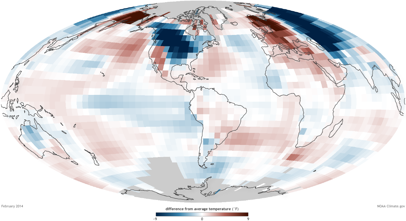
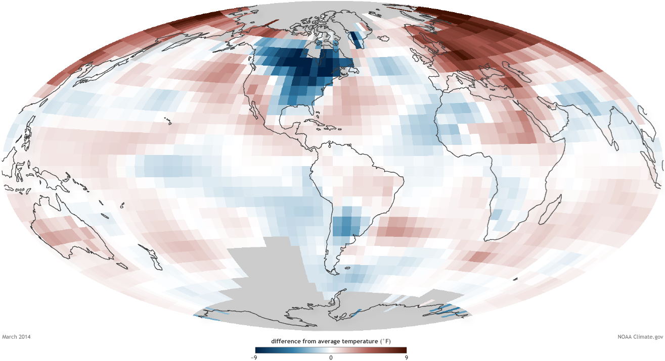
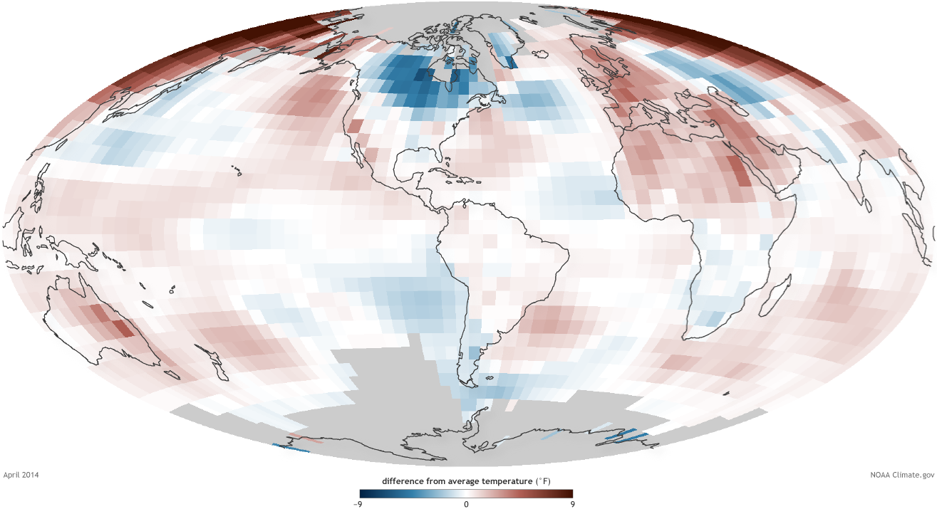
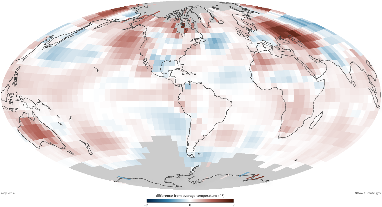
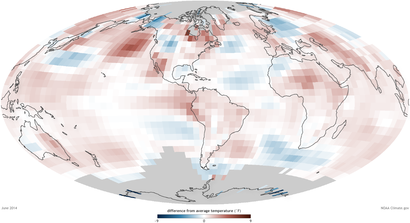
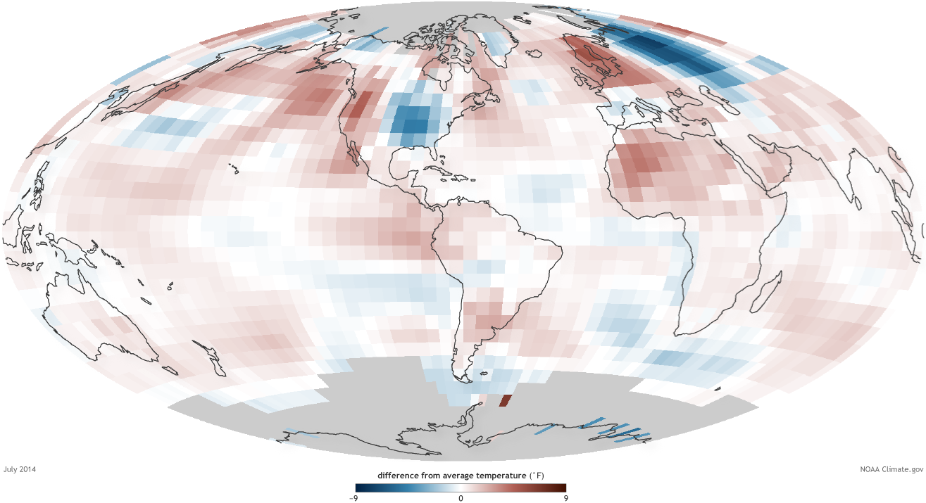
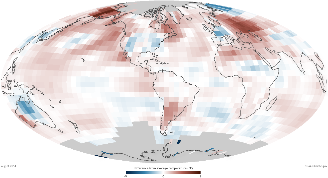
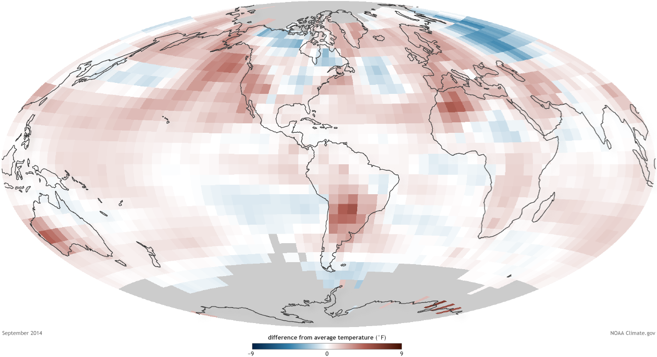
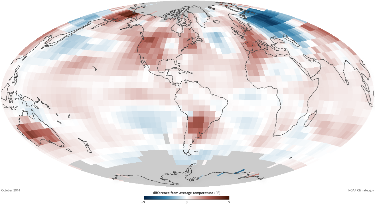
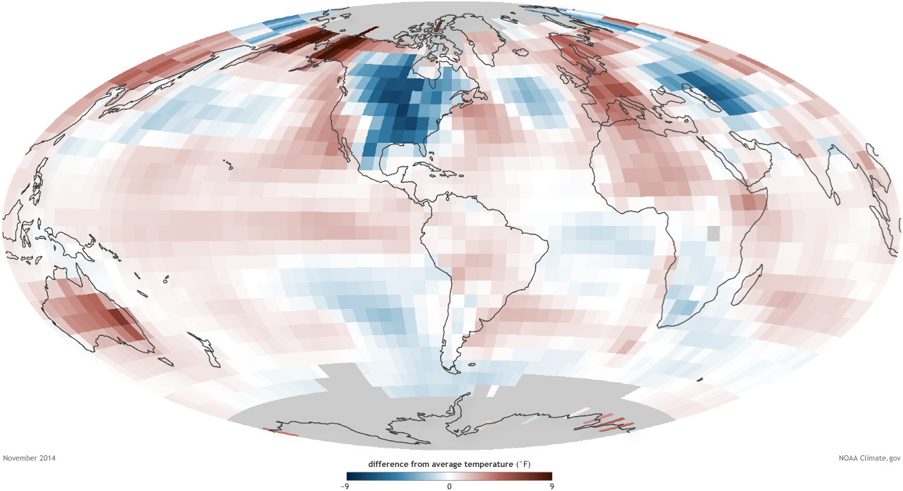
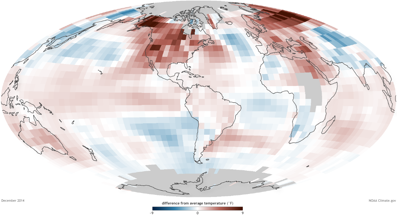
This animation shows Earth’s surface temperature in 2014 compared to the 1981-2010 average, followed by monthly maps of difference from average temperatures for each month January through December 2014.
Details
This animation shows Earth’s surface temperature in 2014 compared to the 1981-2010 average, followed by monthly maps of difference from average temperatures for each month January through December 2014. Maps are based on data from NOAA’s National Climatic Data Center.
In 2014, the combined land and ocean surface temperature was 1.24°F (0.69°C) above the 20th century average, making the year the warmest since records began in 1880. The ocean alone was record warm, while the land alone was fourth warmest. Five months set new records for warmth: May, June, August, September, and December. October tied for record warmest.
Nineteen of the twenty warmest years on record have occurred in the past 20 years.* Except for 1998, the 10 warmest years on record have occurred since 2002.
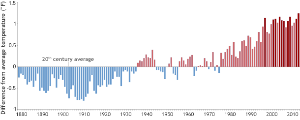
Annual temperatures since 1880 compared to the twentieth-century average. The ten warmest years on record (darkest red) have occurred in the most recent decades. Graph by NOAA Climate.gov, based on data from the National Climatic Data Center.
For more 2014 global climate statistics, visit
http://www.ncdc.noaa.gov/sotc/summary-info/global/2014/12
*[Correction: Jan. 20, 2015. This post originally stated that all 20 warmest years on record have occurred in the past 20 years.]
*****
FAQ: Why do you use the 20th-century average for baseline for the statistics and rankings, but use 1981-2010 for the maps?
The short answer is because of global warming.
The Earth’s average surface temperature has risen significantly enough over the 20th century that if we made a map that compared any recent monthly average to the 20th-century average for that month, virtually the entire globe would have positive anomalies; most of the map would appear in shades of red.
Such a map would be less meaningful for helping people understand how a the current month or year compared to their recent (or even lifetime) experience of climate, which is often more interesting and relevant to people than how the current period compares to the 20th-century average.
So, rather than mapping current conditions compared to the 20th-century average, we show them compared to the most recent complete 30-year period (1981-2010).
See answers to more FAQs here.
