Beyond 2016: Year in Review
In this edition of Beyond the Data, we’ll look back at 2016 and identify some of the most meaningful climate and weather events from the year.
First, the disclaimers
This is not a “top five” list of the biggest weather and climate events of the year. There are plenty of those running around. It’s simply one climate scientist’s view about selected important climate happenings of 2016, and why they speak to our understanding and experience with long-term climate.
Warmest year (probably) on record, globally.
What happened:
It was another important year for what is perhaps the most overused climate change indicator out there: globally-averaged surface temperature. This metric is very good for one thing: tracking climate change in a broad-brush sense. Beyond that relatively important function, it’s not particularly relevant. The data aren’t final, but it appears very likely that 2016 will go down as nominally warmer than 2015, which blew away 2014, which was nominally warmer than the rest of the years in modern history.
Why it matters:
Taken individually, especially in a warming world, the “warmest year on record” is not much more than a curiosity item—a headline atop a much broader story. If the world is warming, and it is, a new “warmest year on record” is inevitable every few years. However, one thing makes this year more notable than the other four "warmest years on record" we've had since 2000. 2016 will make a hat trick for 2014-16: three years in a row setting a new record. That’s rare. With the exception of 1939-41, when the NOAA time series was barely in statistical adulthood, this is only time the modern record yields three straight "warmest years on record."
Beyond the Data:
Of course, those 1939-41 years aren’t even in the top 30 any more. The world has warmed—a lot—since then. For some perspective of how much, consider this: 1940 was the first year of the record to be warmer than the 20th-century average.
I like to think of long-term change, the kind that has been going on since the early-to-mid 20th century, as riding up an escalator. Transitory bumps from factors like El Nino, are like jumping up and down while you’re on the escalator. Yes, a big jump will help you reach new highs, and make a difference between nearby years on the time series. But it’s that escalator ride that makes the next record inevitable: even if it’s not likely in 2017, it’s inevitable.
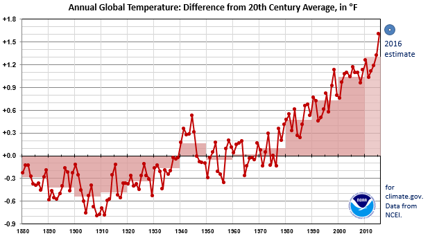
Global temperatures show year-to-year variability, but the long-term trend has been up since the mid-20th century. Red line: Global temperatures, expressed as the difference from the 20th century average, for each year from 1880 through 2015. Dots above the black line represent years warmer than the 20th century average. Pink boxes: averages for each decade during the period of record. Blue donut: an estimate for 2016, based on January-through-November data.
The La Niña that could, and then couldn’t, but then did
What happened:
El Niño finally faded coming out of the winter of 2015-16, and La Niña appeared inevitable. And then it didn’t. And then it did.
Depending on how you’re wired, you might see the emergent La Niña of 2016 as one of the wimpier, more non-committal La Niñas on record, or you might see it as a survivor, overcoming tough headwinds (literally) to finally get the ocean and atmosphere on the same page. Well, kind of. This one certainly won’t go on the Mt. Rushmore of La Niñas.
Why it matters:
La Niña is part of the El Niño / Southern Oscillation phenomenon, or ENSO. It can be influential in how our seasons play out, especially regionally, and especially during the non-summer months. I won’t waste your time here talking about ENSO, we have a whole blog, written by some of the best in the business, dedicated to ENSO.
Beyond the Data:
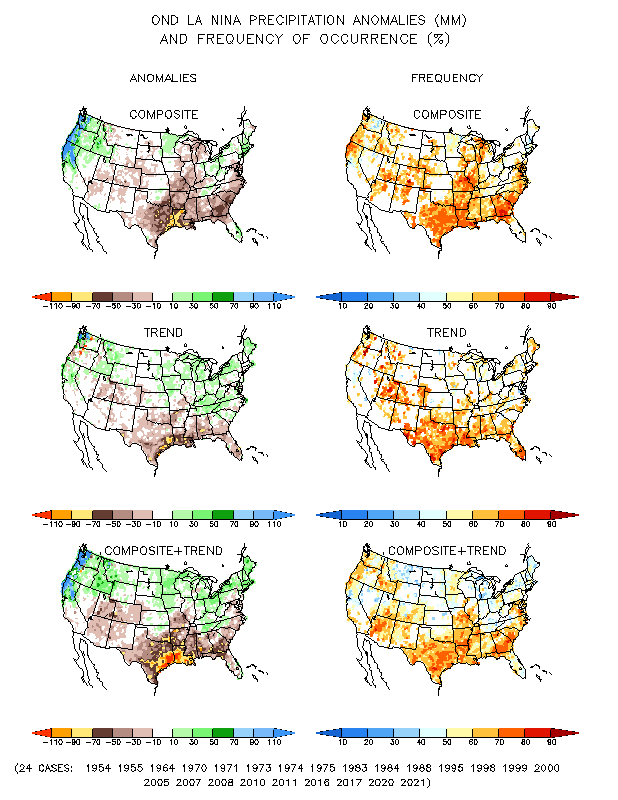
But here’s the thing. Despite being something of an ugly and scrawny duckling in the La Niña family picture, that La Niña coincided with record and near-record dryness here in the Southeast. And autumn and winter dryness in the Southeast is kind of a La Niña calling card. The national map isn't a perfect match for La Niña—no monthly map is—but a dry Southeast is a preferred pattern for La Niña.
November 2016 precipitation percentile maps for the contiguous United States. The colors show how the November 2016 precipitation compared to history for each location. Near Normal: precipitation was in the middle one-third of history. Above or Below Normal: precipitation was in the upper or lower one-third of history, respectively. Much Above or Much Below refers to the upper or lower 10 percent of history. Record driest and wettest indicate unprecendented November precipitation values at that location.
Louisiana, Hermine, and Matthew
What happened:
These three events brought colossal rains to the South in August, September, and October, respectively. NCEI’s Billion Dollar Disaster tracker has already confirmed the Louisiana event as causing roughly $10 billion in damages (Stay tuned for Adam's Smith's blog on the 2016 Billion-dollar Disasters Report coming out Monday!) Losses related to Matthew will also surely make the Billion-Dollar list.
Why they matter:
The Atlantic Ocean has been a fairly active hurricane producer in recent years. Despite this, the U.S. has quite improbably dodged, for more than a decade now, a direct hit from a major hurricane (defined as a Category 3 or greater hurricane at the time of landfall). But we haven’t dodged huge impacts. In 2012, Sandy was technically undergoing transition to an extra-tropical storm when it made landfall, but had massive impacts.
The flooding in Louisiana was related to a tropical disturbance, but it wasn’t even organized enough to get a name. Matthew was a historic storm earlier in its life cycle, and traced Florida’s and Georgia’s Atlantic coasts as a major hurricane, with major-hurricane type winds and storm surge, but technically made landfall as a Category 1 (not “major”) storm.
Beyond the Data:
Even outside of the context of climate change, the inland flooding associated with tropical storms is often the big killer. These events were no exceptions. The rainfall and flooding were catastrophic.
However, they dovetail with the broader fact that the Southeast—and, more generally speaking, the eastern half of the country—is seeing a large increase in the number and importance of large rainfall events. In a statistical sense, these events will go down as a few more data points in a trend that is crystal clear: the eastern U.S. is getting its precipitation in larger doses, and those larger doses are making up more and more of the average annual rainfall budget.
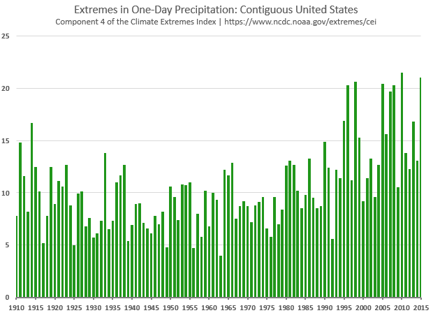
The Climate Extremes Index shows how different climate hazards are changing - or not changing - over time. Its fourth component, shown here, tracks trends in extreme one-day precipitation for each year from 1910 through 2015. The larger the value (the taller the bar), the larger the role that large, one-day precipitation events played in the year's rainfall budget. The data indicate that the nation, on average is seeing one-day big rain events increase over time, with inter-annual ("year to year") variability.
Drought Goes National
What happened:
Early in 2016, the Western U.S. was mired in a multi-year drought. Back-to-back-to-back-to-back seasons in the West had been either very dry, very warm, or both, leading to drought, accompanied by disappointing snowpack, in general. Thankfully, the Northwest improved significantly during 2016, and even the Southwest saw some modest improvements in places. But in the east, drought blossomed in the Northeast and exploded across the Southeast. Wildfire complexes dotted the Southeast, especially during autumn.
Why they matter:
Drought is an almost ever-present hazard in our American climate, and has been for centuries. For a combination of reasons, drought is the “quiet hazard.” It’s not telegenic, or particularly visually compelling. It rarely provides heart-pounding drama. It creeps over long timescales, out of the foreground. But what it lacks in attention-grabbing antics, it compensates for by being relentlessly effective in causing pain, to the economy, to public health, to mental health, and to our water supply. In most years, especially those that don’t feature big hurricane landfalls, drought is the costliest natural hazard that occurs.
Beyond the Data:
We often think of drought as a supply issue, in which there’s not enough precipitation to go around. But it’s also a demand issue, even before human use of water. The first party to demand water from the ground is the same one that put it there: the atmosphere. A warmer atmosphere is a thirstier atmosphere—it will take back more water through evapo-transpiration (ET, a term that combines evaporation with transpiration, which is the release of water vapor from plants). Precipitation being equal, a hot drought is droughtier than a cool drought.
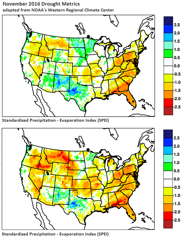
Comparing two drought indices for November 2016 shows the role of warmth in exacerbating dry conditions. The top panel shows the Standardized Precipitation Index (SPI), which depicts drought severity according to the precipitation that occurred during the month. The bottom panel shows the Standardized Precipitation Evapotranspiration Index (SPEI), which depicts drought severity according to the precipitation that occurred during the month (supply), combined with the evaporative stresses (demand) based on temperature. The SPI and SPEI technically depict severity in terms of unusualness. Increasingly positive values (building to darker blues) indicate more unusual wetness, while increasingly negative values (building to darker reds) indicate more unusual dryness/drought. These maps were adapted from those produced by NOAA's Western Regional Climate Center, using PRISM data.
Alaskan Heat
What happened:
At times this year, Alaska’s temperatures were literally off the charts. No, seriously. They broke our map legends. Alaska skated to its warmest year on record, by 1.6 degrees Fahrenheit. That's a lot.
Why it matters:
Alaska is America’s crucible of change. Much of Alaska sits in the Arctic, which, not coincidentally, is the globe’s crucible of change. The Northern Hemisphere’s high latitudes are changing more rapidly than any other major geographic region on the planet, and taking Alaska with them.
Like most things climate, temperature is only one indicator of change. In the Arctic, moreso than just about anywhere else on the planet, we see different climate elements mutually reinforcing the changes set in motion by global-scale warming. Climate scientists, perhaps ironically, call this “positive feedback,” and it goes something like this: warmer temperatures lead to smaller sea ice cover, which leads to more warming of the waters, which lead to smaller sea ice cover. Or, alternatively, warming leads to less snow, which leads to warming, which also leads to shrubbier and darker vegetation, which reinforces warming. And so on.
Beyond the Data:
There might not be a clearer example of this feedback than September and October in Alaska’s North Slope. These are the months surrounding the time when Arctic sea ice retreats to its annual minimum—it’s smallest footprint of the year. In the past, on average, the retreat didn’t make it very far from Alaska’s Arctic coast, and the sea ice, on average, ad returned during October. Now, it retreats well offshore and October returns are largely a thing of the past.
All of that open water during these two months brought profound changes to the climate of the North Slope since just 2000. The result is striking: look at the September-October temperatures there. It’s not that the place is hitting new records, which it is, it’s that a new normal, much different from the previous one, has taken root.
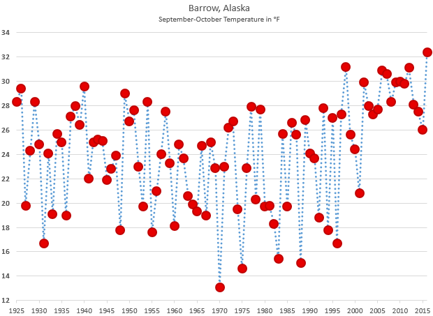
Average temperature for each September-October period since 1925 at Barrow, Alaska. The baseline climate of the 21st century is noticably different than the previous years in the series. Barrow is in northernmost Alaska, and September-October are months when sea ice traditionally formed just offshore.
In southern Alaska, the last two years have seen large scale wildfire. It’s not easy to separate the role of climate change and climate variability, but record warmth and considerable lack of snow cover, both more likely in a warmed world, played a role.
Comments
Margin of error
RE: Margin of error
For the global data, the 95% envelope is roughly +/-0.15C, but varies slightly each month/year based on data coverage. You can see exact values in our reports, for example the tables here: https://www.ncdc.noaa.gov/sotc/global/201611
For the US, a previous CONUS dataset had trend uncertainties estimated as +/-0.015C per decade (please see http://journals.ametsoc.org/doi/pdf/10.1175/2008BAMS2613.1 for details). Please note, however, that USHCN is no longer the basis for our estimates of US temperature, and uncertainty estimation is an ongoing area of focus at NCEI.
Thanks
Deke
Add new comment