No, your 2nd grader can’t dunk on Tim Duncan
In two weeks, we’ll know whether the Earth has tied the longest streak of “warmest months on record” in its modern history. By then, my colleagues at the National Centers for Environmental Information will have ingested and analyzed the February 2016 data, compared it to history, and published their findings.
As of the end of January, we’d seen nine straight “warmest months” – each month from May 2015 through January 2016 was the warmest on record for that month. This streak matches a nine-month run from June 1997 through February 1998.
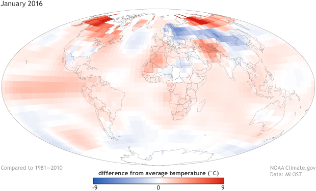
Temperature anomalies (departures from the 1981-2010 average) for January 2016.
If February 2016 winds up warmer than the warmest February on record (2015), the current run will match the longest such streak since the global temperature record reaches statistical adulthood in the early 1900s. That run occurred from January-October 1944.
As far as “longest streaks” go, this one is roughly equal to the longest on record. In some ways, the last year has stood out from the pack sort of like those past runs. That might lead you to believe that this current run is comparable to the past runs.
They’re not comparable. They’re not close. What’s the best way to really understand just how not-comparable these different streaks are? By comparing them, of course! Get your thinking shoes on. Let’s go Beyond the Data.
Context Matters
Comparing a record-setting warm streak from 2015 to one in 1997 or one in 1944 is like comparing the tallest player in the NBA to the tallest player in a high school to the tallest kid in 2nd grade. Sure, they may all be the tallest among their peers by two inches, and that’s nice for the Saturday afternoon pick-up game.
But context matters. The tallest 2nd grader isn’t going to dunk on Tim Duncan. The world is much warmer than it was 20 years ago, and colossally warmer than it was 70 years ago. Repeat it with me. Context. Matters.
Just a quick look at a trace of global temperature (this one is for all the Januaries since 1880) will show that each of these three years rest in different neighborhoods. January 1997 was the warmest January on record at the time. It’s now the 9th warmest. And it has held up better than many of the other months in the 1997-98 streak.
The table below is something of a “Where Are They Now” treatment of the months that made up the 1997-98 run of record-warm months. It shows how the 21st-century temperatures have run circles around the late 1990s, in two dimensions.
- First, with the exception of February, which is up next, the 1997-98 values have been obliterated by the recent run of warmth, with the departures - the differences from the 20th century average - well more than 50% larger than the erstwhile record holders from the late 1990s.
- Second, it’s not just the difference between the old records and the current records; it’s also the number of times each month’s record has been broken since the late 90s run. Again, with the exception of February 1998, none of the late 1990s records have even stayed in the top five. Most are already out of, or currently clinging to, the top ten.
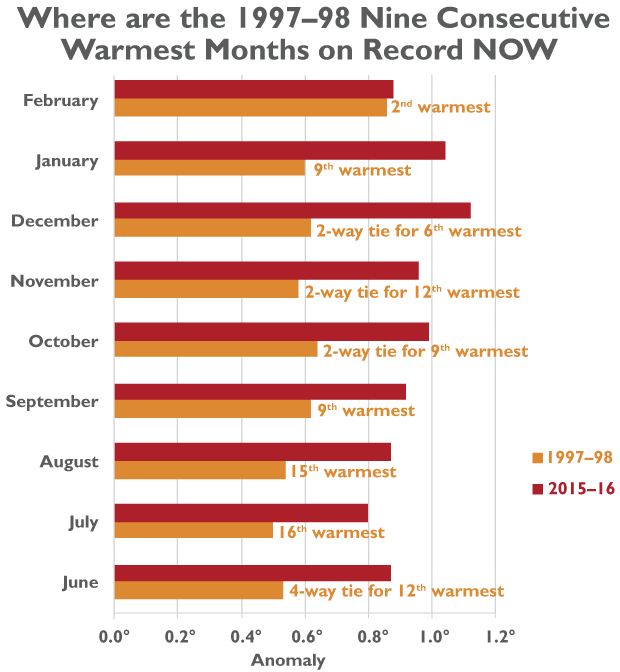
Looking at 1944’s run would just amplify these comparisons. The anomalies that occurred during the months in that run are now more than doubled, and in some cases, tripled, by the new records.
What do the differences look like on a map? Take January, for example. The maps just below show how the warmest-on-record-globally January of 2016 differed from the Januaries of 1944 and 1998. Red spots show locations that were warmer in 2016, blue spots were cooler in 2016. One thing is clear: there are strong regional patterns in any single month. This regional variability is typically strong in January in the Northern Hemisphere, and you can see that show up in spades as eye-catching red and blue regions. But the balance of the maps lie in red, particularly in the oceans, and especially in the Pacific.
Click buttons to switch views. These maps show how much warmer the January 2016 anomaly was than either the January 1998 or January 1944 anomalies. Although January 1998 and 1944 were each part of a similarly long run of record-breaking warm temperature anomalies, neither came close to 2016's warmth.
Here's the obligatory mention of El Niño
The figure below shows the same global temperature time series, but zoomed into the 1980-2016 period, with each month represented, and colored by the sea-surface temperatures in the Niño-3.4 region as a “poor man’s estimate” of ENSO conditions. Months with SSTs similar to La Niña conditions are blue; those that reflect El Niño are red. If this seems familiar, we’ve done this before.
Slowly scan your eyes from left to right. For reference, 1997-98 are almost exactly in the middle of the graph. The 1997-98 run was a large spike above its immediate predecessors, in part due to the strong El Niño of the time. The current 2015-16 run (the rightmost months) is the same. But the recent months have launched from a much warmer base than existed in the late 1990s. The recent run of record temperatures pushed us into new territory. I had to change the scale on this graphic; the recent temperatures were literally off the charts.
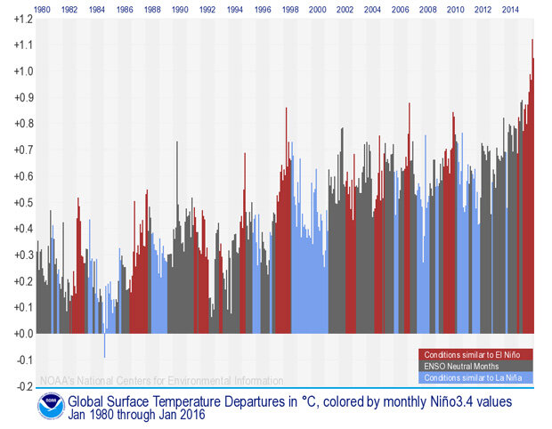
Global sea surface temperature anomalies from Jan. 1980-Jan. 2016 in degrees Celsius. Red bars represent conditions similar to El Niño, Blue represents conditions similar to La Niña, and grey represents ENSO-neutral conditions. Credit: NOAA NCEI.
Coda
Look again at the graph. Even the stronger El Niño events [temporarily] add a few tenths of a degree Celsius (up to about a half degree Fahrenheit). But the general warming during this stretch has been more than a half degree Celsius (almost exactly one degree Fahrenheit) since 1980. Decades of warming dwarf the impact of any single El Niño on global temperatures.